Live data from Hacker News

It's hard to justify Tahoe icons

tonsky.me

331–340 of 984 posts

Re: It's hard to justify Tahoe icons

#331

Funnily enough, I find icons an improvement overall - even if those are inconsistent, it feels like it gives me more points to anchor my eyes on when skimming through an unknown menu and gives me any context. Starting to use Mac ~3 years ago, I often encountered giant blocks of text in right-click menus and while pleasing aesthetically, those were a chore to actually parse. For someone who daily drives macOS for, I a…

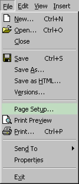
It’s best when only some of the items in a menu (like maybe a third of them) have icons, preferably the most important commands. This gives the menus a visual structure and can also help in better recognizing groups of related items.

The classic Windows menu from the article is a good example: https://tonsky.me/blog/tahoe-icons/word@2x.webp?t=1767611340
Re: It's hard to justify Tahoe icons

#332

It's hard to justify Liquid Glass in general. The wastefulness of flat design (in terms of space) married with the visual excess of skeuomorphism, but without even providing any affordances (does the sidebar being raised give you any new information on how to use a sidebar? No). If you're a designer at a top 10 S&P 500 company making 6 figures, you owe it to yourself to have some love for your craft. If a PM tells yo…

I agree, Liquid (Gl)ass is hideous. I'll stick to macOS Sequoia for the time being.

Same. And finally thinking that our KDE home server doesn’t look too bad, it’s almost comforting.

The major reason to stay on macOS is stability. Hopefully they stop breaking things on the Mac front.

Re: It's hard to justify Tahoe icons

#333
post #319

Earlier quoted context omitted.

I agree, Liquid (Gl)ass is hideous. I'll stick to macOS Sequoia for the time being.

MacOS 26 highlights were... and this was _Apple's_ opening modal... "Icons that look like shit!" and "Notification summaries that may not be correct!" In general I feel as if Apple's software feels buggier and less solid lately across my iPhone and my computers. Won't be upgrading the personal computer for as long as possible

> Apple's software feels buggier and less solid lately across my iPhone and my computers.

Agreed. Rendering is very flaky. Input events are dropped.

Blinky. Laggy. Two of the Seven Dwarves of Liquid Glass.

Re: It's hard to justify Tahoe icons

#334

Earlier quoted context omitted.

The only "real" justification is that this is a long term play to figure out a UI and interaction shift that will work for general augmented reality devices (aka whatever device Apple releases five years and two iterations from now based on the Vision Pro.)

That’s the same logic that led to the Windows 8 UI being designed tablet first because that’s “where we’re all going”. Fast forward to Windows 10 where MS had to concede that, no, turns out it isn’t where we’re all going and rolled most of it back.

It's somewhat understandable.

A lot of us felt at the time that surely laptops and tablets would converge. Otherwise, what a waste of hardware.

But it hasn't really happened. From a hardware perspective, things have gotten closer with the iPad's magnetic keyboard. But, I still find that the iPad as laptop replacement to be a compromise that I may tolerate for travel but don't love for a lot of laptop work.

Re: It's hard to justify Tahoe icons

#335
post #138

It's hard to justify snowflake animations on your website...

Sometimes you need an animation to turn your site into a special snowflake of a site, and what better way to do that than to use a snowflake animation? TBF, you can turn it off by clicking on the snowflake icon in the top right corner. But then the background turns from blue into an annoying shade of yellow. Ok, you can click on the sun icon to fix it by switching to night mode. But then... aaaaargh!

The dark mode action got an audible chuckle out of me.

Re: It's hard to justify Tahoe icons

#336

It's hard to justify Liquid Glass in general. The wastefulness of flat design (in terms of space) married with the visual excess of skeuomorphism, but without even providing any affordances (does the sidebar being raised give you any new information on how to use a sidebar? No). If you're a designer at a top 10 S&P 500 company making 6 figures, you owe it to yourself to have some love for your craft. If a PM tells yo…

> If you're a designer at a top 10 S&P 500 company making 6 figures, you owe it to yourself to have some love for your craft.

I think you've unintentionally illustrated the root of the problem here.

People motivated by profit are not incentivized to produce high-quality results. Rather, people motivated by profit are only incentivized to do the least effort that they can get away with.

People motivated by pride are those who are incentivized to produce good results, because the result reflects on them personally.

Which is all to say, pride motives produce a race to the top, whereas profit motives produce a race to the bottom. It's no wonder our modern economy can only produce slop.

Re: It's hard to justify Tahoe icons

#337
post #272

Earlier quoted context omitted.

It’s not how you get promoted though. Plus implementing complex UIs is challenging which engineers like. The incentives are off.

It's not only not how you get promoted, it's a pretty good way to get canned as well. If you don't like the work you're being asked to do, your options are pretty limited to doing it or going elsewhere. There are a million UXers and engineers who'd love to work at Apple and would be happy making whatever their boss suggests.

Seriously. People got canned for resisting the corporate overlords. That’s capitalism. Corporations run by their employees? Guilds? Cooperatives? Hah! https://www.youtube.com/watch?v=ynbgMKclWWc

Just that usually the forcefed initiatives have to do with corporate profits for shareholders, or trends like shoving AI into everything. Imagine saying no to that!

Even at the supra-corporate and supra-national level, if the organizing principle is competition, no actor not even a CEO or a corporate board or a government can afford to stop racing towards disaster. There is a simple mantra: “If we don’t achieve AGI first, China will and then they’ll dominate.”

Once in a while, the world comes together to successfully ban eg chemical weapons or CFCs, and repair the hole in the ozone layer. Cooperation and restraint takes effort.

Judging by the way we’ve drained all the aquifers, overfished the last fish, destroyed the kelp forests, cut down the rainforsts, bleached the corals, and polluted the world with plastic, I don’t think there is much hope of stopping.

Insects and pollinators are way down, and many larger species are practically extinct, 95% of the world’s animal biomass is humans and their food, and people still pretend environmental catastrophe is all about a few degrees of temperature.

PS: Yes, that escalated quickly. In the real world, it has taken only 80 years… :-/

Re: It's hard to justify Tahoe icons

#338

Earlier quoted context omitted.

> author, please either make the snowflakes less distracting or toggleable They already did, as the grandparent comment already explained: >> TBF, you can turn it off by clicking on the snowflake icon in the top right corner.

Did you see what happens when you do? I wouldn’t say it improves readability.

Yup: all the animation stops, the overlaid snowflakes disappear, and the background changes from blue to yellow. I haven't bothered to check the foreground/background contrast of the two versions, but I suspect that, although the yellow version will have less contrast, the removal of the snowflakes will make for a net benefit to readability for the average person.

Re: It's hard to justify Tahoe icons

#339
post #273

It's hard to justify Liquid Glass in general. The wastefulness of flat design (in terms of space) married with the visual excess of skeuomorphism, but without even providing any affordances (does the sidebar being raised give you any new information on how to use a sidebar? No). If you're a designer at a top 10 S&P 500 company making 6 figures, you owe it to yourself to have some love for your craft. If a PM tells yo…

Alan Dye ruined everything at Apple, no idea how he clung on for so long. You know he designed the horrible ios7 as well? https://www.youtube.com/watch?v=YSzjcVZXolc https://tjkelly.com/blog/ios-7-sucks/ And he also takes credit for the dynamic island. It is an assault on my senses to see everything constantly moving around on my screen. I have been working with Macs since 1995, but this year is my first using Pixel…

Thank god he left for Meta

Re: It's hard to justify Tahoe icons

#340
post #273

It's hard to justify Liquid Glass in general. The wastefulness of flat design (in terms of space) married with the visual excess of skeuomorphism, but without even providing any affordances (does the sidebar being raised give you any new information on how to use a sidebar? No). If you're a designer at a top 10 S&P 500 company making 6 figures, you owe it to yourself to have some love for your craft. If a PM tells yo…

Alan Dye ruined everything at Apple, no idea how he clung on for so long. You know he designed the horrible ios7 as well? https://www.youtube.com/watch?v=YSzjcVZXolc https://tjkelly.com/blog/ios-7-sucks/ And he also takes credit for the dynamic island. It is an assault on my senses to see everything constantly moving around on my screen. I have been working with Macs since 1995, but this year is my first using Pixel…

Dye was a symptom, not the cause. At a widespread organizational level, Apple just does not give a shit.
Post reply on HN