Live data from Hacker News

Bring Back Idiomatic Design (2023)

essays.johnloeber.com

301–310 of 385 posts

Re: Bring Back Idiomatic Design (2023)

#301

Earlier quoted context omitted.

> React is also how you get consistent design across a major web app. Can you imagine if every button on every site was the same Windows button gray color, regardless of the site's color? It'd be awful! React components (with CSS classes) are a way for a site like Amazon to make all their buttons orange (although I don't actually know if Amazon uses React specifically). I don't understand this point specifically. I m…

Design is more than styling, it is also behaviour and state, which is what react helps you encapsulate in a component.

> Design is more than styling, it is also behaviour and state,

Maybe I need an example of this for buttons: what behaviour on buttons should be consistent? What about state - what state on buttons should be consistent?

Re: Bring Back Idiomatic Design (2023)

#302

In text boxes in some applications, enter submits the entered text, and ctrl-enter forces a newline (not at my computer, but I think Slack does this). In others, it's the other way around (pretty sure GitHub does this for comments). I don't know how we got here and I don't know how to fix it, but "bring back idiomatic design" doesn't help when we don't have enough idioms. I'm not even sure if those two behaviors are…

This is a lot of pain. It is very easy to fix. Add button somewhere around text box. Which turns it into multiline text edit control, increases its height. Now works as line feed and to submit the text user have to click "send" button. Most of chat messages are not multi-line, but few are and for them, proper edit UI is essential. I, personally, just use separate text editor like Gnome Text Edit to compose my message…

I think this is just doing things differently, not fixing them - and IMO not for the better either.

I've been playing with making a chatbot with llama.cpp and FLTK[0] and FLTK's default behavior is actually to add a newline in the multiline editor when pressing Enter even if a 'Return button' is in the form (Return buttons are buttons activated when you press Enter or Return though Return is also handled kinda differently). And i have a big Submit 'Return button' there.

And TBH it annoyed me a LOT that i have to move the mouse and press the button to submit or that Enter adds newlines instead of submitting so that i explicitly added code so that pressing Enter is not handled by the editor (letting the Return button submit the input) and pressing Shift+Enter is what adds the newline (Ctrl+Enter also works, this comes from FLTK's behavior, but i've been used to Shift+Enter myself).

Which is basically how pretty much every chat interface (be it AI chatbot or something like Discord or whatever) that i've used in recent times works. And TBH it makes sense to me that the simplest/easiest shortcut (Enter) is what does the most common thing (send text) in a chat interface whereas the more involved shortcut (Shift+Enter or Ctrl+Enter) is used for the exceptional/less common case. In such an interface, the multiline editing is there as an exception (for when you want to paste some stuff and even then often Ctrl+V by itself can be enough), but most interactions are going to be single line submissions (often wordwrapped to look like multiple lines but still a single line).

[0] https://i.imgur.com/K3m9KAD.png

Re: Bring Back Idiomatic Design (2023)

#303

Earlier quoted context omitted.

is automatically formatted based on the user's locale.

This is still a partial solution as the user needs to know that their locale is being used and know how their locale is configured to understand the format. This is most problematic on shared computers or kiosks, especially when traveling.

I think modern browsers are actually quite good here. They show a template in the form TT.MM.JJJJ for me (so the German equivalent of MM/DD/YYYY, with the usual order and separator in German). I can just type the date, including the dots if I want (they're just ignored; there would be extra points for moving me to the next component when typing "2.", but the world's not perfect). If I'm confused about the format, or want to see a calendar view, I can click on the calendar icon (also accessible via tab) and select a date there.

For normal date inputs, I really don't think there is a good reason to use anything else. (Possible exceptions I can think of: Selecting date ranges and/or showing extra data about the dates (like daily prices).)

Re: Bring Back Idiomatic Design (2023)

#304
post #51

Earlier quoted context omitted.

It’s amazing how many blank stares I get when I, as mobile engineer, tell stakeholders that we shouldn’t just implement some random interface idea they thought up in the shower and we instead need design input! “But why can’t you just do it?” Because I recognise the importance of consistent UX and an IA that can actually be followed. Just like developers, (proper) designers solve problems, an we need to stop asking t…

> “But why can’t you just do it?” The answer should be "because users will hate it and use a competing product that's better designed". A shame that it isn't actually true any more.

Those people generally are not eager for feedback especially if it's even remotely perceived as negative or some kind of gatekeeping.

The only way to avoid getting furious about this is to deeply understand that you can't require people to be properly self-aware, especially because many many people that checks the expert boxes are very incompetent or inadequate, so they when the come up with their half bake ideas, they delegate the other to deliver contrarian proofs. It's exhausting.

Re: Bring Back Idiomatic Design (2023)

#305

In text boxes in some applications, enter submits the entered text, and ctrl-enter forces a newline (not at my computer, but I think Slack does this). In others, it's the other way around (pretty sure GitHub does this for comments). I don't know how we got here and I don't know how to fix it, but "bring back idiomatic design" doesn't help when we don't have enough idioms. I'm not even sure if those two behaviors are…

Nice solution for this might be: Ctrl+Enter: Always submits Shift+Enter: Always newline (if supported) Enter: Reasonable default, depending on context

I thought this is how it works for most software. What are the exceptions to this rule?

Re: Bring Back Idiomatic Design (2023)

#306
post #243

The solution to this kind of problem is standards. For most of the history of computation, things were moving too fast for anyone to really worry about standardization. Computing environments were also somewhat Balkanized. Standard keyboard shortcuts, for just one example, weren't. They still aren't. e.g. If you fingers are accustomed to hitting Ctrl-C to copy on most computers, they'll hit Fn-C on a Apple keyboard,…

Isn't the Macintosh desktop (with Cmd as the modifier for standard shortcuts) older than Windows and Linux desktops? So historically, it's not Apple that deviated but the others?

(I did not do an extensive search into this, so there might be Ctrl-based standard shortcuts that predate Apple.)

Re: Bring Back Idiomatic Design (2023)

#307

Earlier quoted context omitted.

The author may have identified that "the idioms come from the use of system frameworks", but they absolutely got wrong just about everything about why apps are not consistent on the web (e.g. I was baffled by their reasons listed under "this lack of homogeneity is for two reasons" section). First, what he calls "the desktop era" wasn't so much a desktop era as a Windows era - Windows ran the vast majority of desktops…

It doesn't matter that different platforms have different standards, as long as applications on any given platform are mostly consistent. I don't care if your app looks different on Windows, because I'm on a Mac. I care that it behaves like a Mac application, and the muscle memory I have from all my other Mac apps also works on yours.

If you say that too loud, the “but my brands unique UI supersedes your functional requirements” people will emerge, screeching, from the woodwork!

I can’t prove it, but I just know they’re the ones who live their lives one NPS score at a time, and must think that we operate our software, being thankful for every custom animation that they force us to sit through on their otherwise broken and unimportant software.

Re: Bring Back Idiomatic Design (2023)

#308

Earlier quoted context omitted.

What lower turtles were there? My impression was that teletypes were the first proper keyboard-based interfaces.

The telegraph was keybased - only one key so I can't call it a keyboard, but in other ways it is what you are asking about.

Pianos have keys. And some telegraphs were outfitted with piano-like keyboards with one key per letter. Wikipedia has some pictures in the printing telegraph article [1]. So there is arguably a clear lineage from pianos to the modern computer keyboard.

Pianos however don't really have a concept of advancing the line or sending a recorded message.

1: https://en.wikipedia.org/wiki/Printing_telegraph

Re: Bring Back Idiomatic Design (2023)

#309
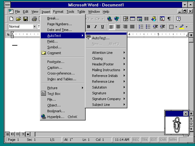
It's a little interesting that they would pick Office 2000 as an example, since Office 97 and onwards do not use standard OS widgets -- it reimplements and draws them itself*.

The menu bar in Office 2000 does not look like the standard OS menu bar, for instance. The colors, icons and spacing are non-standard. This is only slightly jarring, because it's pretty well done, but it's still inconsistent with every other app.

This was kind of the beginning of the end for Windows consistency -- when even Microsoft thought that their own toolkit and UX standards were insufficient for their flagship application. Things have only become worse since then.

* This becomes very obvious when you run Office 97 on NT 3.51, which generally looks like Windows 3.1, but since Office 97 renders itself and does not care about OS widgets, it looks like this: http://toastytech.com/guis/nt351word.png

Re: Bring Back Idiomatic Design (2023)

#310
post #4

> Prefer words to icons. Use only icons that are universally understood. Underrated. Except for dyslexic people, and the most obvious icon forms, I am pretty sure most people are just better and faster at recognising single words at a glance than icons.

It varies, some applications - the ones that people spend their workday in - have specific iconography that is domain specific for that application.

A difference needs to be made between general public applications and domain specific employee applications. SAP is a great example of this. Of domain specific icons I mean, not of good UX design.

Post reply on HN