Live data from Hacker News

LabPlot: Free, open source and cross-platform Data Visualization and Analysis

labplot.org

31–40 of 44 posts

Re: LabPlot: Free, open source and cross-platform Data Visualization and Analysis

#31
post #23
post #7

Obviously there is a lot of work here, but I am a bit confused. If you already have lab code in Julia, Matlab, R, Python, Excel, etc., what is the motivation to use this tool? Is this hot in a specific community?

It's the use case. Here is one concrete example. I worked as a project engineer during the development of a launch vehicle. The telemetry data frames from every test and every flight were processed into numerous CSV or TSV files that were labeled with the parameter name. Those files could be very large depending up on their sampling rates, especially for tests that lasted hours on end. You would conduct exploratory m…

I'm also space and launch-vehicle adjacent. Using vnlog for data storage (like what you described, but with better tooling support) and feedgnuplot/gnuplotlib for visualization. Works great. The learning curve is really easy, you can get going and start analyzing stuff FAST. Making complex plots is fiddly, but it usually is with any tool.
Re: LabPlot: Free, open source and cross-platform Data Visualization and Analysis

#32
I used SciDavis a lot and before that tried QtiPlot. When I had a chance to I used Origin. SciDavis was clunky and had some issues (liked to crash) but it worked well enough for what I wanted. Had some problems with setting plots styles, maybe it was just me but it wasn't obvious how to copy style between plots.

Tried LabPlot recently and had issues with csv import with datetime data not really recognising date and time series format even after using advanced import options and setting it myself manually. Tried to find some solutions, the LabPlot manual website is just a bunch of youtube videos [1]. That is really not helpful, I am not browsing manual to be forced to watch clips of what I already tried. Developers really need to think about making traditional manual.

There is also a AlphaPlot, a more or less alive fork of SciDavis. Still have its own issues but still has the same issue with yyyy-MM-dd hh:mm:ss.zzz dates. Other than that it is a useful bit of kit.

But when I want to do some batch processing and generate multiple plots, automate and have it reproducible I go with gnuplot. The learning curve is steep, but after writing gnuplot scripts few time you just have a personal template and know relevant parts. It is really good.

All in all I am glad there is an opensource movement in this area. It is always better to have more options.

1. https://docs.labplot.org/en/2D_plotting/2D_plotting_xycurve....

Re: LabPlot: Free, open source and cross-platform Data Visualization and Analysis

#33

Earlier quoted context omitted.

I'm in potentially the target demographic for this. I regularly bounce between R, Python, Maxima, and occasionally MATLAB/Octave. Passing data between these is usually done using the lowest common denominator: CSV. Having four completely different interfaces to these tools is a hassle. I'm also not a big fan of Jupyter and if this feels better for me it might be a decent Jupyter replacement even without the cross-lan…

I'm someone who enjoys figuring out the details of making a nice looking plot (in base R, I can't stand ggplot), but even as someone who enjoys it, LLMs are pretty much good enough that if I explain to them how I want the plot to look and how my data is structured, they can generate code that works first shot. It seems to me that, at this point, if you are already doing some coding in one of the above languages but e…

Sorry for the off-topic question but would you mind to elaborate on why you can't stand ggplot? I personally haven't spent too much time with the r base functions but have come to absolutely adore ggplot for graphing and am thus very interested in learning about potential reasons to use r base plotting functions instead!

Re: LabPlot: Free, open source and cross-platform Data Visualization and Analysis

#34

Earlier quoted context omitted.

I'm someone who enjoys figuring out the details of making a nice looking plot (in base R, I can't stand ggplot), but even as someone who enjoys it, LLMs are pretty much good enough that if I explain to them how I want the plot to look and how my data is structured, they can generate code that works first shot. It seems to me that, at this point, if you are already doing some coding in one of the above languages but e…

Sorry for the off-topic question but would you mind to elaborate on why you can't stand ggplot? I personally haven't spent too much time with the r base functions but have come to absolutely adore ggplot for graphing and am thus very interested in learning about potential reasons to use r base plotting functions instead!

I think it's just too different from base R, and I had spent too long in base R before tidyverse/ggplot became a thing. By the time it came around, I was already good enough to do basically all my plotting without it, and having to learn an entirely new set of syntax just annoyed me.

My reaction is much more emotional than rational.

Re: LabPlot: Free, open source and cross-platform Data Visualization and Analysis

#35

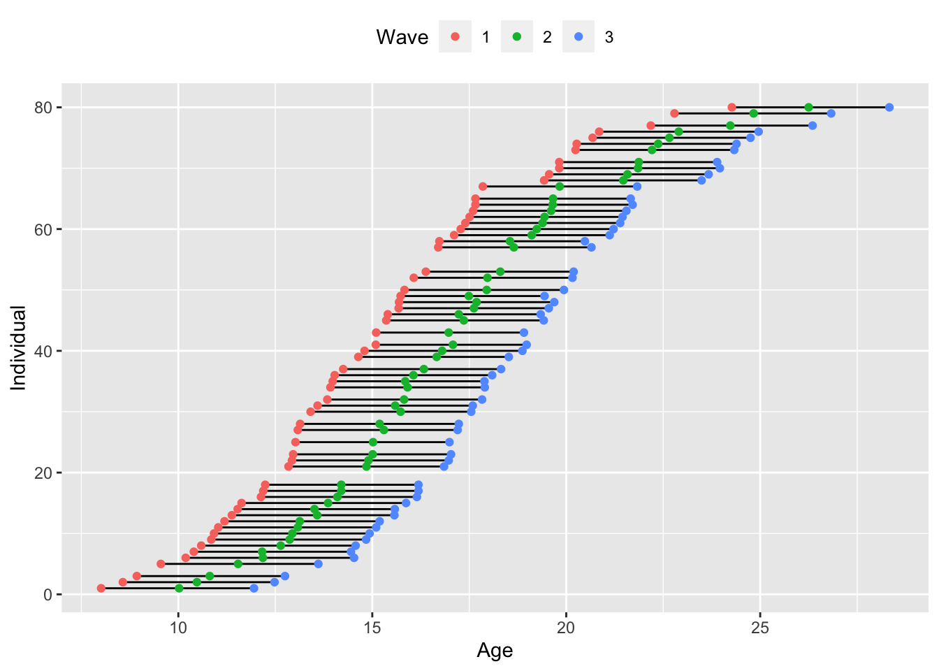
Sure ggplot, for example, is finicky, and you need to fuss over it to get the look you are wanting, but then again, it is very flexible. Most of these solutions get frustrating as soon as you want to do, for example, spaghetti plots of within subject repeated measures using age (not time-point) of accelerated longitudinal design data, with fixed effect plots on top. e.g. this plot of mine [1] [1] https://imgur.com/a/…

I just needed to stop and say: as a biostatistician, boy do I love a beautiful complex longitudinal design: I remember my old professor asking us how at this point we would decompose into cross-sectional and longitudinal effects, Lord's paradox, etc... and I still don't fully understand Lord's paradox as well as I should.

This is a very important idea. For example, one issue with accelerated longitudinal designs, see image [1], is that while they efficiently cover a larger age range, the fixed effects of age are largely driven by cross-sectional differences between who is samples are younger and older ages. One method that can be used to test whether the pattern seen in the fixed effects represents the pattern within subjects is to decompose within and between effects of age. For example, you can create a non-time-varying variable like age at first visit (starting_age), and then a within subject variable change in age since first visit, which would be zero at the first visit (age1-age1=0, age2-age1 for change of age between visit 2 and visit 1, age3-age1, for change in age between 3rd visit and first visit), calling it dage. Then in the mixed model, test for an interaction between starting_age:dage. If you have an interaction, then you know that the within subject effect of change in age is different depending on how old you were when you started. I got this from Lesa Hoffman's freely available lectures [2], particularly [3][4], and now I discovered she recently published [5], which I should read.

[1] https://e-m-mccormick.github.io/static/longitudinal-primer/l... [2] https://www.lesahoffman.com/ [3] https://www.lesahoffman.com/PSYC944/944_Lecture11_Alt_Time.p... [4] https://www.lesahoffman.com/Workshops/SMiP_Presentation_June... [5] https://www.tandfonline.com/doi/full/10.1080/00273171.2025.2...

Re: LabPlot: Free, open source and cross-platform Data Visualization and Analysis

#36

Sure ggplot, for example, is finicky, and you need to fuss over it to get the look you are wanting, but then again, it is very flexible. Most of these solutions get frustrating as soon as you want to do, for example, spaghetti plots of within subject repeated measures using age (not time-point) of accelerated longitudinal design data, with fixed effect plots on top. e.g. this plot of mine [1] [1] https://imgur.com/a/…

I just needed to stop and say: as a biostatistician, boy do I love a beautiful complex longitudinal design: I remember my old professor asking us how at this point we would decompose into cross-sectional and longitudinal effects, Lord's paradox, etc... and I still don't fully understand Lord's paradox as well as I should.

And thank you for the reminder of Lord's paradox. I should refresh myself.

Re: LabPlot: Free, open source and cross-platform Data Visualization and Analysis

#37
post #7

Obviously there is a lot of work here, but I am a bit confused. If you already have lab code in Julia, Matlab, R, Python, Excel, etc., what is the motivation to use this tool? Is this hot in a specific community?

In my experience, there are people out there who don't program, or who don't feel that it's a productive way of doing things. I'm firmly in the Python camp, but recognize that my workplace has several JMP licenses, and the majority of engineers are satisfied with Excel. And I never let anybody see how long it takes me to do things. ;-)

However, those people also belong to the most-of-the-world who are still leery of "open source" or anything that doesn't come from a known brand.

This thing could be an option for someone who wants to mess around with data but isn't comfortable mentioning it to the boss until they see for themselves if it's worthwhile.

Re: LabPlot: Free, open source and cross-platform Data Visualization and Analysis

#38

Earlier quoted context omitted.

Sorry for the off-topic question but would you mind to elaborate on why you can't stand ggplot? I personally haven't spent too much time with the r base functions but have come to absolutely adore ggplot for graphing and am thus very interested in learning about potential reasons to use r base plotting functions instead!

I think it's just too different from base R, and I had spent too long in base R before tidyverse/ggplot became a thing. By the time it came around, I was already good enough to do basically all my plotting without it, and having to learn an entirely new set of syntax just annoyed me. My reaction is much more emotional than rational.

Thanks for elaborating on that, I was wondering too. In a very similar way (with a different outcome), my first real introduction to R was due to the "A Layered Grammar of Graphics" paper while doing some tangential research during grad school. I fell in love with the abstractions in the paper and reluctantly learned R so that I could get access to ggplot :).

As a side note, my research ended up essentially discovering Flame Graphs before Brendan Gregg was publishing/popularizing his version. His are much better than mine, but I take some comfort knowing that the ideas I was coming up with in grad school were decent!

Re: LabPlot: Free, open source and cross-platform Data Visualization and Analysis

#39
Looks cool, but I wish there was a section explaining 'here's why it's better than matplotlib or [other popular charting tools]'. I looked through the feature list but I didn't feel like mentally constructing a comparison matrix. I see lots of things to like about it, but I would really appreciate case studies or something to explain why I might want to invest time in learning this new thing.

Re: LabPlot: Free, open source and cross-platform Data Visualization and Analysis

#40
post #27

Earlier quoted context omitted.

I installed it and the only choice I got for selecting a database was SQLite

On linux, you are likely missing the db drivers for Qt for other database types.

I'm running it on Windows
Post reply on HN