Live data from Hacker News

Nebula Sans

nebulasans.com

31–40 of 107 posts

Re: Nebula Sans

#31

Ok, it is a font alright. To me, it looks exactly as all the other fonts I have on my OS already, but I guess that's just how it is if you are not in the font bubble.

On the screen, in small print, you may not notice the difference between this and, say, Franklin Gothic. But in print the difference is more noticeable, even if not immediately visible without taking a closer look. If you encounter a booklet purported to be form Bank of America set in this typeface instead of Franklin Gothic, it will look very similar but you'll feel that something is slightly off.
Re: Nebula Sans

#32
post #30

Little PSA: a) This is a clone of Whitney, an incredibly beautiful and unique typeface from 2004 b) Whitney was designed by Tobias Frere-Jones c) He was an equal co-founder of the H&fJ foundry d) He designed the vast majority of their most famous fonts, including Gotham, Archer and Armada e) Somehow, for years, Hoefler never did the paperwork to confirm FJ's co-ownership f) When pressed, he instead kicked FJ out, kep…

This is not a clone. They just matched the *outer dimensions* of Whitney, so that they could swap out their old font and not have to remake all their typography.

Re: Nebula Sans

#33
post #30

Little PSA: a) This is a clone of Whitney, an incredibly beautiful and unique typeface from 2004 b) Whitney was designed by Tobias Frere-Jones c) He was an equal co-founder of the H&fJ foundry d) He designed the vast majority of their most famous fonts, including Gotham, Archer and Armada e) Somehow, for years, Hoefler never did the paperwork to confirm FJ's co-ownership f) When pressed, he instead kicked FJ out, kep…

This is not a clone. They just matched the *outer dimensions* of Whitney, so that they could swap out their old font and not have to remake all their typography.

Not 1:1, but it has an extremely similar look and feel. In how glyphs are cut and the rhytm of the typeface.

Scroll down to "Comparison of Nebula Sans versus Whitney SSm" part of the linked page.

I was literally going to complain here that it was a Whitney clone before seeing them mention it on the page.

Re: Nebula Sans

#34
post #30

Little PSA: a) This is a clone of Whitney, an incredibly beautiful and unique typeface from 2004 b) Whitney was designed by Tobias Frere-Jones c) He was an equal co-founder of the H&fJ foundry d) He designed the vast majority of their most famous fonts, including Gotham, Archer and Armada e) Somehow, for years, Hoefler never did the paperwork to confirm FJ's co-ownership f) When pressed, he instead kicked FJ out, kep…

This is not a clone. They just matched the *outer dimensions* of Whitney, so that they could swap out their old font and not have to remake all their typography.

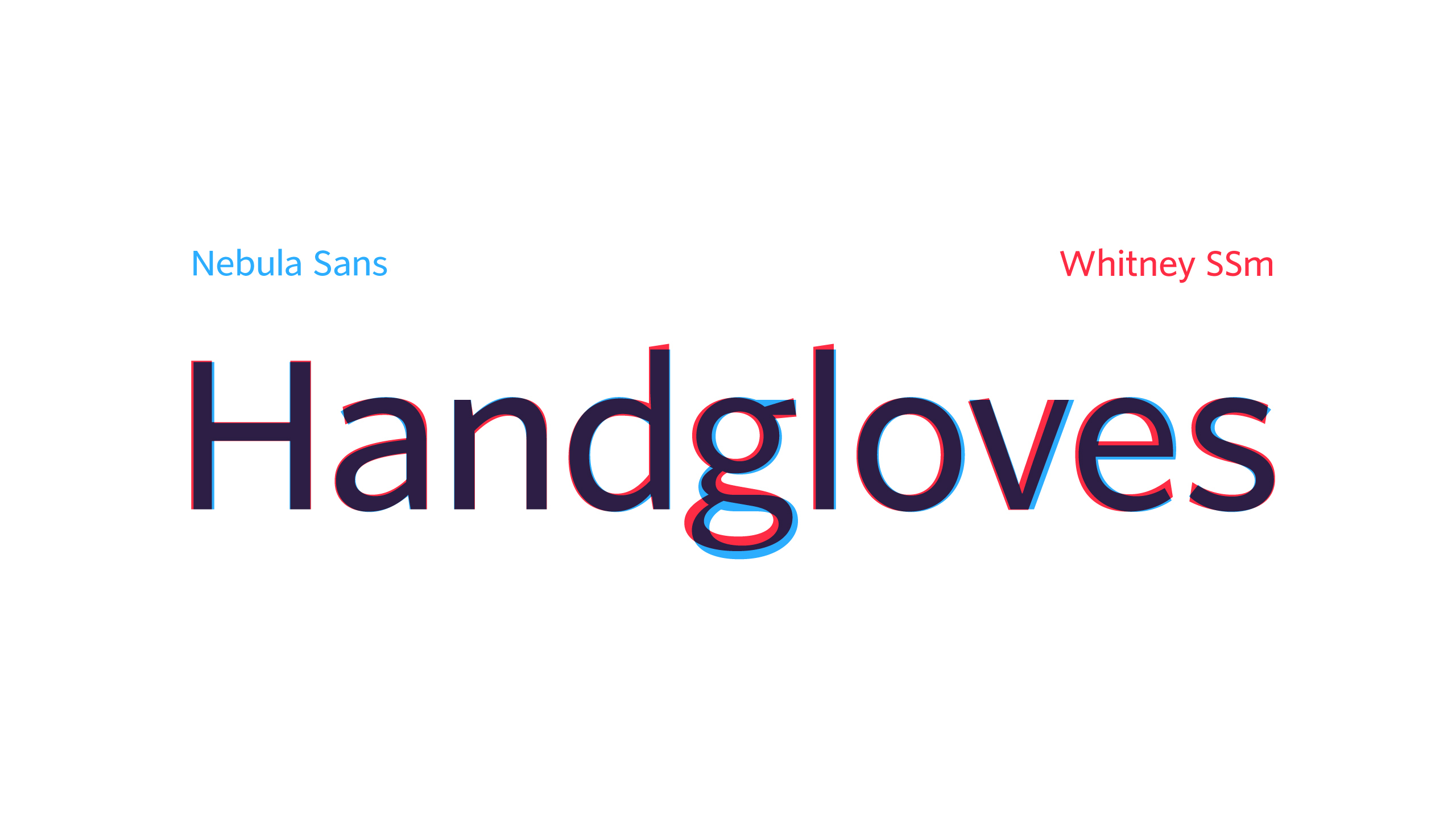
They have a comparison at the bottom of the page. Some letters are dead ringers, some, like "g", differ significantly.

Re: Nebula Sans

#35
post #21

> We believe in facts, science, and human rights The font looks ok. This is an off putting sample sentence though. It sounds like a secular, pseudo-liturgical version of the Nicene creed.

Whats wrong with facts, science, and human rights?

Re: Nebula Sans

#36
post #20

“neutral aesthetic” Subdued, muted and neutral seems to be very much “in” at the moment. On one hand it definitely gives us highly readable, usable interfaces and text. But I do miss the chaos and vibrance of the early web. Modern web is starting to look really washed out.

[dead]

Re: Nebula Sans

#37
post #30

Little PSA: a) This is a clone of Whitney, an incredibly beautiful and unique typeface from 2004 b) Whitney was designed by Tobias Frere-Jones c) He was an equal co-founder of the H&fJ foundry d) He designed the vast majority of their most famous fonts, including Gotham, Archer and Armada e) Somehow, for years, Hoefler never did the paperwork to confirm FJ's co-ownership f) When pressed, he instead kicked FJ out, kep…

All true, except it’s not really a Whitney clone. It’s Source Sans very lightly adjusted to match Whitney’s metrics. It looks and feels exactly like Source Sans to me. It’s a little strange to present it as a prestigious project with a minisite like this.

Source Sans is nice and easy to read, but so overused it’s rarely a good starting point for a visual identity.

Re: Nebula Sans

#38
post #37
post #30

Little PSA: a) This is a clone of Whitney, an incredibly beautiful and unique typeface from 2004 b) Whitney was designed by Tobias Frere-Jones c) He was an equal co-founder of the H&fJ foundry d) He designed the vast majority of their most famous fonts, including Gotham, Archer and Armada e) Somehow, for years, Hoefler never did the paperwork to confirm FJ's co-ownership f) When pressed, he instead kicked FJ out, kep…

All true, except it’s not really a Whitney clone. It’s Source Sans very lightly adjusted to match Whitney’s metrics. It looks and feels exactly like Source Sans to me. It’s a little strange to present it as a prestigious project with a minisite like this. Source Sans is nice and easy to read, but so overused it’s rarely a good starting point for a visual identity.

https://nebulasans.com/img/handgloves.png

Re: Nebula Sans

#40
post #34

Earlier quoted context omitted.

This is not a clone. They just matched the *outer dimensions* of Whitney, so that they could swap out their old font and not have to remake all their typography.

They have a comparison at the bottom of the page. Some letters are dead ringers, some, like "g", differ significantly.

Except for the ”H”, none of them are particularly similar to Whitney. It would have been more interesting to compare the glyphs to Source Sans. Its ”g” is basically identical to this one.

EDIT: I created such a comparison. See neighboring subthread.

Post reply on HN