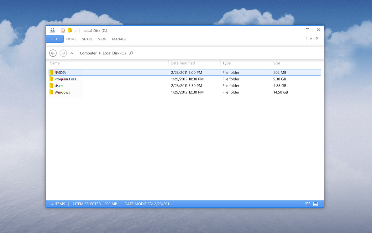
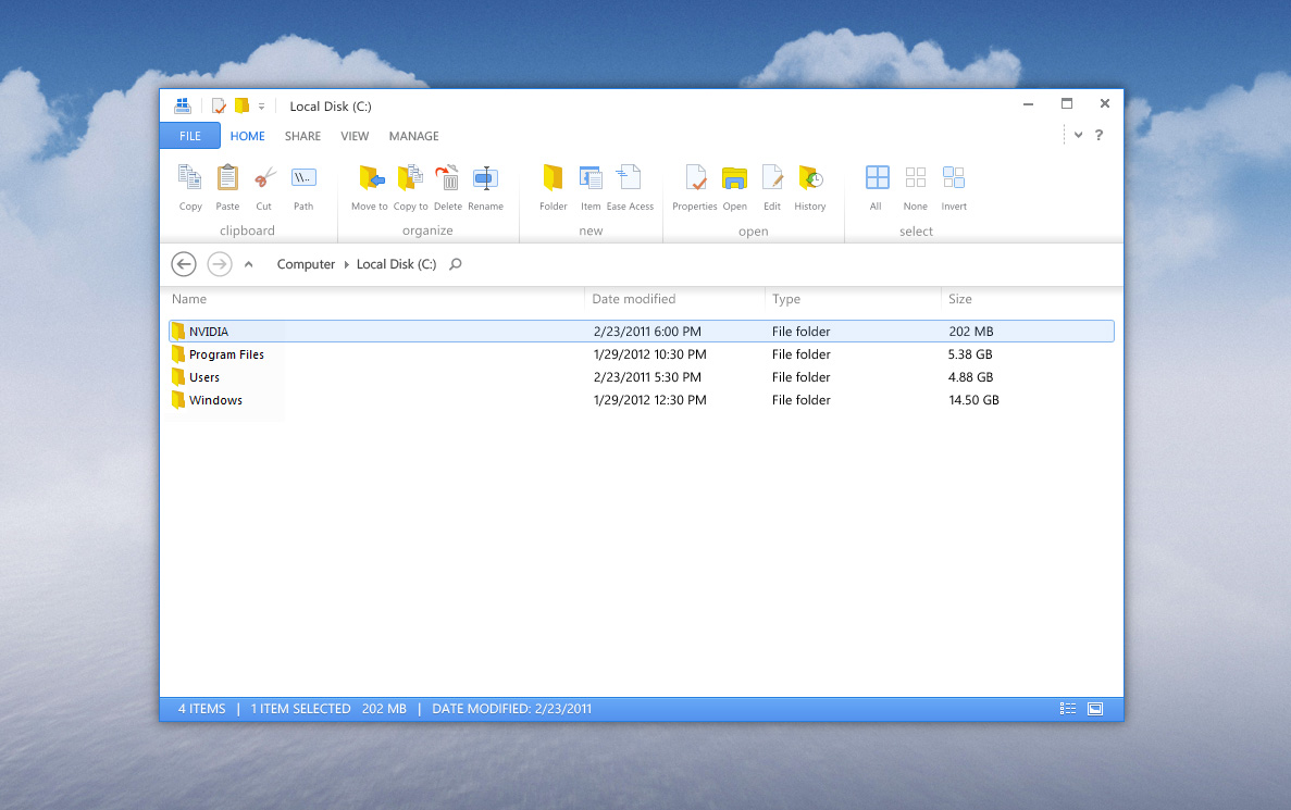
This is one of those situations where the UI is gorgeous but the UX is awful for a certain demographic. And that's nothing against the designer - he created a UI design, not a UX model, and I think he did a good job on it. From a UX perspective, however, this is just going to be awful for anyone who is a power user or who is concerned with productivity. I'm both and, if I was forced into using something like that for…
This is what a designer thinks looks good but there is no solution to any problems here, just more problems that aren't obvious in a single screen-shot. It's the same problem as when as web developer gets the signed off design and realises that the whole design falls apart when any number of variable elements go in because the designer narrowed in on making a flat image look good rather than exploring every possible outcome of that UI.
The biggest initial problem is exploration and sign-posting (making discovery of user objectives easier either explicitly or subtly). The is no room for sign-posting because everything is flat and white.
Also the contrast looks good in a flat image, but would drive people nuts after a while (and would break most contrast requirements for accessibility).
Don't get me wrong, it's lovely... but no one will ever produce a commercial OS UI like this.