Live data from Hacker News

Fractional scales, fonts and hinting

blog.gtk.org

31–40 of 117 posts

Re: Fractional scales, fonts and hinting

#31

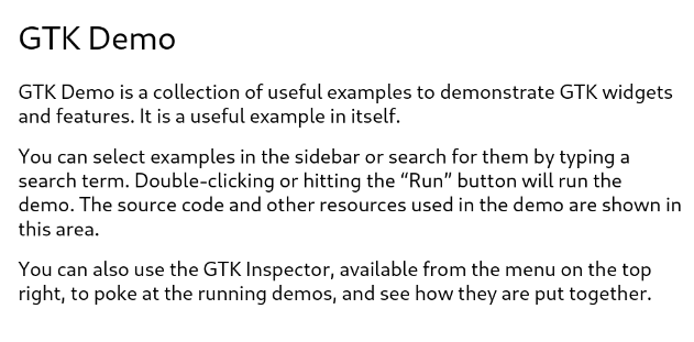
I was a bit puzzled that the images were so blurry compared to the surrounding text. Then I realized that the 1px border around the before/after images forces them to be scaled down from an otherwise correct width of 600px to 598px. While not solving the blurriness completely it, removing the border with the inspector helps a lot. I think the remaining blurriness comes from the images using grey scale hinting rather…

Well spotted. Following this, I found opening each image in a new tab and switching between them worked as a nice way to compare.

For convenience (second is hinted)

+ https://blog.gtk.org/files/2024/03/Screenshot-from-2024-03-0...
+ https://blog.gtk.org/files/2024/03/hinting-125.png
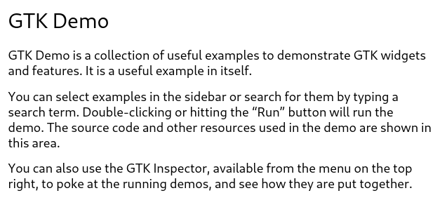
You can really spot the difference.

Re: Fractional scales, fonts and hinting

#33

The new renderer definitely looks better, but the letters still have something fuzzy about them. They don't feel crisp. Is this due to the font or due to the rendering?

The fuzzy is just an artefact of parts of the font not lining up with the monitor's pixel grid. There are ways to deal with this, but they can distort the font in other subtle ways, so no solution is perfect.

In any case, it makes much less difference (almost none practically speaking) on hi-dpi displays.

One of the reasons web designers have issues with text looking different between Windows and MacOS is that Windows' font renderer tries to force things to align with the pixel grid more, reducing a sharper result but slightly distorting some font characteristics. Apple's renderer is more true to the font's design, can can produce a little fuzziness like you see here. It also makes many shapes look a little more bold (at least on standard-ish DPI displays). A couple of old posts on the subject: https://blog.codinghorror.com/whats-wrong-with-apples-font-r..., https://blog.codinghorror.com/font-rendering-respecting-the-.... Differences in sub-pixel rendering also make a difference, so where people have tweaked those options, or just have the colour balances on their screens set a little differently (intentionally or due to design/manufacturing differences) you might see results that differ even further for some users even on the same OS.

Re: Fractional scales, fonts and hinting

#34
> The idea is that we just place glyphs where the coordinates tell us, and if that is a fractional position somewhere between pixels, so be it, we can render the outline at that offset just fine. This approach works—if your output device has a high-enough resolution (anything above 240 dpi should be ok).

So it just requires 6x more memory, GPU power and HDMI/DP bandwidth and prevents usage of large monitors ...

Re: Fractional scales, fonts and hinting

#35

Haiku OS in my opinion solves this better by basing everything on default font size (in pixels). Eg it defaults to 12px, I used 20px for a 3840x2160 monitor. Some GUI widgets scale based on this. All text (when using be_default_font) scale based on this. Spacing / layout depends on this. The key difference (compared to a global x1.5 scaling factor) is that developers of each app decide how to use this information, so…

This is similar to how Win32/GDI layout guidelines (pre-win 10) worked.

Windows says reference font dpi is 72 and reference sizes for buttons, list, labels, etc is specified at 96 dpi, then you're supposed to use actual dpi/ref_dpi and scale things according to that.

Then you set DPI scaling per monitor v2 in manifest.xml and catch WM_DPICHANGED message and recompute scale factors and presto, perfect dpi scaling across any monitor at any fractional scale.

Re: Fractional scales, fonts and hinting

#36

I'm curious - when you were doing research into the mechanics of hinting options, did you stumble onto any relevant discussion around allowing custom pixel geometries to be defined, to enable hinting on modern OLED / WRBG displays? There's a good thread on the topic here[0], with some people referring to it as 'ClearType 2' on the MS side [1]. On the oss side I know FreeType theoretically supports this[2], but I can'…

It would be nice if monitors exposed info about subpixel geometry as part of their EDID data. An alternative would be to capture it in a hardware database.

Re: Fractional scales, fonts and hinting

#37
post #2

As a long-time developer against GTK (I started using it back in the 1.x days in the late 90s) this is really awesome to see. I enjoyed the side-by-side comparisons of the old vs new renderer, and especially the idea of homing in on particular letters ('T' and 'e') and extracting them, that really made the improvement clear. Cool stuff, and many thanks to the developers who keep pushing the GTK stack forwards.

against GTK? As in its philosophy? usage?

Re: Fractional scales, fonts and hinting

#38
post #6

Earlier quoted context omitted.

Nit: the option does not hint, it emboldens text, as in, smears it a bit to make it appear thicker. And I think the default is actually 2?

Well whatever it does, I actually prefer it to hinting and always have. Whatever happens on linux makes the fonts look too thin for my personal taste. Regardless, I hope everyone agrees that hi dpi + no hinting (or smearing) looks the best.

i always disliked hinting aswell, but thankfully one can just disable hinting on linux, and then fonts actually look fairly similar to what osx did(~10-15 years ago)

Re: Fractional scales, fonts and hinting

#39
post #6

Earlier quoted context omitted.

Nit: the option does not hint, it emboldens text, as in, smears it a bit to make it appear thicker. And I think the default is actually 2?

Well whatever it does, I actually prefer it to hinting and always have. Whatever happens on linux makes the fonts look too thin for my personal taste. Regardless, I hope everyone agrees that hi dpi + no hinting (or smearing) looks the best.

If hinting makes the fonts "too thin", your display gamma is probably misconfigured. That kind of artifact is a common side-effect of graphical operations being performed in the wrong gamma space.

Re: Fractional scales, fonts and hinting

#40
post #2

As a long-time developer against GTK (I started using it back in the 1.x days in the late 90s) this is really awesome to see. I enjoyed the side-by-side comparisons of the old vs new renderer, and especially the idea of homing in on particular letters ('T' and 'e') and extracting them, that really made the improvement clear. Cool stuff, and many thanks to the developers who keep pushing the GTK stack forwards.

against GTK? As in its philosophy? usage?

Probably as in 'linking against'.
Post reply on HN