Live data from Hacker News

The Case For Better Watch Typography

hodinkee.com

31–40 of 43 posts

Re: The Case For Better Watch Typography

#31
post #8

The article diplomatically doesn't show any examples of the terrible typography foisted on other watches, but it doesn't take much browsing around Hodinkee to find examples. Like the stretched SAT DEC on this Patek Philippe: https://hodinkee.imgix.net/uploads/images/cf044e7b-7239-44a7... Or this 'Word Art meets Mickey Mouse' Omega: https://hodinkee.imgix.net/shop/images/bf1f83ff-b964-4a98-a9... (edit:) Here's another…

Very few watchmakers, even at the top of the range, seem to get typography right when it comes to day/date/month windows. They just print whatever gets the information across and call it a day. At best, they might match the color and add a border around the window. It's almost as if they only care about designing the top layer of the dial. The only well-known brand that consistently seems to get it right is A. Lange…

    Japanese brands are even worse.
It's polarizing, but a lot of people (including me) absolutely love the "wall of unnecessary text" on some Casio models. I can't defend it on any logical level, but I'm certainly not alone.

https://www.watchuseek.com/cdn-cgi/image/format=auto,onerror...

https://bladereviews.com/images/casio/img-casio-dw-5600-01.j...
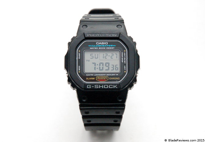
    Take any complicated Citizen watch and you'll 
    instantly recognize the "Eco-Drive" label in 
    italic Arial/Helvetica with awkward kerning.
I agree, and I think it's just so baffling and frustrating.

Their use of solar (quartz) movements means that a lot of enthusiasts have no interest in them, but I think they make a lot of the best watches under $500USD. However that Eco-Drive logo is just so basic. A minor tweak to that Eco-Drive logo alone would do wonders for their brand, I think.

I wonder if the suits in charge of Citizen realize how bad/boring that logo is. I think they honestly may be blind to it, just as Western suits might be blind to typographical issues when they look at kanji characters.

Re: The Case For Better Watch Typography

#32
post #18

Earlier quoted context omitted.

These watches last longer than a year.

True, but think of all the complications a regular person could perform that the watch can't.

Watches have complications, but people have complications, maaaaan

Re: The Case For Better Watch Typography

#33
post #9

Earlier quoted context omitted.

I think that is fine, most people aren't wearing watches out of practicality reasons. More as a style thing. I guess smartwatches could be considered more practical less stylish.

You’re not paying $65k+ for a watch because it’s utilitarian.

Part of the fun of some watch styles (because let's face it, we're overgrown children) is utilitarian aspects we'll never need. Like wearing a 200M or 300M waterproof dive watch to your office job.

Just in case, like, the Navy SEALs suddenly drop into your cubicle and ask you if you'd like to go on some kind of amphibious assault mission on extremely short notice. I mean, they won't. But what if they DID? Wouldn't you want your watch to be up to the task!?

Re: The Case For Better Watch Typography

#34
All of these comments and the article itself are evidence that there is a “there” there when it comes to typography criticism, but personally (aside from the like 1% most egregious examples) I don’t get what people are talking about when they complain about this sort of thing.

Re: The Case For Better Watch Typography

#35

The Junghans Max Bill is the most legible analog watch I’ve ever seen. https://www.ablogtowatch.com/wp-content/uploads/2017/05/Jung... You go from inside out “10... 08”. No counting, no distributions. Edit: Come to think of it you still need to count the offset from the nearest minute hand.

It's funny how different people have different ideas about what's legible and usable.

I've never seen that model in person but in general I find skinny silver hands on a white dial tend to be less than ideal for legibility.

And while the numeric minute markers are clever and legible, they seem wholly unnecessary to me -- when looking at an analog clock I'm nearly always going to round it off to the nearest 5 minutes in my head anyway. "Oh, it's almost 4:15" or "Oh, it's about 1:30" etc.

Which is not to say anything you're saying is "wrong!" I just think it's interesting how different people think about time and watches differently. One of my favorite things about the watch hobby.

Re: The Case For Better Watch Typography

#36
post #25

If you want it readable, why analog in the first place?

> If you want it readable, why analog in the first place? Granting that not everyone learns to "tell time" these days, for those who did, the watch hands instantly convey the (12-hour) time by their positions. That is, as long as one of the hands is sufficiently longer than the other. Years ago I woke up, looked at my analog watch, saw it was 6:55 a.m., got up, and started shaving, thinking I'd overslept. A few minut…

You are right :)

I'm just about old enough that I kind of unlearned reading the clock again. I can sure do it, but on blank clock faces without hour marks I have to think a bit.

Re: The Case For Better Watch Typography

#37

The Junghans Max Bill is the most legible analog watch I’ve ever seen. https://www.ablogtowatch.com/wp-content/uploads/2017/05/Jung... You go from inside out “10... 08”. No counting, no distributions. Edit: Come to think of it you still need to count the offset from the nearest minute hand.

It's funny how different people have different ideas about what's legible and usable. I've never seen that model in person but in general I find skinny silver hands on a white dial tend to be less than ideal for legibility. And while the numeric minute markers are clever and legible, they seem wholly unnecessary to me -- when looking at an analog clock I'm nearly always going to round it off to the nearest 5 minutes…

Interesting that you round. I wish I could just be fine with rounding but if I’m being honest with myself I’m anal-retentive when it comes to time. My clocks have to be atomic-synced too. Maybe I need to go all digital. I agree that black on white would add contrast and improve it.

Re: The Case For Better Watch Typography

#39
post #8

Earlier quoted context omitted.

Very few watchmakers, even at the top of the range, seem to get typography right when it comes to day/date/month windows. They just print whatever gets the information across and call it a day. At best, they might match the color and add a border around the window. It's almost as if they only care about designing the top layer of the dial. The only well-known brand that consistently seems to get it right is A. Lange…

Japanese brands are even worse. It's polarizing, but a lot of people (including me) absolutely love the "wall of unnecessary text" on some Casio models. I can't defend it on any logical level, but I'm certainly not alone. https://www.watchuseek.com/cdn-cgi/image/format=auto,onerror... https://bladereviews.com/images/casio/img-casio-dw-5600-01.j... Take any complicated Citizen watch and you'll instantly recognize the…

At least Casio is consistent. Notice how all the text in your photos is set in the same typeface, despite the variation in size, color, and styling. You could call it "Casio Sans". It probably comes attached to a detailed style guide. It's so much better than the soup of random fonts that Citizen and Seiko tend to use.

Re: The Case For Better Watch Typography

#40
post #25

Earlier quoted context omitted.

> If you want it readable, why analog in the first place? Granting that not everyone learns to "tell time" these days, for those who did, the watch hands instantly convey the (12-hour) time by their positions. That is, as long as one of the hands is sufficiently longer than the other. Years ago I woke up, looked at my analog watch, saw it was 6:55 a.m., got up, and started shaving, thinking I'd overslept. A few minut…

Granting that not everyone learns to "tell time" these days The kids across the street, now 13 and 9, have no idea or have to translate when they ask the time and I tell them it's "ten 'til eleven" or summat. I'm not 100% sure they can read an analog dial without giving it some thought. Smart kids, too, I just don't think there are a lot of analog clocks in their life. The only analog clock in my life is the watch fa…

I played around with a lot of digital and verbal clock faces when I got my smart watch, but keep coming back to an analog face because it really helps me visualize how time is passing, or how much time I have before I have to do something. I'm not great at math, so maybe it's easier for me to process the change in angle of the minute hand instead of adding or subtracting from a number.

Now that you mention it, there aren't many analog clocks in my house anymore. My grandfather clock needs a spring replaced so it stands still until I can get around to doing that (again), and I don't bother winding my cuckoo clock most days. The rest are mostly watches I don't wear unless my smart watch is charging or too delicate for whatever I'm doing.

Post reply on HN