I hope it will work better than the previous one. It was unbearably slow on my puny work PC and hardly usable on my other machines, and frankly, I don't think that I should upgrade to quad core because of ONE website.
Slashdot Launches Re-Design
31–40 of 57 posts
Re: Slashdot Launches Re-Design
#32I don't like the feel to it. When scrolling it feels sluggish and the screen seems to flicker.
Re: Slashdot Launches Re-Design
#33It looks uglier than the old version, in my opinion. On the other hand, it looks like paste now works correctly when entering comments. (It used to often fail on Webkit-based browsers if there was any text already in the box), so that's a huge improvement.
Re: Slashdot Launches Re-Design
#34Ugh, all this time, a whole new revamp, and it still suffers from the problem where hitting "Get more comments" moves everything around, and you've got to look through everything to figure out what the hell actually just loaded...
Why would anyone ever think that hitting more should load more comments above the comment you just finished freaking reading? And yes, I realize they're loading low ranked deeply nested comments that are underneath ones that are already visible, but yeesh - just clip the damn comment tree after a certain number of comments are displayed, FFS, no need to try and be clever about it...
Re: Slashdot Launches Re-Design
#35I don't really care so much for design as content. Slashdot looks tired, whatever design you slap on top of
it. For example they've updated the Bill Gates Borg icon. It looks very dated now, though.
Re: Slashdot Launches Re-Design
#36I was hoping Slashdot was going to reduce the huge amount of padding around each comment, but no luck. For instance, on my screen right now I can fit 13 comments on HN or reddit but no more than 5 on slashdot. This makes it much harder to navigate comment threads, connect replies with comments, etc. I'm I the only one who thinks this is easily the worst part of Slashdot? It's reminiscent of a bad forum where each 3-w…
The original slashdot was actually very readable. Here's a screenshot: http://images.slashdot.org/faq/screen_nested.gif
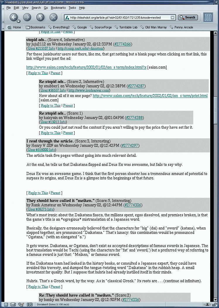
Not pretty, but readable and very usable.
The padding and useless decoration that you (rightfully) complain about was introduced with the first ajax-redesign a few years ago.
Re: Slashdot Launches Re-Design
#37Looks like CRAP in Opera. Sheesh.
Re: Slashdot Launches Re-Design
#38I liked slashdot more when it was plain, quick-loading HTML. I liked most sites more when they were plain, quick-loading HTML. Ain't It Cool News is the only other one coming to mind at the moment, though.
Google's Marissa Mayer said it best: The web likes to be square. Rounded corners and other elements slows down a site.
Huh, why would that be? Drawing a round corner is in fact more complex than drawing a square one, but surely for a few dozen rounded corners the number of additional CPU cycles spent pales in comparison to things like anti-aliased font rendering, calculating CSS box model layouts, decompressing gzipped contents and the myriad of other tasks that a browser has to perform during loading and rendering of a web site nowadays.
Re: Slashdot Launches Re-Design
#39Ugh, all this time, a whole new revamp, and it still suffers from the problem where hitting "Get more comments" moves everything around, and you've got to look through everything to figure out what the hell actually just loaded... Why would anyone ever think that hitting more should load more comments above the comment you just finished freaking reading? And yes, I realize they're loading low ranked deeply nested com…
I might be alone in this, but I actually preferred the old-fashioned pagination approach to to 'get more articles' buttons.
Actually, I might not be alone in this as HN does the same thing :)
Re: Slashdot Launches Re-Design
#40I like the redesign. Have they fixed the unusably bad commenting system?