Speaking of github’s UI, how come on mobile there are lists of pull requests and issues, and closing them doesn’t remove them from the list?
Redesigning GitHub Repository Page
31–40 of 315 posts
Re: Redesigning GitHub Repository Page
#32Two nitpicks: 1. Why are the images cropped so strangely on mobile? It makes this article really hard to read. 2. Shouldn’t the title be “Redesigning the GitHub Repository Page”? ^ And a meta question for programmers, what do you do when English grammar calls for a question mark to be inside your quotation mark at the end of a sentence, but you’re literally quoting something that should not include the question mark?…
You can do what you like in British English - so, worst case, people will just assume you're from the UK.
Re: Redesigning GitHub Repository Page
#33should've stopped here.
http://tonsky.me/blog/github-redesign/160_files_buttons.png
Re: Redesigning GitHub Repository Page
#34Agree of disagree with OP's design, you have to admit that his breakdown is very clear and highlights problems well.
Even without adopting his solution, this really gives github some ideas on problem areas to focus on. I would consider hiring this person if I were them.
Re: Redesigning GitHub Repository Page
#35I always have trouble finding the releases section on a repository. Every single time. I need it rarely enough so that it's not readily in memory, and I usually spend 5-10s just moving mouse around before I notice it. I also dislike icons in general. Use icons or use text (on a button, ...) but not both, was one of the first rules of thumb I've heard about from a friend, and it makes sense. Especially these days when…
I really don't understand this icon-ize everything UX trend. Since when do I hieroglyphics instead of English?
Keep icons small, use brief text, employ information hierarchies. Don't turn everything into a jumbled mess of icons "because they look nice."
Edit: This comment is not directed towards you. It's more my frustration after spending two hours last night trying to understand the abysmal JIRA interface.
Re: Redesigning GitHub Repository Page
#36I think it's strange to focus on all these details without addressing what seems to me the overwhelming problem with the GitHub layout - the deprioritisation of the readme. Why is it below the fold? I was very confused for a considerable time when people would point me to GitHub for a description of a project, because there didn't appear to be a description, just a repo. Was I supposed to build it to see what it was?…
As a developer, the README is useless, I am usually on a Github repo to start looking at code, and I don't want to have to first scroll through a README.
IMHO documentation websites and the like is where people should get their first feeling for a project, that is where the README should be.
Re: Redesigning GitHub Repository Page
#37This is a great example of applying design thinking, and the reactions to it really highlight the limitations of design thinking. Requiring training or prior knowledge to use a tool is not en vogue, and so you must anticipate every possible outcome a visitor has. The personas that use Github live in the solution generation space. They don't need pre-ordained solutions. They need functions.
Re: Redesigning GitHub Repository Page
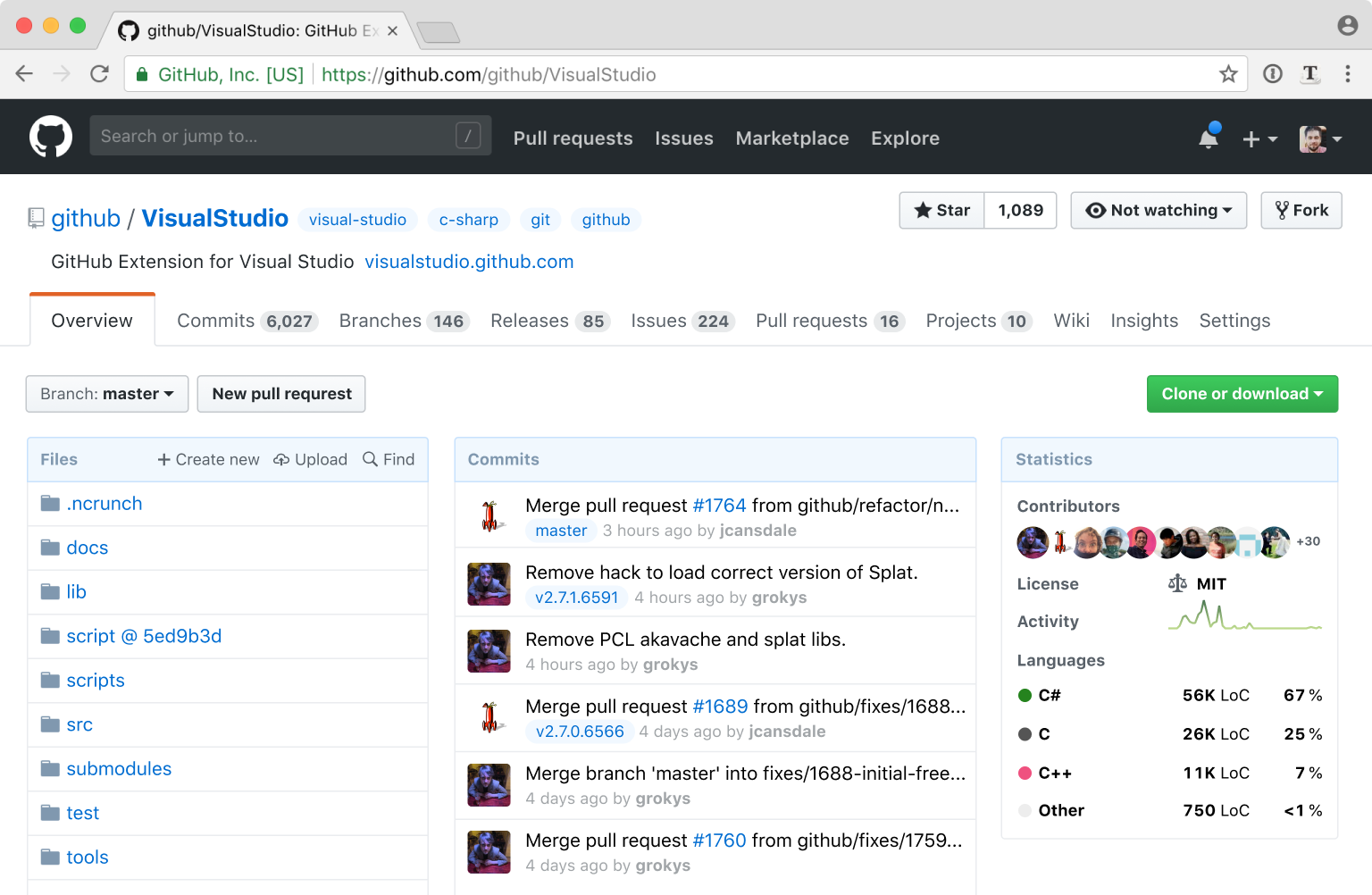
#38The final result looks too widget-y/SPA-y, overloaded with information. That's precisely a front where GH wins (over Gitlab): it's visually calm and sparse, ideal for something that would be part of daily, thoughtful work.
It was heading in the right direction for a while, but at the end it basically turned into Bitbucket. With all due respect to the author, I think the current Github UI works just fine, and the fact that it has become the dominant player in the market with a clean interface that hasn't changed much over the years, is a testament to how well it works. I rarely say this, but let's not try to fix this.
Re: Redesigning GitHub Repository Page
#39Github is a utility, a developer facing utility, not a consumer beauty product. As it works already, I would argue it doesn't need redesign, not many people are complaining its look.
Re: Redesigning GitHub Repository Page
#40I really like reading and seeing explanations like this. Blog posts like this are a a brilliant way to help design design process.
There are some good ideas, and this article does a fine job of calling out problems, but I also can't help but feel the end result is unpolished looking and would perform very poorly when it comes to usability.
* The end result feels unstructured, like elements were just tossed on the page, due the lack of strong grids either from background colors or implied by layout.
* The left and right alignments of elements is basically non-existant, contributing to a messy feeling.
* The "statistics" category will be entirely useless on small repositories, or personal ones, just taking up a huge amount of space for no reason.
* Removing the icons makes it more difficult to develop "muscle-memory" on websites you use a lot. Icons, even if irrelevant, help us pick the item we want off of the page more quickly.