[deleted]
How the Web Became Unreadable
31–40 of 354 posts
Re: How the Web Became Unreadable
#32It’s true that many designers tend to look at text more like a texture. Instead of making it large and distinct they will make it small and light colored when it's in fact the only valuable thing on the screen. It's an unfortunate consequence of so much design today going minimal and more typographic, which makes it's hard to differentiate elements any other way than to start evening out the contrast. If everything t…
I'm assuming that by retina screen you simply mean high resolution? Because Retina display is just the apple term for a high resolution screen.
Its actually their term for high DPI displays. If you want to be pedantic, at least be correct.
Re: How the Web Became Unreadable
#33I think it's a broader problem - too much css fluff, far too much javascript; even the simplest webpages now seem to feel the need to be miniature apps in their own right, instead of just serving the damned content already. I often websurf using an old 1st gen iPad and it's a massively frustrating experience just how many sites nowadays just crash the damned browser.
Re: How the Web Became Unreadable
#34There is a reason for this.
I happen to have an almost brand-new LCD screen here with LED backlight and high resolution, and a low-resultion over-a-decade-old LCD screen.
And guess what?
A website that looks totally fine on the old one is so blindingly bright on the new one that it hurts.
It literally hurts to look at.
This can be useful, as it provides a higher dynamic range, which can be used to recreate the blinding brightness of an explosion when watching a movie.
But it also means that websites have to use less contrasts.
The overall problem is:
We specify sizes in the web independent of the actual monitor size, with rem and em and pt and so on.
Why can’t we specify colors independent of the monitors actual contrast ratio, too?
Why can’t I have a website where the text seems to have the same contrast on and old and a new monitor, while that gif of an explosion is as blindingly bright as possible?
Re: How the Web Became Unreadable
#35I'd like to see some evidence that today's sites are less readable than those that went before us. Otherwise, it just looks like nostalgia for the 'good old days'. Well I remember the 90s when we there were plenty of unreadable sites, ugly monstrosities with unreadable typography and garish colour schemes. Meanwhile, much of the web is now dominated by sites like Facebook, Google, BBC, etc - all of which are extremel…
> Meanwhile, much of the web is now dominated by sites like Facebook, Google, BBC, etc - all of which are extremely readable.
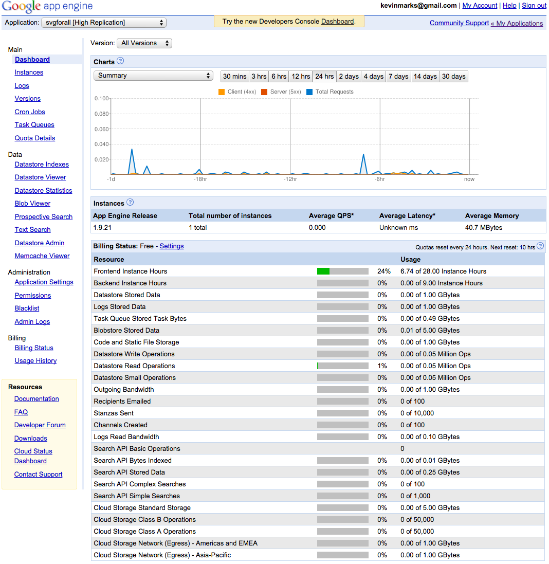
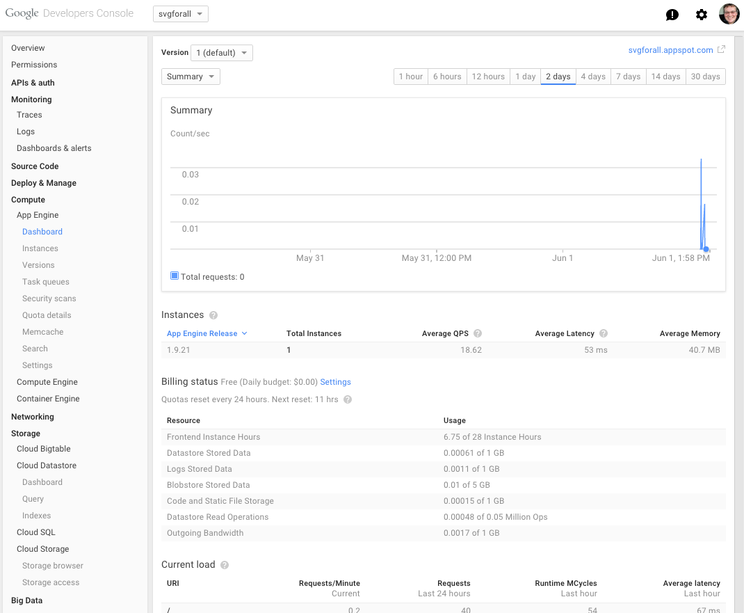
The author actually calls out Google and Apple specifically, for breaking their own contrast suggestions
His example: https://kevinmarks.github.io/appenginebefore.png https://kevinmarks.github.io/appengineafter.png
Re: How the Web Became Unreadable
#36Does anyone know what the contrast ratio for black ink on white paper roughly is? I was once a big fan of black-on-white on my computer screen, until I read that Solarized aimed for the contrast of "shaded paper" [1] and realized that the contrast ratio on a computer screen was much greater than the contrast ratio in printed material.
Also, it seems to me that monitors have improved in being able to display more contrast than was previously possible. Is that true? Is that another reason why lower-contrast designs have become more popular?
Re: How the Web Became Unreadable
#37We need some strong AI to strip away the ads, and extract only the main text, then format that text using the reader's preferences. OCR 2.0, if you will. Caveat: it may kill the advertisement industry.
[deleted]
Re: How the Web Became Unreadable
#38I'm so surprised that all attempts at solutions for "readability" so far seems to have addressed the actual article or post content only. I don't just want to read a sane looking web, I want to browse a accessible and sane looking web.
I'd like to be able to activate a browser mode that cleans up not only the content of the site, but also the structure by creating simple and accessible navigation (perhaps according to html and css rules that I can write myself).
Many sites have a similar type of structure (/about/, /contact/ etc). HTML5 sites with will hopefully have made this endeavor much easier.
Sites with more complicated structure could perhaps be analyzed by AI and OK'd and corrected by a collective of users (via a browser extension). When the sites has been "solved" by AI and/or it's users, it can be added to a shared database (think something like https://userstyles.org/) that will be automatically queried when you use the site.
Re: How the Web Became Unreadable
#39Subjective though it may be, there are a lot of people who find black-on-white unpleasant to look at. I greatly prefer sites that don't use it, regardless of what they do with font and size. This could just be a case of conflicting preferences, but I don't think it has to be. Clear contrasts are achievable without insisting on #000/#FFF web design. - The most obvious improvement is simply keeping an eye on contrast.…
>Finally, we can choose colors which are not strictly grey. The HN background is a rather usable 244/244/235 - not far outside of light grey, but tan enough to provide more contrast than the pure brightness
The key for HN readability is that the foreground text color is #000 -- pure black. (Pressing F12 in the web browser shows css style ".c00 {color = #000000;}").
Like dredmorbius previously mentioned, shifting the background from pure white to a subtle shade of tan doesn't kill readability when you keep the text at #000. It's when designers make the text itself a light gray that makes it unreadable.
Re: How the Web Became Unreadable
#40"between ambient light and backlight leakage, by the time a color makes it to a screen, not even plain black (#000) is pure; instead it has become a grayer shade." This is changing. The best phone displays display "pure" black. If you open a black image on the screen, you cannot tell if the screen is on or off, even in pitch darkness. I love pure blacks in my apps and Web pages, contrary to the author.
That’s an issue I also mentioned in another comment.
If a user wants to get a 7:1 ratio on a modern screen, they have to heavily compromise – as newer screens can often times have hundreds of times the contrast ratio of older ones.
If you get 7:1 on a brand-new screen, you might only get 2:1 on an older one.
If you get 2:1 on a decade old screen, the contrast will be actually painful on a brand-new screen.