Live data from Hacker News

Every Frame Perfect

tonsky.me

291–293 of 293 posts

Re: Every Frame Perfect

#291
Animation is all about trickery, especially real time animation where you have a performance budget, like in video games. You can reveal the trick by doing frame by frame, or other techniques, but it matters less than the overall feel. It is more of an art form than an exact science.

Often the animation itself is the trick. The backend is too slow to deliver data in time, so you start some animation to hide the latency. If you make a screen capture during that time, of course you won't see the data because it is not there yet, that's the trick. Ideally, the back end should keep up, this way, you don't even need an animation, but sometimes, you have to make do with what you have.
Re: Every Frame Perfect

#292
post #151

I still have Sonoma on some of my devices. All I can say is: wow, steady regress. The save dialog, albeit a little shakey, is nowhere as chaotic as in your example. The buttons in Notes move between panes in a perfect seamless manner. Albeit the animation occasionally glitches out when you repeatedly focus and deselect the Safari bar, the cursor is perfectly timed with the text, only fading in after the text is done…

A lot of these animation regressions in Apple's UI originated from iOS 7 and the move away from skeuomorphism.

The move away from skeuomorphism made it acceptable for UI elements to do things that make no sense.

Examples:

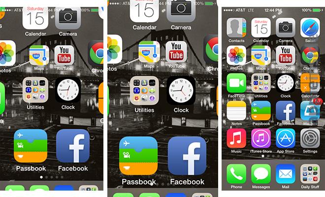
1. https://photos5.appleinsider.com/archive/13.06.15-Homescreen...

The status bar is unreadable on in-between frames, whereas in iOS 6 there was no such problem.

2. https://youtu.be/XawiZc8qmWA?si=vqT-JEYf0NDp8I9o&t=461

Play it at 0.25x and notice the app opening animation.

In iOS 6, the status bar is never unreadable for a single frame.

In iOS 7, the status bar is first obstructed by home screen icons animating under it, then obstructed by the dock animating over it, and finally it fades away while a new status bar is drawn on the app that is being opened.

It irks me to no end that iOS handles the status bar this way to this day. In the app switcher, every app card is drawn with a blank area at the top [1] where the status bar would go, when really the status bar should be permanently at the top and the app card should not include space for the status bar (webOS figured it out before iOS 7 [2]).

1. https://imgur.com/a/Qj6DGus

2. https://imgur.com/a/bM8OWZc

Re: Every Frame Perfect

#293
post #216
post #36

Earlier quoted context omitted.

Play any game with good UI and you will see animations used everywhere. Instant transitions are only good in theory.

> Instant transitions are only good in theory. For a professional tool, animations are anathema . They interfere with muscle memory. Someone who uses a program continuously can be clicking or typing before a dialog box or button is even in the right position. My wife drives me MAD with this. She has already clicked the cancel button on a popup before I can even read the first word in the dialog box. This is fine when…

I don’t understand this. One of my colleagues drove me mad with exactly this behavior. He opened an internal tool to load some complicated data for visualization. The tool immediately had a popup that said “Loading” with a sole button labeled “Cancel” in it. He reflexively clicked “Cancel” and then complained that the internal tool did not work at all.
Post reply on HN