Live data from Hacker News

Firefox Release 89.0

mozilla.org

281–290 of 487 posts

Re: Firefox Release 89.0

#281

Earlier quoted context omitted.

'Compact' is flagged as not supported but looks like it still works.

How do you turn it on? I don't see it.

Looks like they made it harder to find the option to customize the toolbar.

Right click on toolbar, select 'Customize Toolbar', click 'Density' option at the bottom (I'm macos).

Re: Firefox Release 89.0

#282
post #273
post #270

Earlier quoted context omitted.

Besides floating tabs I find rest of Proton overhaul pretty good: better contrast, subjectively nicer colours, better focus styles, nice icons. After removing all corner rounding and tweaking tab bar I am quite happy.

Care to share the CSS for removing the rounded corners?

Well I went full mental and simply bruteforced it [1]. I'm doing it for page content as well with userstyle.

[1] https://gist.github.com/myfonj/f5415dd0580663a82ea18407ef2ee... This file starts with instructions how to make it work; I'm on Developer edition, Windows, dark theme. Same instruction wit illustration can be seen in Twitter thread [2] [2] https://twitter.com/myfonj/status/1387584962354982912

Re: Firefox Release 89.0

#283
post #217

Earlier quoted context omitted.

UI design is like fashion design, often trying to catch your eye. Sometimes trying to be edgy or controversial, to provoke a reaction.

Browser is a tool to browse the web. Tools need to be functional first. There is a reason why there's no "summer 2021 hammer" in hardware store.

Considering how complex the web is, and how technologically complicated a browser needs to be regardless of UX, a car analogy is perhaps more appropriate; and you do have '21 models of cars.

Re: Firefox Release 89.0

#284
Ok, I don't want to complain about it, I just want to completely reverse it. Can I do that with themes?

edit:

"browser.proton.enabled" => false

"browser.uidensity" => 1

long term solution seems to be via userChrome.css: https://www.userchrome.org/firefox-89-styling-proton-ui.html

edit 2:

Apparently they also added this annoying rubberish effect when you reach the end of a scrollable area, which can be turned off like this:

apz.overscroll.enabled => false

Re: Firefox Release 89.0

#285
post #15

Chrome does superficial ui updates way less than Firefox. One of them got the priority right. Honestly these kinds of change can be welcomed by some people and not by some others, I personally don't like that thick ass tab bar.

> Chrome does superficial ui updates way less than Firefox. One of them got the priority right. Yeah, why change how things look when you've got data to harvest? But really I agree, the look is definitely not an improvement.

I commented specifically about the perceived priority. I didn't say Chrome was better.

However, Chrome also seems to be rather consistent with its minimal UI philosophy. Firefox's UI doesnt appear to have a philosophy, I liked it regardless, at times.

Re: Firefox Release 89.0

#286
post #170

Earlier quoted context omitted.

The tabs are more compact than they used to be

Really? They seem much bigger, like twice the size. I don’t dislike them as much as I initially did. They’re just a little to big on low resolution monitor. Personally I’d like to see browsers move away from trying to be “special” and just follow the design of operating system. A little tricky on Linux, but for Windows and macOS just follow the guidelines from Microsoft and Apple.

I'm wrong, but the difference is about 2 pixels on Linux.

Re: Firefox Release 89.0

#287
post #259
post #166

Earlier quoted context omitted.

Even the back button is wrong in the new version. Previously it spanned up to the left edge of the window. Now it's moved to the right, lacks immediate feedback and then it is drawn to the right with some new empty space for no reason but to make it harder to hit the back button, the most used button of the interface. The visual cue with the circle around it is also gone. Even the lines used to draw the arrow are thi…

> Even the back button is wrong in the new version. Previously it spanned up to the left edge of the window. When you actually try it instead of comparing screenshots, you'll see that its clickable area still goes all the way to the edge of the window. The button hasn't moved to the right; there's just more negative space because they removed the circle around it. Deleting that space would actually move the button to…

After I move the mouse over the back "button" at first nothing happens, it's surely nothing happening "as soon as the pointer" enters the area.

Then after some delay, the "area" of the button is shown, but not inclunding the newly "empty" space, which you claim is clickable.

But what is highlighted starts to the right. If my mouse is already close to the edge, it visually signals that it's not over the button, that is, that I moved the mouse too far.

It's very awful experience: not having the limits of the button drawn (which doesn't give me any hint of the area I can target), then not showing the limits fast enough once the pointer is there, then misleading about the limits (forcing me to move the mouse to the right even if I was already on the right place), drawing with the thinner line the arrow (also making it less obvious where it is): four wrongs in just one enforced update which is claimed to "improve" UI. On the most used button.

Re: Firefox Release 89.0

#288

Earlier quoted context omitted.

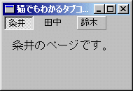
Interestingly, they (or at least not all of them) didn't fake it - there's a style option on the tab control to turn tabs into push buttons. It looked exactly like the task bar - maybe the task bar was actually implemented using that control.

I did not know that. Is it this? https://docs.microsoft.com/en-us/windows/win32/controls/tab-... https://docs.microsoft.com/en-us/windows/win32/controls/tab-...

Yeah, I think it's TCS_BUTTONS. Looks like this: http://www.kumei.ne.jp/c_lang/img/sdk20601.gif

Re: Firefox Release 89.0

#289
post #214

Earlier quoted context omitted.

Yeah, just disable the loader if you don't like it. Kinda unfair to call the whole system unfree for just being able to load non-free software.

Unfortunately some of the Linux kernel mainline has questionable licensing too. [1] In short, [2] and [3] are probably linux-firmware territory in the mainline kernel. [1] https://www.fsfla.org/pipermail/linux-libre/2020-August/0034... [2] https://git.kernel.org/pub/scm/linux/kernel/git/torvalds/lin... [3] https://git.kernel.org/pub/scm/linux/kernel/git/torvalds/lin...

Some card's bundled firmware from 1996 that's not even compiled in normal distro kernel builds? :D

Re: Firefox Release 89.0

#290
post #24

> "We’ve redesigned and modernized the core experience to be cleaner, more inviting, and easier to use." Why does the UI change with every single Firefox release? I find myself having to re-adjust every time a new update is shipped. What's wrong with having a consistent experience that survives for more than 6 months? It's just a URL bar, and a bunch of tabs. Just leave it be already.

> Why does the UI change with every single Firefox release? It doesn't. Maybe small parts of it get tweaks here and there. But your argument about having to re-adjust every update is just dishonest.

I disagree. These small unnecessary tweaks can really disrupt regular users' workflows.

For example, they just changed "Undo close tab" to "Reopen closed tab". Not only is it difficult to justify how this is clearer (any casual computer user should be familiar with the concept of 'undo'), but for a regular user:

- There's a period where you have to adjust, scanning for the correct menu entry each time;

- This change also modified the hotkey from 'u' for 'undo' to 'o' for... re-open, apparently.

Imagine if your editor changed its key bindings, or renamed features with each minor update?

I love Firefox, am a daily user, but I get very annoyed at the lack of proper change control that's applied.

This kind of arbitrary change at the very least annoys users, but can also degrade usability and workflow.

Finally, by showing they don't review their minor changes very well, it makes it harder to trust that they won't accidentally introduce some major bug or security flaw.
Post reply on HN