That's very flattering. So I'll relay some comments on your site:
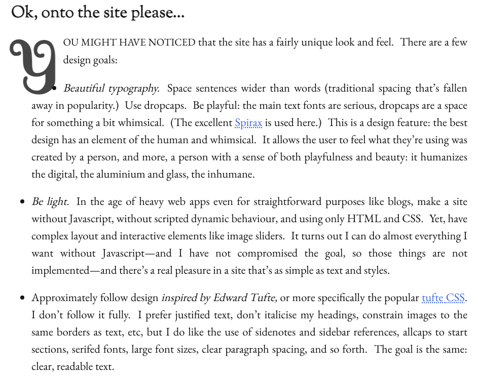
- you make sentence-spacing a major design goal. I looked into that a bit ago and I found little or no real evidence that sentence-spacing is a good idea (https://gwern.net/doc/design/typography/sentence-spacing/ind...) and it would be expensive to implement: you do the only reasonable thing of injecting s... but oh so many s. If you get long pages like mine, that is going to cost you - DOM nodes are not free, soldier!
- one issue with sentence-spacing is that you are fighting HTML & CSS the entire way. They just do not want to do it. You correctly note that it's hard, but you accidentally demonstrate it's even harder than you thought: you have justification enabled but not hyphenation... so all that happens is that sentences get stretched out to make them fully-justified and you get large double-spaces everywhere! Your current implementation winds up being not so much 'sentence-spacing' as 'every few words spacing'. (This is especially glaring in the sidenotes, like on the page I'm looking at right now, 'Stephen Zamadics' looks like 'Stephen_________Zamadics'. Since you set the column narrow, you probably want good hyphenation too... perhaps server-side, if you're deadset against JS.)
- Dropcap positioning is hard, especially if you'd like it to work on more than one browser, and I'm not surprised yours has problems; pretty much everyone screws those up. (At least, I assume you don't intend the positioning problems like the '1' almost overlapping the 'someone' in cases like https://daveon.design/creating-joy-in-the-user-experience.ht... .)
- I think the dotted underlining is too hard to see: much too small and close to the link. Are you sure you don't need `text-decoration-thickness: from-font` & `text-underline-position: from-font`?
- Rubricating the entire sidenote on hover seems excessive.
- Sidenote numbering is very confusing. They get numbered 1/2/3/4... and then all lose their numbers in favor of ''? Mixing numbered & unnumbered is confusing enough, but then transitioning at the utterly arbitrary '5' let me baffled and wondering if the ''s were supposed to be a separate kind of sidenote like a margin-note. Definitely a case for 0/1/infinity.
- Sidenotes come off as cluttered and hard-to-read, at least partially because they are all 1 big paragraph. Breaking them up would increase readability. I hope you didn't inherit Tufte-CSS's unnecessary and artificial limitation to non-block elements...? (I can't believe they refuse to fix that.)
- EB Garamond is a variable font, which is a bit of a questionable choice because OS+browser support is still relatively low. (Just browser-wise, it's only at ~95% global https://caniuse.com/?search=variable%20font so add on OS incompatibility... The text should still render, but it won't look like you expect it to. Example: https://share.obormot.net/screenshots/Arcturus_Screen%20Shot... Also shows the sentence-spacing problems & dropcap problems.)
- The use of auto-smallcaps (after H1s, I guess?) winds up feeling busy and confusing. Look at a page like https://daveon.design/about-dave-on-design.html where the sections so short - it winds up feeling like smallcaps is just being sprayed around at random, and the logic is lost.
- Your image dragging widget is mysterious. The icons are unfamiliar and so small that they signal non-interactive.
- am I imagining it or are your -asterisk-thingies weirdly offset to the right?
- The lack of any header or obvious site navigational apparatus, despite the very large header, makes the site feel somehow cramped and confining. You must like your tree - have you considered the classic HTML approach of an image map?
- The use of triangles in the ToC is a bad idea. They look too much like collapse/disclosures, which are becoming increasingly common, especially in ToCs like this, especially when the reader has already seen you use black-dots for unordered list markers.
- Easter eggs like `X-Clacks-Overhead` are fine, but the page should still validate... (Doesn't look like a legal http-equiv to me: https://html.spec.whatwg.org/multipage/semantics.html#attr-m... )
- You have low-hanging fruit in performance and can definitely render faster: https://pagespeed.web.dev/analysis/https-daveon-design-about...
- Tooltips, tooltips, tooltips!