Earlier quoted context omitted.
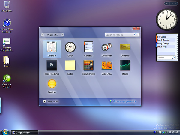
Plus, to be truly realistic it also would need to take into account ambient lighting scenarios surrounding the device displaying it. Like this it’s really just another try in recreating glass which never made sense to be used in UI. It is beyond me, how this got chosen as a way forward - taking visual design which makes sense in a VR/AR environment, to ruin their rectangular display UI. It will make implementation wa…
I think they refuse to pick a shade of grey for their UI's background, so we're stuck with transparent elements.
These are UI elements designed to work great over scrolling content feeds, full screen product images, album artwork, and thirty second videos of people doing meme dances. There is no room for ‘a gray background’.