Live data from Hacker News

How to make a better default Firefox UI

github.com

231–240 of 266 posts

Re: How to make a better default Firefox UI

#231

Earlier quoted context omitted.

> which may not give a specific practical advantage It, in fact, gives a specific practical disadvantage.

I mean, I don't really care to optimize "number of buttons per screen" (and text can be as dense as it wants, although I usually set my font size to 16pt or above) but to each their own.

The relevant cost of too much padding isn't fewer buttons on the toolbar. It's that too little of the screen is actually showing me the web page I want to see.

It's usually most important to quantify in the vertical axis; today's bloated touch-oriented UIs are horrific for 16:9 wide screens. Add up the taskbar, window title and tab bars, URL toolbar, the 72pt dickbar menu at the top of the web page with single-line labels, and the cookie banner at the bottom of the web page, and you're lucky to have half of the shortest dimension of your screen devoted to real content until you start excising the bad UI elements. It's like being back in the 1990s and seeing the old horrors of people who said yes to every adware toolbar that asked to install itself, except we're now wasting far more vertical space for far less functionality.

Re: How to make a better default Firefox UI

#232

Earlier quoted context omitted.

I, too, remember when GUIs (not UXs!) respected the user's desires, workflow and general agency. That's not entirely gone yet, but it's going. Heck, Office 365 updated lately and now I have this ongoing little contest of displaying the tiniest number of coworker Teams comments in the hugest amount of white space. The results beggar belief. Edit: Teams (it's a Chrome browser window, but that's not really relevant to m…

Software maintenance is not the primary cost of a configuration option. The biggest cost is the customer support load [1]. This is especially a problem if the customer manages to get the application into a "busted" state. Your complaint, where the software is less convenient than it could be because the sidebar is too big, will never result in a Priority 1 Customer Support Ticket. Adding the ability to resize a sideb…

> Someone accidentally resizing the sidebar to become unusably small or large and calling support because they don't know what they did or how to fix it will describe it as an emergency.

And that's why you have an in-house support departments whose job is to solve these issues. It's like buying a tractor, then relying on the company several towns away to provide repairs.

Customizability is good. Because when I settled in a workflow, I don't want to see things I don't want occupying space or distracting me. It's like not using part of the desk because you're supposed to have piles of books in this place.

I'm not advocating to have trillion of options a la VIM. But anything except the core purpose of the software should be customizable in some way, including the options to hide it.

Re: How to make a better default Firefox UI

#233

Earlier quoted context omitted.

Software maintenance is not the primary cost of a configuration option. The biggest cost is the customer support load [1]. This is especially a problem if the customer manages to get the application into a "busted" state. Your complaint, where the software is less convenient than it could be because the sidebar is too big, will never result in a Priority 1 Customer Support Ticket. Adding the ability to resize a sideb…

> Someone accidentally resizing the sidebar to become unusably small or large and calling support because they don't know what they did or how to fix it will describe it as an emergency. And that's why you have an in-house support departments whose job is to solve these issues. It's like buying a tractor, then relying on the company several towns away to provide repairs. Customizability is good. Because when I settle…

> And that's why you have an in-house support departments whose job is to solve these issues.

There's a market for software that doesn't require that.

Small companies don't have in-house support departments. They contract with an IT provider. Big companies do, but theirs isn't materially different than the contracted one (a typical "big company" is really just three small companies standing on each others' shoulders wearing a trenchcoat). Their purchasing decisions are going to be based on what they think will reduce the amount of support calls they have to deal with.

> It's like buying a tractor, then relying on the company several towns away to provide repairs.

John Deere software locks their parts. They haven't gone out of business, so a lot of farms must be doing just that.

Edit: This is not an argument against RTR. Anyone who's willing to break a warranty seal and tinker with the inside of the computer or tractor they own should be allowed to do so. Being able to customize is good. Being able to accidentally customize is bad.

Re: How to make a better default Firefox UI

#235
post #225

Earlier quoted context omitted.

Over the years, there have been dozens of serious attempts at reinventing bookmarks (from third-party services and plugins), and none of them have caught on. My conclusion is that they're just not a concept that works for people; they got squeezed out by web search on one side and complex note-taking applications on the other.

I think there’s room for better bookmarks, but they have to be a part of the browser proper… third party apps and even browser extensions can never be integrated to the required extent, but none of the big browser makers have iterated in this space at all.

> but they have to be a part of the browser proper…

Raindrop is more or less perfect for me.

Yes, for a lot of things I just start typing: or but that works without bookmarking.

For longer time storage however, I just click the raindrop icon and fill inn tags and it is done.

Re: How to make a better default Firefox UI

#237

Earlier quoted context omitted.

It's strange, the absence of padding gives me room to breathe, because if I can quickly scan a menu with my eye then I feel I have good overview and control over affairs. With more padding, you cannot do the same scanning motion with the eye, you have to read each item as a single atom unto itself, and suddenly the menu has become a jungle of megaliths where it's easy to get lost.

There is research out there that shows use of white space can improve things like reading speed and comprehension. An example for text paragraphs: https://www.semanticscholar.org/paper/Reading-Online-Text%3A... I think it really depends on individuals though. If you can memorise a dense screen of buttons you'll be able to work faster, avoid scrolling etc. But it'll make the UI harder to use for people who don't use i…

The ever smaller seeing slots in the "knights jousting helmet of ui" give me anxiety because I ride to battle and work with that things low info density.

Re: How to make a better default Firefox UI

#238
post #22

Whenever I see someone using (or a screenshot of) horizontal tabs I'm just shocked that people put up with it, or perhaps even more so that it's still the default in all major (and minor?) browsers. I recommend Sidebery, but more than that I just recommend something to get your tabs listed vertically in a sidebar, so they don't squash each other up as you add more until you can't tell what's what at a glance, the wid…

Most users, like 90% or more have tabs that all fit visibly in the horizontal space. Look it up. Mozilla's telemetry is public. 5 or 6 tabs fit just fine and in a sidebar are hugely wasteful of pixels. You think everyone browses just like you so you can't imagine why the browser is shaped for people not like you but your browsing habits are in the ultra-minority. Take a look at the telemetry before making silly posts…

Most users also don't actually need modern processors.

Most drivers don't need to pull a trailer.

Most people don't need a wheelchair ramp.

Still arguing for stopping processor development, removing the possibility to use towing hitches and removing wheelchair ramps isn't something I hear people argue for.

It is almost like in other areas of life we accept that different people have different needs and wishes, but in software everything needs to be pixel perfect the way the designers envisioned it.

Why?

Re: How to make a better default Firefox UI

#239

Earlier quoted context omitted.

Do you have any data to back that narrative? I know Mozilla is pushing that explanation, but from how I remember it Chrome gained market share because it was technologically superior to Firefox when it was released. It had a much more modern UI, much faster JS implementation, sandboxed tabs, etc. All features that it took Firefox years to copy. Some would say that Firefox has never caught up. I find the ads narrative…

Ehh... UI was comparable. Chrome was a bit faster. For the ads, see some snapshots of what that campaign looked like at the time https://searchengineland.com/googles-jaw-dropping-sponsored-... It was a massive push of basically spammy links all over the internet. To be clear, I'm sure some people switched for the features. But given the scale of the sponsored push to every internet user, we can't really say features…

Thanks for the link. That certainly shows that Google was sponsoring an aggressive and fairly ugly ad campaign.

> UI was comparable.

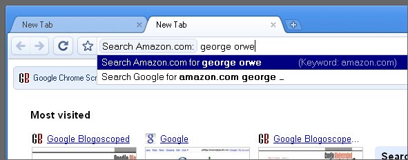
They were not at all comparable. Here is an image of what Firefox looked like when Chrome was released [1]. Here is an image of what Chrome looked like at release [2]. Barring some design tweaks Chrome looks roughly like any modern browser whereas Firefox looks ancient by modern standards. It has the app menu, no integration with window decoration, a separate search box, tabs below the address bar, etc. Lots of things that Firefox would copy over the coming years. There's a reason Chrome was named after its Chrome–the UI was a huge selling point.

1: https://user-images.githubusercontent.com/25581533/141687681... 2: https://blogoscoped.com/files/google-chrome-browsing/search-...

Re: How to make a better default Firefox UI

#240
post #14

The main issue I've had with their new UI is the massive size of everything, it's fair enough for fat finger phone displays but is annoyingly wasteful for any regular sized desktop. This is partly due to the increased padding as per the article, but also because they removed the "compact" UI density option. However you can bring this back under about:config browser.compactmode.show Then go to menu > more tools > cust…

Yeah, this is a problem for me also. FF UI is so big. Also, why a huge white space between the reload and url bar???? It is a horrible waste of space.
Post reply on HN