Live data from Hacker News

Redesigning GitHub Repository Page

tonsky.me

231–240 of 315 posts

Re: Redesigning GitHub Repository Page

#231

Earlier quoted context omitted.

It's called nostalgia. It's emotional, not rational. Ask any 16 year old (like my son), who came of age having no context for what the windows 95 UI even looked like. Shocker, he vastly prefers flat interfaces, ie. like the design of Notion. The problem I see in this github redesign has nothing to do with the fact that it's flat. It's tougher to use because it's just bad design. The three columns make it insanely den…

No, it's not nostalgia, goddammit. It's because it contains good visual affordances. Skeumorphism isn't pretty, but it works because our eyes are naturally trained to perceive the visual hints. Our eyes are trained to subconsciously perceive depth via shadows. To perceive clear edges and group things by them. I really, really hate that 99% of all UX designers are basically graphic designers who are good with visual f…

Thank you for going into detail- I was pretty sure it was UI and you pinpointed what.

Could you point me to some reading on shadow stuff please?
Re: Redesigning GitHub Repository Page

#232
post #220
post #17

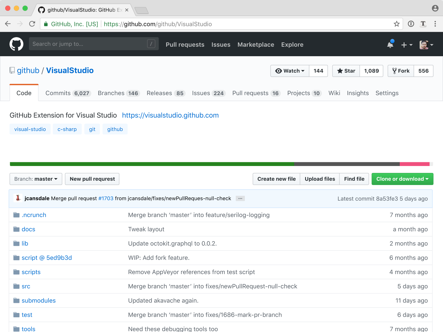
> If you are a programmer, you might be surprised but other people normally don’t like hierarchies. Nested structures are hard to grasp, remember, navigate, and grouping is very often non-intuitive. Nested tabs are one of the worst UI patterns out there. GitHub is primarily a development tool, so it should be designed for developers. Hierarchies align very well with development tasks, so it's natural to use them for…

I’m a big fan of nested hierarchies. But hierarchies only work when they are logical. And on GitHub they patently aren’t: For instance, I’ve got to search for the Releases tab every single time . Its placement below “Code” makes no sense whatsoever. And even though I know this, I’m still disorientated every time. The same is true for some of the other tabs. I agree with you about the Issues and PR tabs, but I think i…

I agree, but that's another point: maybe hierarchies could just be "refactored", e.g. letting Releases be a top tab item

Re: Redesigning GitHub Repository Page

#234
> http://tonsky.me/blog/github-redesign/60_icons-removed.png

Why should a user without any background in coding / git, care about the branches when opening an issue? Or individual commits? Not the mention that the number of commits may change depending on the selected branch, but the issues and releases stay the same, which is something the author does not talk about.

> If you are a programmer, you might be surprised but other people normally don’t like hierarchies.

Citation needed.

One of the big benefits of a hierarchy (be it in UI design or on a political / social / corporate level) is that on any level, you really don't have to think about the levels above or next to you that much, and thus even individuals with a very limited skill set can be productive members of this hierarchy. The anarchic approach of "everything is accessible to anyone everywhere" taken here just excludes specialists from using a GUI productively.

Re: Redesigning GitHub Repository Page

#235

Overall I like this redesign! Some parts I truly enjoy there: * single layer navigation: it looks busy, but it would improve my life a lot; I find the current one pretty annoying * showing statistics on the main page: this is very useful information for me when I come to evaluate whether I should use the library in my project * list of commits: again it helps me to see whether the project is still maintained; if the…

I was always angry at people telling they don't like my/his/her new haircut, because I know they are just used to the previous one, and this is the only reason they dislike the new one.

About this redesign: I would welcome it with all my heart. For me, GitHub won on the social side. So let's put the social side in front. I find the current project and profile pages very poor and limited. I would welcome ghuser.io redesign as well.

If I really want to scan the code, I clone the repo and scan the code in my IDE. Or I use a browser extension that displays a folder tree in a toggleable-sidebar on the left.

The current "Files" is only useful to click on the files to get to see their contents. The last commit message for each file is something I look at when I'm bored and want to waste time. I also hate to see very old commit message on very old files like LICENSE.

Re: Redesigning GitHub Repository Page

#238
post #64

I think there is a design flaw with step 9: The code tab has been changed to "overview", but an overview is supposed to be a glance of something, not an authoritative source of data. So where's the authoritative source of files in the repository now? Are we supposed to be using the "overview" as a file browser too? I don't really want to see all that stuff on the right if I'm just trying to traverse some directories…

I thought exactly the same thing. It replaced the files tab, whereas it should have been an additional tab, otherwise where would files be?

Re: Redesigning GitHub Repository Page

#240
post #102

Earlier quoted context omitted.

_If you feel disoriented, give it a minute._ The guy spends a very long article explaining how things could be laid out easier to orient yourself in and then asks you to give a minute to get used to his color scheme.

This criticism seems somewhat unfair. I believe they were implying that familiarity with the old design will strongly bias your initial reaction, and giving it just a few more seconds will help to avoid that trap.

No. If the new design is better, I will immediately go "oh wow, that is good". If I have to give it time until my bias goes away, the new design is not necessarily better, merely different.
Post reply on HN