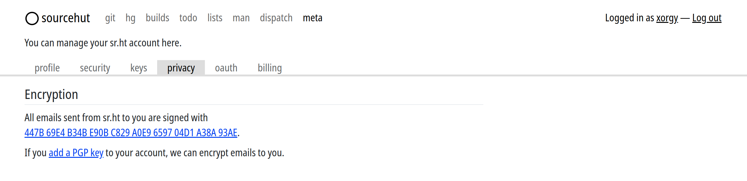
I guess it is SourceHut actually; I think it could use a bit more texture/skeumorph on things like tabs and buttons, but it is so clean, especially since it uses my default sans serif font (which is condensed). There's just so much to do right, see: https://qui.suis.je/drop/sourcehut.png
Ask HN: Thoughts on new GitHub layout?
221–230 of 590 posts
Re: Ask HN: Thoughts on new GitHub layout?
#222Like many others, I use Github every day. Changes like this add friction to our workflow. There better be a damn good reason for these changes, otherwise it's a pointless redesign that looks no better than it did previously while simultaneously adding a slight overhead as users "learn" the new layout. Does anyone know of an option to revert this update?
Re: Ask HN: Thoughts on new GitHub layout?
#223I submitted feedback over it but, aside from the over-reliance on rounded corners, and making pills and buttons hard to separate, the single worst change is that you can't see the latest commit status from the repo screen. Instead, you get the commit hash, and have to click a tiny ellipsis button to get the commit message and the status indicator. When I'm browsing on github and not using git directly, the commit sho…
> the single worst change is that you can't see the latest commit status from the repo screen. Instead, you get the commit hash, and have to click a tiny ellipsis button to get the commit message and the status indicator. Omitting the commit message is a net improvement to me; I've found that the commit message of the random commit that happens to be at top of tree is completely unhelpful for someone browsing the rep…
The number of broken master branches I’ve seen on Github is astounding. So I find the CI status indicator to be very useful.
Re: Ask HN: Thoughts on new GitHub layout?
#224They are following the trends of flat design and rounded corners, which I don’t really mind. I’m more bothered by the fact that nothing is aligned: the GitHub logo, the breadcrumb, the horizontal menu and the issue title are all on different verticals. Looks messy.
We'll all get used to it, but it's harder now to see what is a button and what isn't, e.g. only 2 of these are clickable https://imgur.com/a/wR9xsvT
Re: Ask HN: Thoughts on new GitHub layout?
#225Hoowever, the increased use of horizontal space makes it harder to read (imagine HN without the blank sides) and I believe the information density has been lost a notch way too much.
All in all I think I prefer the previous design because to me information readability comes first.
It actually becomes pretty decent if you zoom out to 80% in Firefox although the text becomes a tad too small. I believe making an extension to increase information density shouldn't be too hard.
Re: Ask HN: Thoughts on new GitHub layout?
#226I submitted feedback over it but, aside from the over-reliance on rounded corners, and making pills and buttons hard to separate, the single worst change is that you can't see the latest commit status from the repo screen. Instead, you get the commit hash, and have to click a tiny ellipsis button to get the commit message and the status indicator. When I'm browsing on github and not using git directly, the commit sho…
Re: Ask HN: Thoughts on new GitHub layout?
#227Re: Ask HN: Thoughts on new GitHub layout?
#228Re: Ask HN: Thoughts on new GitHub layout?
#229Overall this design change doesn't matter to me. The only thing that really stands out and that annoys the hell out of me is the circular profile images. It looks completely out of place compared to all the other elements on screen, even their generated profile images don't fit in it correctly. It seems that this decision was made not from "add value" point of view but someone just really liked Instagram or the look…
Fortunately it's easy to use a little custom CSS to revert them to square images, at least for now:
https://gist.github.com/jmarshall/a880c93725ee727abb54473582...
Re: Ask HN: Thoughts on new GitHub layout?
#230Contrary to everyone else I really like the new design. The metadata is placed to the right as it should have always been. The languages are in the sidebar and are visible without me remembering that typescript is somewhat dark blue. Also the new look is more modern and unlike most people here I am not afraid of change.