Live data from Hacker News

The Windows 95 user interface: A case study in usability engineering (1996)

dl.acm.org

201–210 of 290 posts

Re: The Windows 95 user interface: A case study in usability engineering (1996)

#201

Any user interface designer should take a good look at the controls on a commercial airliner. An awful lot of effort goes into making an intuitive, effective user interface. I have disagreements with it, but there's no denying it's very well done. Designing a programming language is mostly about usability. I'll be giving a talk about that in April at Yale. It's a fun topic!

I tend to agree, but the FMC on Boeing aircraft sure leave something to be desired.. I do not find the menu/tab system very ergonomic (and the non-QWERTY key layout)

Asking for qwerty keyboard in an fmc just screams you have never been in a cockpit. You dont type into the fmc with both hands.
Re: The Windows 95 user interface: A case study in usability engineering (1996)

#202
post #131

Earlier quoted context omitted.

I'll also give the opinion that Apple consistently creates some absolutely crap designs and when they do this, release something really really mind mindbogglingly stupid that it should be embarrassing they are instead met with applause on the "amazing design". It's a tiresome pattern repeated for decades now. eg. The 'breathing status light' that lit up the room at night due to extreme brightness which meant every ma…

> release something really really mind mindbogglingly stupid that it should be embarrassing I’m still trying to understand who came with the idea of charging the mouse from under, instead of from a position that would allow to use the mouse while charging…

Their laptop touchpads are the only Apple "pointer" input device I've ever liked. (And by extension, the iPhone and iPad.)

I hate myself every time I settle for yet another disposable Microsoft mouse.

Though, I would have killed for an Apple Pencil, back when I was a CAD jockey.

For me, the butterfly keyboard was Apple's mostest worstest user interface design decision.

(Doubly so because it persisted for so long. I love that Apple (and others) try new things. But I don't understand commitment to design failures.)

Source: I've been an Apple partisan since the Apple ][. Even stubbornly resisting Amiga's siren call.

Re: The Windows 95 user interface: A case study in usability engineering (1996)

#203

Earlier quoted context omitted.

> From what I remember it lost the ability to render rounded window corners, ...I'm guessing you haven't used Windows 11? -------- By "rounded corners" are you referring to rounded-off corners in the nonclient area (such that the hWnd's rect is not clipped at all)? If so, then no: those would be rendered using a 9-grid[1] and have always been supported. If you're referring to how so many fan/community-made msstyles f…

I’m speaking specially about Windows 8/8.1. Obviously 11 and the new Fluent design language it brought don’t suffer the same issue. Whatever the case, rounded corners on the titlebars and window chrome were common in XP/Vista/7 custom msstyles but were nowhere to be seen for 8/8.1 custom msstyles. It was one of the most frustrating aspects of that era of Windows for me.

Hmm, yes; I think you're right. I honestly don't know the explanation behind that, sorry.

Re: The Windows 95 user interface: A case study in usability engineering (1996)

#204
post #188

Earlier quoted context omitted.

There's an entire is that loves 90s msft user interface. SerenityOS.

SerenityOS was born dead. Let me explain why. No new OS today will ever be used by any significant number of people without 1) a working web browser and 2) hardware support for laptops, phones, wifi cards... you know... stuff people already have. SerenityOS might get a working browser. Not very likely, but it might get it. The #2 condition will only be solved if it somehow "imports" Linux drivers or wrap Windows bina…

SerenityOS serves as a cool side project for those who like to tinker with OS dev. I don't think it was "born" with any other goals in mind. Neither was their browser project, it just happened to turn into something a lot more serious.

Re: The Windows 95 user interface: A case study in usability engineering (1996)

#205

Earlier quoted context omitted.

While the exact reason has never been documented, if you look at that mouse's design, you'll see that its first generation had a regular battery compartment on the bottom. When gen 2 arrived, they fully reused the same shell and only replaced that bottom part to now be an integrated battery with a charging port instead of a compartment for AAs. Moving the charging port would've required a brand new design, since ever…

The reason people talk about the mouse is that it's one of the worst ideas they ever had. At the time, I remember someone claimed that the reason was that they were afraid people could leave it plugged in for convenience. Apple thought that would lead to a worse experience because their mouse was designed to be used wirelessly. I think it was actually more related to aesthetic "icks" by the designers, because people…

> it's one of the worst ideas

It's still one of the worst ideas. Insult to injury.

Re: The Windows 95 user interface: A case study in usability engineering (1996)

#206

Earlier quoted context omitted.

Textbook case of form over function. Either an engineering constraint forced by the design and deemed an acceptable trade-off by higher-ups, or maybe more likely, the designer just thought a visible charging port would’ve ruined their design.

While the exact reason has never been documented, if you look at that mouse's design, you'll see that its first generation had a regular battery compartment on the bottom. When gen 2 arrived, they fully reused the same shell and only replaced that bottom part to now be an integrated battery with a charging port instead of a compartment for AAs. Moving the charging port would've required a brand new design, since ever…

While I get the feeling you appreciate the, erhm, efficiency with which Apple modified this product, the problem is that Apple is not supposed to be efficient. They don't need to save money on the engineering process because they are not hurting for money. They sell themselves as being a design-forward company that prides itself on making bold, not expedient, choices. To take a shortcut like that shows a lack of respect for the customer to whom they are charging premium prices for these items.

Re: The Windows 95 user interface: A case study in usability engineering (1996)

#207

Earlier quoted context omitted.

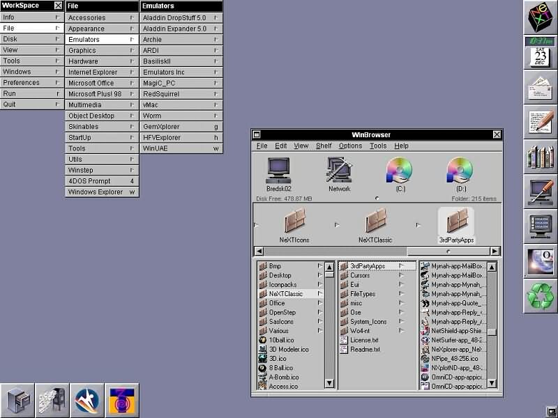
Motif was also 3D, but the actual look of Windows 95/NT 4.0 clearly took some inspiration from NeXTSTEP and OPENSTEP, for example the window decorations.

I accept that's possible - if not likely (and everyone steals from each other!) - but even-so it only amounts to to the gunmetal-grey default colours and use of a 1px bevel/inset effect; because NS and NT3/NT4's UX/UI design and concepts are just so different otherwise. ...but I'm not personally convinced: instead, consider the demonstrable fact that similar engineering teams, working on similar problems, will indepe…

As mentioned, Windows 95 uses more or less the same window decorations as NeXTSTEP - although with different semantics. What is minimize in NeXTSTEP is maximize in Windows 95 IIRC.

https://www.operating-system.org/betriebssystem/bsgfx/apple/...

It could be coincidence of course, but...

> my favourite example to point to is how eerily-similar the Eurofighter Typhoon, Saab Gripen, and Dassault Rafale all look - even entirely indistinguishable at an air-show in-person - despite having zero shared pedigree

Considering that France/Dassault was initially part of the Eurofighter / European Fighter Aircraft (EFA) project, I'm not sure if that's the best example to make your point.

Re: The Windows 95 user interface: A case study in usability engineering (1996)

#208
post #131

Earlier quoted context omitted.

> release something really really mind mindbogglingly stupid that it should be embarrassing I’m still trying to understand who came with the idea of charging the mouse from under, instead of from a position that would allow to use the mouse while charging…

Their laptop touchpads are the only Apple "pointer" input device I've ever liked. (And by extension, the iPhone and iPad.) I hate myself every time I settle for yet another disposable Microsoft mouse. Though, I would have killed for an Apple Pencil, back when I was a CAD jockey. For me, the butterfly keyboard was Apple's mostest worstest user interface design decision. (Doubly so because it persisted for so long. I l…

> For me, the butterfly keyboard was Apple's mostest worstest user interface design decision.

I really liked the butterfly kb. It was responsive, and you could hit the key cap anywhere and it would register.*

Subsequent mac book keyboards imo are all terrible and suffer from the terrible issue of sponge-ness that means i can literally press a key cap in a slightly off centre location and it Does Not Register. Its like the key movement is separate from the actuation. I have way more mis key and missing letter using later post butterfly kbs than i ever did. The worst part is this is ‘normal’ and not a fault. You just have to press harder and in the centre.

* except when it was in for work i had 3x top case replaced on my old mbp

Re: The Windows 95 user interface: A case study in usability engineering (1996)

#209
post #174

Earlier quoted context omitted.

I liked the gentle amber sleep mode breathing power button on my circa-2000 CRT iMac. It wasn’t nearly as bright as that of later models and was quite nice.

I had one from 2010 and the bright light wasn't even the main problem at night. The charger emitted an annoying high pitch sound so I'd have to unplug it. And the device turned itself on randomly at night, and the CD-ROM reader and fans would spin up and make noise. I've now used a macbook air for work and I noticed that even when in "standby" for a week my router had a DHCP lease for it. So they still turn on for no…

You can disable it but yes macs will periodically wake up to get emails and notifications even while they are ‘sleeping’

Re: The Windows 95 user interface: A case study in usability engineering (1996)

#210
post #55

Earlier quoted context omitted.

I recently had to get printing working for a family member on an Apple tablet. I'm not an Apple jockey so it took me a while to sort out and I've being using computers since 1980 and consulting since 1995. You tap an icon that looks like the outline of a rectangle with an arrow pointing up. Then you tap the name of the printer. Then you tap another rectangle with an up arrow and then tap the word "Print". I may have…

It's supposed to be the "Share" menu, but that stopped meaning anything very fast because they just crammed everything into it for lack of other UX for system services. Macs have the problem multiple times over, because now they have the normal menu bar and toolbar, and a Share menu that just gets arbitrary stuff dumped into by App Store apps, and the Services menu that shows up in some contexts but not others, and t…

Good point. Its a mess. Come on apple get someone to fix this
Post reply on HN