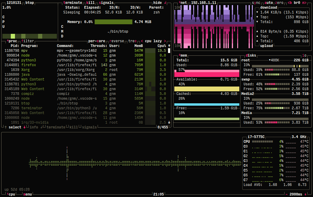
I absolutely love it, very intelligently put together. The gold standard for this in the terminal is btop. Check it out if you’re into this sort of thing:
Example: https://terminalroot.com.br/assets/img/cpp/btop.png
201–210 of 267 posts
Example: https://terminalroot.com.br/assets/img/cpp/btop.png
Earlier quoted context omitted.
I have had the (dis)pleasure of watching my 60yr old mother having to re-learn the entire administrative part of her healthcare job three times over and deeply struggle because the insurance suits decided a new software package was needed. Nothing humbles you more as a dev than seeing a layman struggle through an interface, getting increasingly frustrated and desperate because she can’t find the button she needs due…
This anti-learning attitude is common, but I don’t find it admirable. To me this is like a dev saying “screw Git, I just want to do console.log(). All this complexity is sabotaging my productivity.” Modern jobs, even health care, require learning about and managing complexity. It’s not just “taking care of people”. Throwing your hands up and saying “I’m old”, which is a lousy excuse because I know plenty able old peo…
I've seen healthcare management software evolution due to my partner working with it. As in the worst management story, it's pitched to a boss that doesn't need or want to use it, offered to generally the lowest bidder, and then immediately outsourced in parts that rarely work well together taking years to develop.
The UI and workflows are designed by people that will never use it and are just plainly bad. The software/UI takes years to stabilize and reach feature parity to the same level it was before. During that time, it's pretty common to see staff having to use both systems and perform double data entry.
You're not learning to improve anything here. You're substituting a [shitty] tool with another one which does _exactly_ the same.
Sadly in IT this is pretty common. There's nothing special about healthcare.
Earlier quoted context omitted.
I'm constantly frustrated by software that tries to limit cognitive overload. Stop treating your users as if they were cognitively impaired. In other words, write a software that also an idiot can use, and only idiots will want to use it.
> I'm constantly frustrated by software that tries to limit cognitive overload. Stop treating your users as if they were cognitively impaired. In other words, write a software that also an idiot can use, and only idiots will want to use it. I disagree. I’ve been using IntelliJ for a few years now, and the new, simplified interface has made my experience a lot better. IMHO you should limit the cognitive overload but e…
I had to fiddle with color schemes, add-ons for updated icon colors, etc. It's a mess.
And even if it's about reducing cognitive overload. The old interface had plenty of "features" and "configuration" to reduce the cognitive load as much as you wanted with both presentation mode and the ability to change the UI however you wanted.
My cynical take is that we just had two giant camps promoting this. One was the designers that wanted to have something to do. And the other camp was the VSCode pushers that just couldn't stand that a glorified (and order of magnitude inferior) text-editor is maintaining user-counts.
Earlier quoted context omitted.
I'm calling bullshit on this one. In more ways than one. 1. Stuff that benefits imparied users benefits others. Subtitles help both. You'll never operate always at peak capacity either. 2. You can design UI to be layered. Easy mode for beginners and more advanced options for advanced users. 3. Software that's easy to use sees bigger audience. Period.
A bigger audience isn't a better audience. A violin solo in a football stadium with the usual football audience is not an improvement over one in a recital room with the usual audience.
Earlier quoted context omitted.
Touch interfaces have less pointing precision, but more swiping precision compared to mouse interfaces. The optimal touch interface probably involves lots of pie menus and/or drag-and-drop gestures that ought to easily compensate for the somewhat increased size of initial touch targets. (Note that, by contrast, these gestures tend to be quite awkward when using mouse or touchpad input.)
Ah, the always easy to discover (only in the mind of the designer) gestures. Let's not forget that with the current gigantic size of phones, I can actually easily reach less than 50% of the screen. The top part is completely out of reach.
I've actually stopped using the 'switch between running apps' UI almost entirely now because with that done, it's faster for me to tap to the home screen then on the icon of the app I want to switch to.
Low UI density is the new emperor's clothes in modern UI design. It's being actively promoted by companies in order to cut design costs, but the truth is that it's only reasonable on touch interfaces or casual apps. Mouse interfaces are fundamentally different, because you have much more pointing precision, so it pays off to show more data on the screen. You don't have to cram your interface with with spaces to make…
If you look at Tailwind UI, which is clearly governed by the principles laid out in Refactoring UI, you can pretty much see the blueprint behind 95% of websites today.
I work have built some dense UI for certain types of fixed income (bonds and swaps) trading, looking to move it all to svelte because react cannot handle the quantities of data (and if even if it could the code is unbelievably ugly). Something I've been banging on about for a while is the following: Programmers and designers keep trying to rebuild instagram in every domain, pretty UIs, regular UIs, "simple" UIs. This…
(Svelte is awesome, mind, I compare the two to compliment them both)
Low UI density is the new emperor's clothes in modern UI design. It's being actively promoted by companies in order to cut design costs, but the truth is that it's only reasonable on touch interfaces or casual apps. Mouse interfaces are fundamentally different, because you have much more pointing precision, so it pays off to show more data on the screen. You don't have to cram your interface with with spaces to make…
Another massive consideration is that a mouse (and a keyboard, if you want to expand from UI to UX) pairs that precision with significantly more available control actions - LMB, RMB, MMB, scrolling, and hovering.
With a mouse, the edges and corners of the screen are the easiest and most reliable areas to interact with; this is the inverse of touchscreen UIs, in which the center of the screen is the most ergonomic area of the screen to use, and edges and corners are practically unusable, leading to large margins in almost every UI targeting them.
With controls like LMB/RMB, you can also have functionality _immediately_ available wherever the pointer is located, which is now quintessential for practically all desktop applications, and which can't be faithfully emulated with touchscreen UIs.
Earlier quoted context omitted.
Same, absolutely "stuck" with DataTables. It seems to work well even with comprehensive UI frameworks on top of it like SB Admin Pro. Just super easy to integrate DataTables and has 90% of the features I ever want.
Honestly this doesn't even sound like a particularly bad thing. Sort of like how Houdini has literally no competition whatsoever. Like it's actually hilarious how nothing even comes close. It just works so well that nobody can really hope to ever do better, and there is nearly 0 enshittification happening, so its existing users have no reason to ever switch.
Low UI density is the new emperor's clothes in modern UI design. It's being actively promoted by companies in order to cut design costs, but the truth is that it's only reasonable on touch interfaces or casual apps. Mouse interfaces are fundamentally different, because you have much more pointing precision, so it pays off to show more data on the screen. You don't have to cram your interface with with spaces to make…