Live data from Hacker News

Perfect Motherfucking Website

perfectmotherfuckingwebsite.com

201–210 of 249 posts

Re: Perfect Motherfucking Website

#201
post #170

Earlier quoted context omitted.

Not sure what argument you're trying to make; can you clarify? This article is also partially about smartphones (dark mode, responsiveness, etc). Back when `em` was not a thing yet, text was measured in `px`, where 16px was considered to be the "default" size for readability purposes (and `em` sizes are a function of a base value in `px`). Saying that pixels are unrelated to text isn't really accurate, since text obv…

If the font size is different, em width adapts to that, px width doesn't. Text occupies space in pixels, but not vice versa.

Yes I'm aware of that. But regardless of whether you mean this in the sense of adapting to user stylesheets or the idea that disparate elements' font sizes should relate to each other, they both strike me as maintainability trade-offs that can reasonably go either way. An elitist tone seems a bit unnecessary in that context.
Re: Perfect Motherfucking Website

#202

Earlier quoted context omitted.

> >I want to hecking scream. Overreacting much? > The point of the original website in this chain was not that you couldn't do media queries, or that all of your designs had to be unstyled. It was a gosh-darned satire that showed that even if you did literally nothing, your website would still be responsive and readable and load fast. The fact that it did nothing, that it was just a completely unstyled HTML page was…

'a perfecter motherfucking site' will 'improve' this site adding 10 more tiny CSS lines 'the most perfectest motherfucking site' will improve that site by adding just 6 teeny tiny more CSS lines and maybe like the most little tiny bit of javascript. 'the absolute final most perfectest motherfucking site'.. will improve THAT site, and the feature creep goes on. they're all built off of the concept of the original, so…

https://yourlogicalfallacyis.com/slippery-slope

Re: Perfect Motherfucking Website

#203
I'm fine with the gratuitous swearing, that's part of this genre of websites. I'm fine with the design choices including a11y and dark mode.

What I'm not enthused about is the DO WHAT THE FUCK YOU WANT TO PUBLIC LICENSE. FFS, just use MIT. That's what MIT is for.

Re: Perfect Motherfucking Website

#205
post #57

Earlier quoted context omitted.

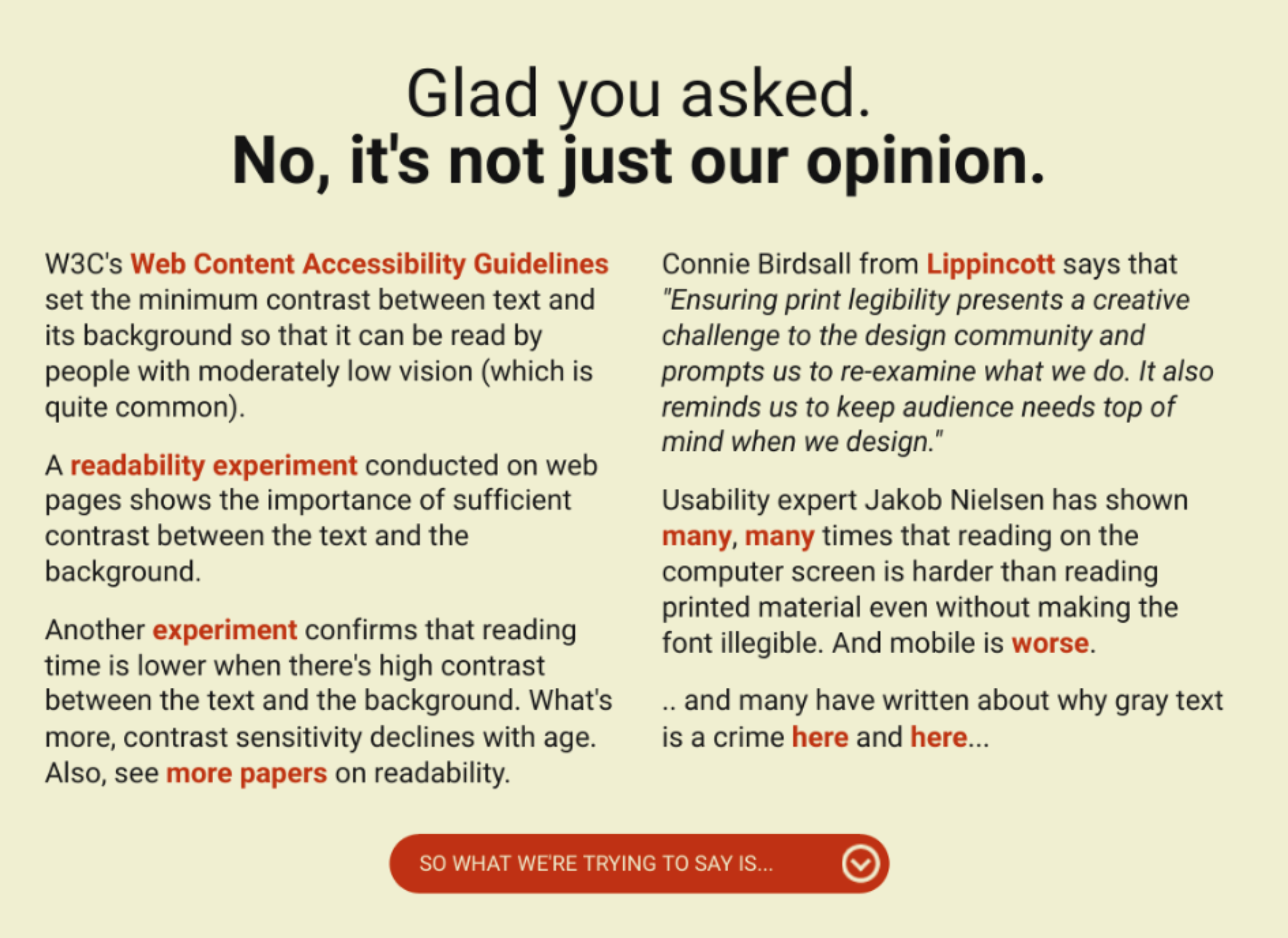
> WHY. WHY DO PEOPLE DO THIS Because designers are taught that too much contrast causes eye strain. They're advised against putting pure black text on bright white backgrounds. https://www.wired.com/2016/10/how-the-web-became-unreadable/

But to little contrast causes so much more eyestrain, and can't be fixed by changing your screens brightness.

Too much contrast can't be fixed by changing your brightness either unless you like spending several hours calibrating it again after every single blogpost you read.

Re: Perfect Motherfucking Website

#207

I want to hecking scream. The point of the original website in this chain was not that you couldn't do media queries, or that all of your designs had to be unstyled. It was a gosh-darned satire that showed that even if you did literally nothing , your website would still be responsive and readable and load fast. The fact that it did nothing, that it was just a completely unstyled HTML page was the reason that the jok…

> >I want to hecking scream. Overreacting much? > The point of the original website in this chain was not that you couldn't do media queries, or that all of your designs had to be unstyled. It was a gosh-darned satire that showed that even if you did literally nothing, your website would still be responsive and readable and load fast. The fact that it did nothing, that it was just a completely unstyled HTML page was…

> Overreacting much?

Matching the poster's tone.

> Yeah, so? Who cares about the point of the original website?

This website (and the rest of the extensive "betterwebsite" collection) is written as a direct response to the original website. That's why the title is what it is, that's why it talks about the original.

Death of the author is a thing, but people don't typically cite death of the author when they are directly responding to someone's point. We usually expect responses to have something to do with what they're responding to.

If the URL of this website was "howtomakeafastprettywebsite.com", we wouldn't be having this conversation right now, because "put a max-width on your columns" is not exactly a controversial or bold design statement.

Re: Perfect Motherfucking Website

#208
post #7

From " http://bettermotherfuckingwebsite.com/ " which is one up the chain: > A little less contrast WHY. WHY DO PEOPLE DO THIS. To give this person credit they have at least chosen some sensible values, rather than gone with something that was just about enough on an expensive graphic designer high-contrast monitor and then not tested it on anything else. Leaving the rest of us squinting to try and read text or manua…

Join the contrast rebellion and demand high-contrast text: https://contrastrebellion.com/

I love that website. It has the perfect amount of contrast, not the harsh #000 on #fff half this comment section recommends.

https://i.k8r.eu/dw9JsA.png

Re: Perfect Motherfucking Website

#209
post #71

All of those changes *should* be the *default*! i.e.: - dark mode should change default colors to white on black. - viewport default should be "width=device-width, initial-scale=1" - HTML's only supported charset should be UTF-8. - Default CSS for body should be something like: body{ max-width:40em; margin:0 auto; padding:1em; }

Re: max-width, please no. Stop making assumptions about my browser's width. If you must specify a max-width (you don't), please at least make it a percentage of the browser's width, and not a fixed pixel or em value. I'm so tired of web sites rendering as a tiny column centered on my nice 27" monitor with gobs of whitespace on either side of the vertical sliver of text.

Re: Perfect Motherfucking Website

#210
post #74

I built an antithesis to this: https://lxe.github.io/everywebsite/

The top banner should be transparent so that the scrolled text is visible through it (cf. stackoverflow). Also needs the second top red banner begging to enable javascript. The looking glass search button should be in a sticky position in the middle of the window obscuring the text (cf. wired.com).
Post reply on HN