Live data from Hacker News

Redesigning GitHub Repository Page

tonsky.me

201–210 of 315 posts

Re: Redesigning GitHub Repository Page

#201
post #17

> If you are a programmer, you might be surprised but other people normally don’t like hierarchies. Nested structures are hard to grasp, remember, navigate, and grouping is very often non-intuitive. Nested tabs are one of the worst UI patterns out there. GitHub is primarily a development tool, so it should be designed for developers. Hierarchies align very well with development tasks, so it's natural to use them for…

I think the two natures of Github as a tool for software development and Github as a social coding site are often at odds. Some ways this could be reconciled: - greater end user customization of the UI layout - an option to enter a different UI(contributor UI) for repositories you contribute to/own - make the contributor UI an enhancement on top of the current UI(perhaps a new darker tab bar) - related to the above,…

Most software in the 90s were highly customizable and a joy to use because of that. I don't remember customization adding a lot of complexity to desktop applications (having worked with classic VB6, VB.NET (WPF) and Qt4).

The complexity today comes from the fact that there is much more focus and priority on getting the application to match designers' vision. Its extremely complex to offer the user customization while still ensuring pixel perfect UIs. (Emphasis on complex, its not impossible).
Re: Redesigning GitHub Repository Page

#202

First half of the article that redesigns the navigation is actually pretty good. It got me hooked and i find it valuable. When they started touching the content, I got a lot more hesitant. 1. I can't articulate why , but honestly it's extremely useful to see the last commit message on each file. It gives me a sense of which files have changed and if my changes are still the latest ones. It's not foolproof, but it doe…

If I wanted to see the history of a file I would go to that file for more context. I agree with the author that I don't think it's useful enough to show in the front page.

I personally care about the commit log most of the time I go onto github, or the issues, or pull requests. Not that keen on navigating to files from github.

Re: Redesigning GitHub Repository Page

#204

Earlier quoted context omitted.

GitHub should go full MySpace, completely custom css per project.

Considering: 1) Most GitHub users are more tech-savvy (and often more CSS-savvy) than your average MySpace users, and 2) Most GitHub users put a lot of value in their repo pages, this actually seems like it wouldn't _inherently_ be the worst idea, assuming the proper precautions were in place versus bad actors. Allowing each org to fully customize their git repo almost encroaches upon (or replaces?) project websites,…

> 2) Most GitHub users put a lot of value in their repo pages,

I think you underestimate how many "Single commit, push and forget" test repositories are out there.

Re: Redesigning GitHub Repository Page

#205

Earlier quoted context omitted.

The tabs redesign suggestion are actually one of the things I like best here! I hate the two (it's actually THREE including the top black bar) navbars, I always get confused about where to look to find something or what i'm clicking on, and I've been using GH for years!

Yeah, but if you look at the tabs redesign, they're cheating a little. They are using a very busy repo(which most aren't) so the little numbers next to each tab are acting as a divider. Most repos would be really hard to navigate without some sort of additional separation between the tabs.

They're also ignoring any sort of internationalisation. In other languages there wouldn't even be room to label all those tabs.

Re: Redesigning GitHub Repository Page

#206
post #21

The tabs especially looks like a terrible idea. Something that had more than enough space on every screen has now become a huge, long list of options that you have to scan every time to find the one you want. Removal of icons also plays into that since they were the visual hooks you could use to navigate after a little while of usage. Then the final redesign, I’m not sure there’s anything to say about it other than t…

The tabs redesign suggestion are actually one of the things I like best here! I hate the two (it's actually THREE including the top black bar) navbars, I always get confused about where to look to find something or what i'm clicking on, and I've been using GH for years!

I totally agree! Tens of times I tried to move to the branches page only to realise that I'm in some view that doesn't display the secondary navigation, and I need to go to main repo page first

Re: Redesigning GitHub Repository Page

#207

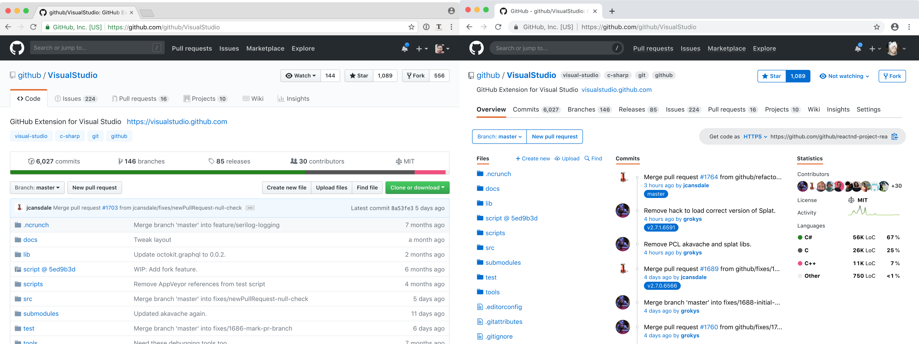
But maybe it’s time to fresh it up a little? Get rid of gradients, dirty washed-out colors, unnecessary separators, add a little more air. No, no, no , NO!!!11 I've had it with these "sea of floating text on an expanse of white" redesigns, seeing yet another one follow this mindless trend just disgusts me thoroughly. The lines, subtle gradients, and other affordances of the old design serve to organise and direct you…

Can't tell if the irony is lost that both GitHub UI mocks are by the same designer, Nikita Prokopov.[1][2] [1] Windows UI satire https://twitter.com/nikitonsky/status/1003593821723267072?s=... [2] Honest redesign http://tonsky.me/blog/github-redesign/

Indeed... if it ain't broke, don't fix it.

http://tonsky.me/blog/github-redesign/210_compare.png

Re: Redesigning GitHub Repository Page

#208
Overall I like this redesign! Some parts I truly enjoy there:

* single layer navigation: it looks busy, but it would improve my life a lot; I find the current one pretty annoying * showing statistics on the main page: this is very useful information for me when I come to evaluate whether I should use the library in my project

* list of commits: again it helps me to see whether the project is still maintained; if the last commit was 5 years ago the project might still be good, but possibly it doesn't work with the new versions of other libraries; also adding tags there is cool!

* icons added to "find/create/upload file" menu, really good idea!

* watching/not watching button

* language names right on the main page. It's very confusing to have to click on the colour bar to see what languages does the project use

And here are some things I'm not sure about:

* colours are more intensive and I feel that my eyes would get tired more easily; I like the current colour palette

* flattening of buttons looks very iOS-ish and I'm not fan of the trend

* there's no separation between columns, for a moment I thought that users avatars belonged to the files column and I didn't know why some files had user next to them and other didn't.

That's a nice experiment and I'd love to see more ideas like this, to understand the way of thinking behind certain design decisions.

On a side, I find it pretty sad that there's so much negativity in this thread. I know people are used to certain designs and don't like changes, but saying "I hate this" is very strong and I don't understand why anyone would have such strong feelings towards other person's blog post.

Re: Redesigning GitHub Repository Page

#209
post #63

Earlier quoted context omitted.

> The two-level hierarchy split makes perfect sense for git metadata vs github repo metadata. That would make sense, but they don't actually keep that separation. The "Releases" tab is Github metadata, yet it's right by the Commits and Branches. Also, right next to the "Branch" button (git) there's the "New pull request" button (github).

I'm not quite sure what the relationship is, but I the releases tab might just show all git tags.

A GitHub release is tied to a git tag, but it's its own thing.
Post reply on HN