Live data from Hacker News

Global land temperatures since 1900 visualized

halftone.co

21–30 of 35 posts

Re: Global land temperatures since 1900 visualized

#21
post #15

Very cool use of Voronoi tessellation. Did you use D3? Also, I see you're using data from ground monitoring systems. You're probably seeing the result of residual heat being let off from surrounding industrialization over time.

Not the author.

Yes, it's essentially Backbone & d3 (with topojson for data). And it's a better intro to "real life Backbone" than todos, so if you're interested, take a look.
Re: Global land temperatures since 1900 visualized

#22
post #16

Warning on the site when you visit with an ipad: "Hey there. It looks like you're on a mobile device. Just a quick warning: This project will download a lot of data from the interwebs (no really!), and even then it probably won't look that great. Your best bet is to bookmark this page, go home, check it out on your desktop, and see it in its full glory." I am at home, on the couch, with an ipad. That is my favorite c…

You need to use a "truck" on this site since your "car" isn't yet capable of doing the same work, obviously.

This is a data visualization company's proof of concept, using voronoi tesselation rendered via SVG.

My iPad 5 doesn't do justice to this, since it can't render fast enough. It's very choppy.

Could they make a stripped-down version that works on iPads? No doubt. But that defeats the purpose of their exercise.

Re: Global land temperatures since 1900 visualized

#23

Possibly the coolest loading screen I've seen. It would be nice to have a "play" button that automatically goes 1 year back every second or something like that.

Yes, I'd appreciate automatic transitions from year to year as well.

I don't know if they could be SMOOTH, because of the use of tesselations, but at least it could do it for me. :)

Re: Global land temperatures since 1900 visualized

#24
post #16

Warning on the site when you visit with an ipad: "Hey there. It looks like you're on a mobile device. Just a quick warning: This project will download a lot of data from the interwebs (no really!), and even then it probably won't look that great. Your best bet is to bookmark this page, go home, check it out on your desktop, and see it in its full glory." I am at home, on the couch, with an ipad. That is my favorite c…

Firstly, if this still let you attempt to view it on your device after seeing the warning, then I think this is a brilliant warning. Sure, we all get pissed off when we see "Cannot view website on Firefox" et al, but this is not just about rendering, but also data usage warnings.

Of course, my problem is not that I'm on a mobile device at home. It is that I'm on my "truck" at home, but connected via my phone's 3G connection, which is capped at 1.5GiB a month... However the website is not aware of that. It's like opening a page where HD youtube videos start to stream without my knowledge. Pity there's no way to warn me about lots of data (except that I tend to read HN comments before visiting the page :)

Re: Global land temperatures since 1900 visualized

#25

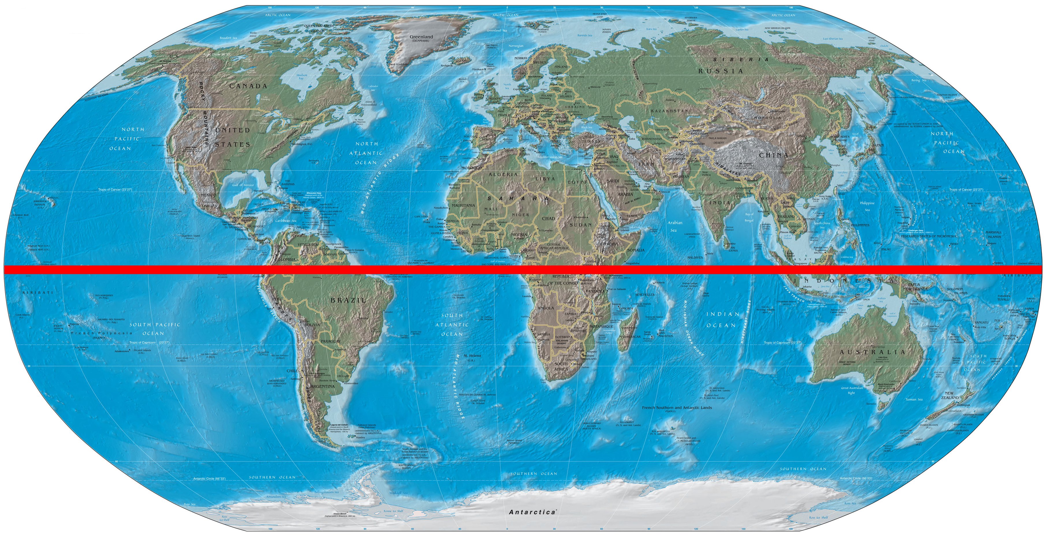
This is a naive question, but why is the southern hemisphere so much warmer?

It isn't, though. You are probably looking at the equator and may be thinking this way because southern hemisphere has much less land than the northern hemisphere, and almost all of this land has tropical weather. But most of the land is also clustered near the equator: Australia, Brazil, South Africa etc. are warm, but so are Egypt, India and Mexico. This image [1] may help.

[1] http://upload.wikimedia.org/wikipedia/commons/f/f8/World_map...

Re: Global land temperatures since 1900 visualized

#28
post #26

For more reliable comparison of temperatures, the minimum temperature should be set to zero Kelvin. Otherwise, the colour shown in the visualization is completely arbitrary, and its intensity cannot be quantitatively described.

Not sure why you are getting downvoted. In addition to your comment it would be more interesting to see a visualization over the past 5000 years rather than the past 100 years. 100 years is a small sample given the context.

Re: Global land temperatures since 1900 visualized

#29
The northern climes are the ones seeing the most heating. I think you can see it most clearly for the month of May. Set the month to May and then click backwards by year through the century, and keep focused on the northern climbs. You can see them colder as you go backward in time.

Re: Global land temperatures since 1900 visualized

#30
post #26

For more reliable comparison of temperatures, the minimum temperature should be set to zero Kelvin. Otherwise, the colour shown in the visualization is completely arbitrary, and its intensity cannot be quantitatively described.

Strongly disagree. 1. Your chart could be simplified to 'the temperature at every point on Earth is broadly always the same' - is this a useful visualisation? (Perhaps, but surely not at the same level of detail) 2. In your chart, what should the maximum temperature be set to?

Since we're talking about temperatures on Earth, it's statistically more appropriate to use a range which covers just the minimum and maximum (conceivable) temperatures on Earth.

Post reply on HN