Since we are on topic, anybody has a suggestion for an icon that represents body fat without representing an overweighted person?
An M in the shape of two large arcs. ;)
21–30 of 60 posts
Since we are on topic, anybody has a suggestion for an icon that represents body fat without representing an overweighted person?
[1] https://www.designprinciplesftw.com/collections/ten-principl...
If I could lodge a complaint to all the UI designers: please stop making all the icons look the same in order for them to have the same "style." If I'm looking at a grid of essentially identical white-on-black pictograms with overlapping forms composed entirely of outlines with no variation in thickness or stroke, then you might as well just use actual words at that point.
As a general rule icons take up less horizontal space than actual words describing what they do, which is why designers prefer to use icons.
If I could lodge a complaint to all the UI designers: please stop making all the icons look the same in order for them to have the same "style." If I'm looking at a grid of essentially identical white-on-black pictograms with overlapping forms composed entirely of outlines with no variation in thickness or stroke, then you might as well just use actual words at that point.
In icon sets, variations in stroke thickness is a bad idea, without changing the context. People who can't evaluate design issues would simply categorise the product as "something's off here", or "I don't trust this". Your iconography has an impact at a deeper level.
If you're designing a B&W icon set, at least make sure that each one has a very eye-catchinge, different outline.
In the 10+ years I've been running a UI/UX design firm for software companies, I've come to the conclusion that icon design, is not very different from logo design and brand design. A Nike swish logo by itself, without context of the brand we have with it today, is just a random piece of graphic. The pixels itself are worth practically nothing. But because when we see the Nike logo, we feel something (Athleticism, mo…
https://www.pngkit.com/png/detail/204-2044131_spells-heroes-...
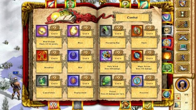
Clear, quite colorful, and they communicate the spell function well. In the worst case, they're easy to memorize. I still like the black&yellow style.
HOMM1 is also good.
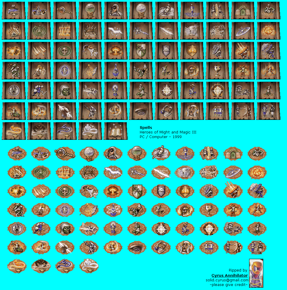
Heroes of Might and Magic 3 made them more decorative, but they're still clear: https://www.spriters-resource.com/resources/sheets/38/41309....
HOMMIV spells - what do these do? https://images.gog-statics.com/e0b6ea10a02d03060d95cb9f79ebc...
Might and Magic Heroes 5 - you need an art historian to figure these out. http://www.heroesofmightandmagic.com/heroes5/spells.shtml
In the 10+ years I've been running a UI/UX design firm for software companies, I've come to the conclusion that icon design, is not very different from logo design and brand design. A Nike swish logo by itself, without context of the brand we have with it today, is just a random piece of graphic. The pixels itself are worth practically nothing. But because when we see the Nike logo, we feel something (Athleticism, mo…
One thing to be aware of with both names and logos, is potentially what the name/logo may mean in other places throughout the world.
Earlier quoted context omitted.
You can use a icon just to rappresent fat (like this one https://www.flaticon.com/premium-icon/fat_1951542 ) and put it next to a person like a emblem in a similar way to this: https://www.iconfinder.com/icons/2740474/personal_protection... hope i did convey the idea. edit: You should probably use a icon like this one https://www.iconfinder.com/icons/830113/character_figure_man... for the person instead the one i lin…
The problem of using words in an icon is that it only means anything for the people who speak that language.
But even without the text it still has some problems, since without context you may think it mean body hydratation level or blood, unless you use colors (yellow, blue and red ) to distinguish between them, but even then, they are not always available/possible and pose accessibility problems, for visually impaired (is the correct word?) etc...
you could also use the text, if you target a specific locale, or also localizing the icons may make sense.
Since i don't know where this icons will be used i don't know what the best solution and i don't have a perfect solution.
I hope I have explained myself better.
edit: grammar
The author has criticised the design of the "electric power steering system warning light" icon without suggesting a better alternative. What's the point of criticizing then? Some concepts are easier to depict literally, others are not. The most important part about the car icons is the color: an orange icon means you can go, a red icon means you must immediately stop.