Am I the only one that wishes the article about the font "made for screens" went into more detail about what makes this specific font better for screens?
Hello, I’m Rasmus. I’d love to dig deeper into these subjects — the details into rasterization and realities of layout engines (or “shapers”) that are out there. Perhaps in another interview or article :–)
> How do you define 'core set of glyphs'? There are more than 150 different written scripts in the world — at least those that are well-recognized. Only a small portion of them are Latin-based ... Then, there's the Greek alphabet which is similar to Latin as well as Cyrillic. Then we have Arabic and Hangul
> Within the first year, before making it open source, I had something that covered the 200 most common Latin characters.
Seems like most of the time spent on Inter was the result of the creator not properly limiting his scope. Later he even talks about how the Cyrillic characters in his font seem completely wrong to actual users of Cyrillic because he can't read Cyrillic. As someone who deals with multiple different scripts on my computer, I always hated the fonts that try to set a uniform style for every script when many of the designers clearly had no idea how many of these scripts worked. It really only makes sense to try to support every script for fallback fonts like Unifont. Rarely do typographic concepts translate well between scripts. If you want an example, install the CJK font "Hana Mincho" and type some English text in it: It looks atrocious.
Is it just me or does Inter look like a clone of Helvetica?
It's not just you... I think it reminds us of Helvetica because it borrows some common elements from Helvetica that are frequently changed in other Helvetica-like faces. For example, the ascender on the lowercase "t" is horizontal, unlike Arial. The apertures are also relatively tight, like Helvetica, and the x-heights are similar. I wouldn't say it's a clone though; it manages to look a little more humanist without…
Well observed. There are a myriad of influences in Inter, some from existing fonts, some from graphic design and shapes I’ve seen in my surroundings and some ideas that grew out of thoughts. For instance, the bend of the “t”, “f” et al just felt right and was not influenced by anything else but their own shapes. In contrast, the “a” was inspired by many existing typefaces like Akzidenz Grotesk, Helvetica, etc. The shapes of the glyphs, spacing and angles of Inter have gone through a long evolution during the past three years. For instance, “e”, “1”, “s”, “g”, “n”, “m”, “d” (and several others) changed a lot early on.
The most it resembles is the San Francisco font (Apple's default system font) which itself was inspired from Helvetica and DIN. Personally I liked this font much better than the other opensource alternatives, especially with the number of weights it offered. I am glad it's gotten popular.
Did Apple reuse the San Francisco font name? Man, they really aren’t in touch with their roots.
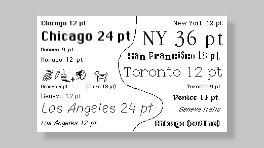
The original San Francisco was designed by Susan Kare. You can see it here. [1]
Roboto is installed default on many systems, specially on phones. The speed factor to me is key. That's why I avoid using webfonts. I use both San Francisco for those on Mac and iOS and Roboto for the rest of the mortals, including other san-serifs.
Link to the font: https://rsms.me/inter/ I am not one who gets worked up over typefaces so my short take is "yet another san-serif font" but the discussion about why he chose to do things in certain ways was useful for me in appreciating how this font differs from other, similar offerings.
I am at once awed by the level of work that goes into a really good typeface, and also astounded that this still seems to be a difficult sort of terrain that people are not just willing, but positively excited to summit. Why go to the trouble when your font is only going to be seen by a small number of people and used by even less? Are you really having any ideas that haven't been had already in plenty of other fonts? Will your extra 0.001% tweak to readability make life easier for 0.001% of people that read something written in it?
Link to the font: https://rsms.me/inter/ I am not one who gets worked up over typefaces so my short take is "yet another san-serif font" but the discussion about why he chose to do things in certain ways was useful for me in appreciating how this font differs from other, similar offerings.
I am at once awed by the level of work that goes into a really good typeface, and also astounded that this still seems to be a difficult sort of terrain that people are not just willing, but positively excited to summit. Why go to the trouble when your font is only going to be seen by a small number of people and used by even less? Are you really having any ideas that haven't been had already in plenty of other fonts…
There are font nerds just like there are nerds for a million other things. Their passion is fonts, so yes, they will spend that amount of time on it.
Am I the only one that wishes the article about the font "made for screens" went into more detail about what makes this specific font better for screens?
Hello, I’m Rasmus. I’d love to dig deeper into these subjects — the details into rasterization and realities of layout engines (or “shapers”) that are out there. Perhaps in another interview or article :–)
Look forward to it. Please do submit to HN if you ever do another interview diving into the details!
The most it resembles is the San Francisco font (Apple's default system font) which itself was inspired from Helvetica and DIN. Personally I liked this font much better than the other opensource alternatives, especially with the number of weights it offered. I am glad it's gotten popular.
Did Apple reuse the San Francisco font name? Man, they really aren’t in touch with their roots. The original San Francisco was designed by Susan Kare. You can see it here. [1] This makes me feel old. 1. https://images.fastcompany.net/image/upload/w_596,c_limit,q_...
This comes up every time San Francisco is mentioned...
Am I the only one that wishes the article about the font "made for screens" went into more detail about what makes this specific font better for screens?
Verdana is a great example of a font designed for low-resolution screens[1]. What’s interesting is that Ikea chose to use Verdana for many of their print & in-store display material[2]. To me it looks a bit blocky and unfinished, which actually is a not a bad look for Ikea. [1] https://www.moma.org/collection/works/139312 [2] https://www.google.com/search?q=ikea+verdana&rlz=1CDGOYI_enG... :
Verdana has great number designs. Each is very distinct and readable. Especially when large like how IKEA used it.