I'm confused - isn't this the wrong graph? Shouldn't we be looking at a histogram showing return multiple on the x axis and # of companies in that group on the Y? Or, alternatively, return decile on the x, and total return value on the Y - this would probably end up looking somewhat bimodal, right?
http://zachaysan.tumblr.com/post/1431828646/paul-graham-is-r...
Yes, I think there's a good deal of confusion about the appropriate axes - or at least talking past one another on these points.
If you take those data and throw them on a graph that looks more like Fred's, you get something that's downward sloping, but not nearly as smooth or severe as a power law curve: http://christinacacioppo.com/downloads/irrData.jpg
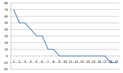
This isn't to say that one way of looking at this is better than another -- just that there seems to be two trains of thought right now.