Isn’t it trivial to show impossible colors in VR by texturing an object in different colors like blue and yellow for each eye’s perspective?
Traditional displays (such as what would be used in vr goggles) do not produce yellow light. You only get reddish-green with rgb colors
Impossible color
21–30 of 61 posts
Re: Impossible color
#22Earlier quoted context omitted.
Isn’t brown just a reddish green. Or a greenish red.
In substractive color theory, yes, you’ll end up with a brown when mixing red and green in near equal parts. Keep in mind that the red and green you’ll be mixing is not 100% color pigments, so it cannot merge into a dark grey.
Re: Impossible color
#23Isn’t it trivial to show impossible colors in VR by texturing an object in different colors like blue and yellow for each eye’s perspective?
Traditional displays (such as what would be used in vr goggles) do not produce yellow light. You only get reddish-green with rgb colors
Re: Impossible color
#24Re: Impossible color
#25Earlier quoted context omitted.
In substractive color theory, yes, you’ll end up with a brown when mixing red and green in near equal parts. Keep in mind that the red and green you’ll be mixing is not 100% color pigments, so it cannot merge into a dark grey.
Can you elaborate on why your don't get grey? That was always what I expected and I was surprised that you just get a muddy brown if you mix random paints.
The website https://www.handprint.com/ is also very good.
In practice it is possible to mix a grey from coloured paints, but you need disproportionately much blue. Brown is just dark orange, and blue is the complementary colour to orange, so you need to move in the blue direction if you want to get to grey. Also, if you're using red, yellow and blue, you generally need less yellow than red. Try a ratio of 1:2:4 = R:Y:B.
Re: Impossible color
#26Is this something to do the THAT DRESS?
Impossible colors are derived from the frequency-response curve of the three standard pigments in the retina. (There are people with 2 pigments and thus have a reduced color space, and people with 4 pigments who have an increased color space.) Since the pigments are not evenly distributed, the brain synthesizes some colors from incomplete information.
The dress problem stems from luminance-color correction in the brain itself. The eye has quite an amazing dynamic contrast ratio, but a much narrower static contrast ratio. If you have picked up on clues that the photograph was over-exposed in one way, your brain interprets that as a signal that the colors are washed out. If you have picked up on clues that the photograph is undersaturated, your brain says that the colors should be brighter than the pixels are. The photograph in question gave ambiguous clues.
Re: Impossible color
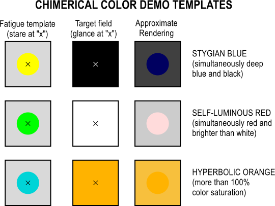
#27Playing off the "chimerical color" examples - it's possible to approximate the effect of "imaginary colors" (activation of only one cone cell type) by fatiguing the other two and then looking at the target color. e.g. staring for a while at #FF00FF and then switching immediately to a #00FF00 makes the green "pop" in a strange way.
https://upload.wikimedia.org/wikipedia/commons/5/56/Chimeric...
Re: Impossible color
#28When adjusting paint colors if what you have is too red “or on the red side” you can correct it by adding green. If what you have is on the blue side add yellow then kind of straighten out the undesirable green by adding a smidge of red. This is the sort of thing a skilled shader technician would do to match automotive or sign paint. I did this for a while for PPG You might find playing with the LAB color scale in ph…
Re: Impossible color
#29Earlier quoted context omitted.
In substractive color theory, yes, you’ll end up with a brown when mixing red and green in near equal parts. Keep in mind that the red and green you’ll be mixing is not 100% color pigments, so it cannot merge into a dark grey.
Can you elaborate on why your don't get grey? That was always what I expected and I was surprised that you just get a muddy brown if you mix random paints.
For opaque paint, it’s weirder: paint scatters and absorbs, so white light goes into the paint layer and starts bouncing around. The resulting reflectance spectrum you see is a function of the ratio of absorption and scattering across the spectrum. Mixing paint mixes the absorption and scattering spectra. One weird result is that adding white can increase a paint’s saturation. (Think of adding apparently-black blue food coloring to white frosting.) Weirder still is you can have two identical-looking paints that, mixed with a third paint make different shades depending on which you use. As a related weird example, yellow plus black can give you a blueish-gray, since the black paint may absorb yellow more than blue (so long as it doesn’t scatter much that’ll still look black) and the yellow will scatter some blue and not absorb all blue (it’s not perfect). So when you mix those you can get something that scatters blue more than it absorbs it and absorbs yellow more than it scatters it. But pick a different black and you’ll get a different result! Color theory is tricky stuff; paint mixing is perhaps the least intuitive part of it.