Earlier quoted context omitted.
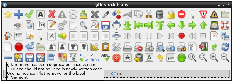
So the rule of thumb is that: if the pictogram is always same, then as in Shannon's model, it conveys no information, and thus is decorative. Discard it. One of first programs that put pictograms in menus was Microsoft Word. But the way Word did it was entirely different from what we do now. Microsoft Word had toolbars and their buttons, of course, were mostly pictorial. Toolbars could be turned on and off and users…
> thus is decorative. Discard it. Or keep it since decoration makes interfaces feel more alive. Not everything NEEDS to be useful
Purely decorative parts are also possible (and even desirable), but they should be personal. A set of colors chosen by the user, a background texture, a picture that the user keeps on the desktop and so on.