Live data from Hacker News

Why is the world losing color?

culture-critic.com

191–200 of 309 posts

Re: Why is the world losing color?

#191
A lot of this stuff is just designers imitating each other. You see this a lot in web design where every website uses similar colors, fonts, visual language etc. I've worked with a few good designers that do actual original design where the point is to be different in a tasteful way. Standing out from the grey masses. If you get a lot of people copying each other, it all averages out to the same bland/boring stuff.

A lot of Hollywood productions these days are sequels, re-runs, and endless variations of successful movies. Down to copying stylistic elements, color grading, etc.

I love Tim Burton and Wes Anderson as directors. Both use vibrant, saturated colors and have a very recognizable style. Tim Burton uses lush, saturated colors to portray suburbs (many of his movies feature lush green lawns white picket fences, etc.).

And Wes Anderson has his famous style of exactly centered subjects,using a lot of surrealist visuals, and elaborate sets and models. I loved the little Roald Dahl thing he did on Netflix two years ago or so (The Wonderful Story of Henry Sugar) where all of this was on display. If you haven't seen that, worth a watch.

Re: Why is the world losing color?

#192

It's not "losing" color. At periods when technology resulted in new color possibilities, people went overboard with color. Make all the things colorful!! Think of the technicolor sixties. And we can go back in history and see the same thing with new clothing pigments, new paint pigments. But when everything is colorful, nothing stands out. Everything being colorful is as monotonous as everything being, well, monotone…

> Making it the main element in everything is just overdoing it. It's bad design.

I disagree. The 60s through the 80s had a wide color palette with extremely good design. Early 1900s too. Heck even the Greek statues were extremely colorful.

Re: Why is the world losing color?

#193
post #178

Earlier quoted context omitted.

The drained-color thing is exclusive to a certain type of TV/movie drama, and then also a serious technical problem involving HDR device-side (which is a whole other story). But if you watch any comedy, or reality show, or plenty of "normal" dramas, on a regular TV, the color is normal. However, yes, there has been a certain trend involving Christopher Nolan, "gritty realism", and legal-political-military-crime theme…

> The drained-color thing is exclusive to a certain type of TV/movie drama It's not. There's even a term coined for it, "intangible sludge". https://www.vox.com/culture/22840526/colors-movies-tv-gray-d... > I don't like it much but you can also just not watch that stuff. It's now permeated everything, so it's hard to not watch stuff, as it's everywhere, with few exceptions.

Right. For a long time I wondered what's going on, and eventually started believing it's my fault - that maybe I'm just a rare HDR-poor person watching TV shows on SDR computer displays, maybe I've hit an unusual corner case in the video decoding path, or something. I kept believing that until Star Trek: Picard, Season 3, which made it clear it's not me, it's them.

The whole show, like everything in the past decade or so, was dark and washed out (except for some space FX parts, where at least some colors were saturated, sometimes). This lasted up until the last two episodes, where for plot reasons[0], some protagonists found themselves onboard a ship from TNG-era shows (1980s - 2000s), pulled straight from a museum, which means the set was recreated as it was on old shows, complete with the lighting. From that scene onwards through the final episode, as it jumped between that one special set and every other dark and gray scene, I had proof in front of me that scenes in modern shows can be properly lit, they just aren't, and it's an active choice[1].

Importantly, this scene wasn't a one-off gimmick that risked coming out too bright on normal people's HDR-enabled TV screens. The set involved was, per the showrunner, pretty much the whole raison d'etre for the entire season, and they burned most of the season's budget on perfecting it[2]. Them being able to light it well (and have it coexist with every other badly-lit scene) only proves there's no technical obstacle involved - that dark and washed out TV is just a choice everyone's making for... unclear reasons.

--

[0] - Hard to navigate around a major spoiler and highlight of the era in the franchise.

[1] - Actually, I can't give this scene enough justice. But given how massive moment that was for people following the franchise, I'll just provide a link to the video (SPOILER WARNING): https://youtu.be/t-mY4Xbjyn8?t=42 -- watch in max quality; compare okay-ish exterior CG early on, observe how dark and washed out scenes with people are - and this is literally how the entire season (and really, entire show) was until that point... or just scroll to 2:27, and then on a perfect cue - "computer, lights!" - observe how next 30 seconds reveal that everything could've been properly lit from the start, but for some non-tech reason, it wasn't.

[2] - Most of that was eaten up by casting very specific people, but the set itself was damn expensive too.
Re: Why is the world losing color?

#194
What I find infuriating is to see colors stripped from children’s toys and clothes, especially by Northern Europe brands. Those dull beige taupe tones might attract parents but I’m sure that they bring little joy and stimulation to children.

Re: Why is the world losing color?

#195
post #164

Earlier quoted context omitted.

> I don't want constant "riotous color", as the article puts it, in my home, or my workplace, or while I'm driving. It's visually exhausting. could a factor driving current monotone style be less about aesthetics and taste and more that we're all just cognitively exhausted? everything is fighting for our attention because our attention has been monetized. so when something bland shows up, it simultaneously provides a…

I think the sensory load idea is productive, but I'd add a related idea of drawing attention to key things only. I don't care if my kettle looks "professional"; one is pink, another is orange. But I prefer walls around me to be white or very lightly colored, not, say, intensively red. That would constantly distract me. Code in my editor is colorful like a Christmas tree, bur most of the interface is muted beige and g…

I have a different take on interior wall colors: any shade too far off from white actually darkens the room no matter the color.

Paint colors subtractively from light: you never get more light into a room when you're knocking out wavelengths rather then reflecting them. Whereas with whiter walls you always have the option of manipulating color by using colored lighting.

Re: Why is the world losing color?

#196
I loath the lack of vibrancy in modern design and fashion. So dull, so boring, so agreeable. Thankfully it allows people who do have a bit of personality to easily stand out if they want to. Still waiting a red MacBook pro

Re: Why is the world losing color?

#197

Earlier quoted context omitted.

Another thing that might also play a role is this styling trend of vehicles looking "meaner" and more and more aggressive. This was discussed[1] a bit on HN a while ago. Bright colors don't really match the "My vehicle is going to punch you in the face" styling (for cars and especially trucks) that has become popular. 1: https://news.ycombinator.com/item?id=32425520

Literally every vehicle seems to have that diagonal line incorporated somewhere. I mean the one generally near the windows that slopes downward as it moves towards the front of the car, regardless of the general shape of the car itself.

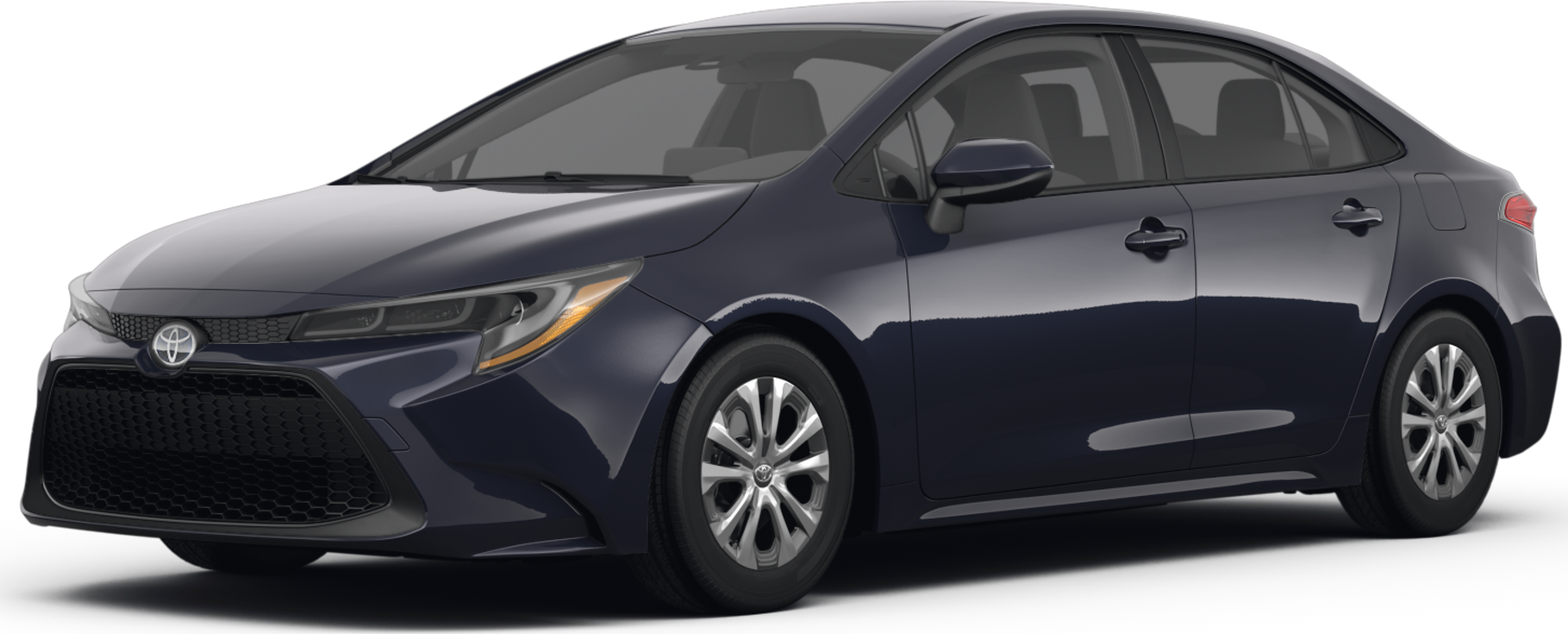
I assume you mean the line near the handles on this Corolla [1]? That whole part of the car is doing a lot of different things.

1. Flat vertical panels are a no-no. Adding creases increases buckling resistance.

2. That's a hugely important area for cabin noise because the side mirrors cause turbulence and the vehicle body needs a channel to constrain the turbulent flow and flex as little as possible near the door seals.

3. The skin needs to expand outwards from the line of the pillars to fit the window mechanisms, the handles/locks, and the side impact protection without intruding into the cabin space.

4. It makes the car look more sporty and interesting. The technical term for the crease itself is "character line", and it's the main reason why the Corolla has one. It's visual reinforcement for the modern standard combo of low hoods-high trunks that's considered attractive styling.

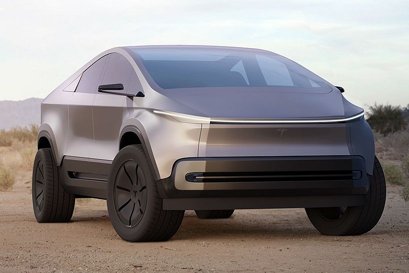
5. The greenhouse (cabin) narrows towards the top for rollover safety and aerodynamic reasons (a.k.a tumblehome), and this needs to blend with the rest of the body in a visually appealing way. The cybertruck is a good example of how unusual it can look if this is just a straight line on the body. Here's a comparison between the current design and an ai-generated "rounded" design [2] [3].

[1] https://file.kelleybluebookimages.com/kbb/base/evox/CP/44005...

[2] https://www.motortrend.com/files/67a2770e2906d20008bad29f/1-...

[3] https://static0.carbuzzimages.com/wordpress/wp-content/uploa...

Re: Why is the world losing color?

#198

Earlier quoted context omitted.

> I don't want constant "riotous color", as the article puts it, in my home, or my workplace, or while I'm driving. It's visually exhausting. could a factor driving current monotone style be less about aesthetics and taste and more that we're all just cognitively exhausted? everything is fighting for our attention because our attention has been monetized. so when something bland shows up, it simultaneously provides a…

> we're all just cognitively exhausted? If you include electronic media as a source of this cognitive exhaustion, then I'm with you. If greyscale dominates the physical environment, then it's a reaction to something equally pervasive.

> If greyscale dominates the physical environment, then it's a reaction to something equally pervasive.

My impression from the data is not that greyscale now dominates the physical environment, but that browns once dominated. Presumably because things like wood, copper, etc. once dominated the materials we engrossed ourselves in. As we've expanded the paints and other materials we live with, we've found much more balance.

Re: Why is the world losing color?

#199
The chart with car colors has been famous for a few years. However I'm seeing an inverse trend in past 1-2 years (at least in France); new cars are getting very colorful. For example:

- Renault Clio is very popular in metallic orange

- Renault 5 e-tech in bright yellow and green

- MG in aqua/azure blue

- Peugeot 208 in dark yellow and blue and dark red

Re: Why is the world losing color?

#200
post #78

Earlier quoted context omitted.

> But when everything is colorful, nothing stands out. Everything being colorful is as monotonous as everything being, well, monotone. This is meaningless. "When many things are different, everything is the same". Its a sentence that seems meaningful, but actually is not. It's just abstraction without generalizing. "000000000000000000000000000" is a sequence just as something as "H90F3iJsjo$(4Opla1zSKX@)!2k" because…

I would describe it more as noise... When there are loud, clashing color patterns everywhere, it all turns into noise and nothing really stands out. It's like watching analog TV with poor reception... there's stuff there, but really hard to make out or focus. I'm with GP on this, I'd prefer most things be somewhat subdued and letting key pieces come out. The subdued doesn't have to expressly be a shade of gray or bro…

Modern SCADA systems are designed like this too. They used to be a riot of programmer art in primary colours, with most things blinking at any one time. Now they’re grey-on-grey for anything “nominal” with alarms in orange or red. Far less migraine inducing and far easier to see the important things.
Post reply on HN