Live data from Hacker News

How did Tropicana lose $30M in a packaging redesign?

bootcamp.uxdesign.cc

181–190 of 278 posts

Re: How did Tropicana lose $30M in a packaging redesign?

#181
post #133

I looked at the title, opened the link, searched for “Peter Arnell,” got zero results, and knew the article was total garbage. https://www.cbsnews.com/news/arnells-explanation-of-failed-t... I had a close friend who worked on a project where they brought this guy in. Charged $1m a month and invoiced his jet fuel to the company, if I remember correctly. Now you know where the $30M actually went. The article is an exam…

This article is massively over thinking it.

The problem is the lack of a the word TROPICANA written really big on the carton.

I doubt people ‘stopped relating to it’ because of the lack of straw. They just didn’t know it was Tropicana at a glance, figured it was sold out and bought something else.
Re: How did Tropicana lose $30M in a packaging redesign?

#182
post #133

I looked at the title, opened the link, searched for “Peter Arnell,” got zero results, and knew the article was total garbage. https://www.cbsnews.com/news/arnells-explanation-of-failed-t... I had a close friend who worked on a project where they brought this guy in. Charged $1m a month and invoiced his jet fuel to the company, if I remember correctly. Now you know where the $30M actually went. The article is an exam…

This is why I love HN. I am the OP, and your comment made me realize what the article was missing.

Re: How did Tropicana lose $30M in a packaging redesign?

#183
post #2

It is my theory, backed up by nothing but instinct and my own very fallible personal experience, that many customers simply did not “see“ the new design. That is, they would have preferred to buy Tropicana but assumed it had disappeared from the shelves.

The eye-tracking heat map GIF in this article supports this too. Before everyone saw the logo, after they didn't. My first thought when I saw the new one was that it looks like an own-brand product, that heatmap probably explains why.

Re: How did Tropicana lose $30M in a packaging redesign?

#184
post #133

I looked at the title, opened the link, searched for “Peter Arnell,” got zero results, and knew the article was total garbage. https://www.cbsnews.com/news/arnells-explanation-of-failed-t... I had a close friend who worked on a project where they brought this guy in. Charged $1m a month and invoiced his jet fuel to the company, if I remember correctly. Now you know where the $30M actually went. The article is an exam…

This article is massively over thinking it. The problem is the lack of a the word TROPICANA written really big on the carton. I doubt people ‘stopped relating to it’ because of the lack of straw. They just didn’t know it was Tropicana at a glance, figured it was sold out and bought something else.

I think the lack of an orange with a straw coming out probably *was* a huge part of the issue. Both boxes have Tropicana written really big on the carton, although one is slightly smaller and sideways.

A box with an orange with a straw looks like a Tropicana box, even if you can't read, and it's a visually engaging image.

The redesign looks like supermarket generic juice packaging, the orange with a straw is as distinctive as the Coca-Cola or Pepsi logo.

Re: How did Tropicana lose $30M in a packaging redesign?

#185

What seems to be lost in these “redesigns” is the why : why are you doing it? If there isn’t a list of benefits long enough to justify the cost and possible risk, well, that’s a problem. There’s also a tendency for companies to be super proud of what they’ve done so they neglect methods like A/B testing and instead just bet the farm on their great new design. After all, it cost a lot of money and looks cool to the de…

I think a lot of times a redesign is simply used as a tool for a manager/exec to have an impact, any impact really. It does not matter so much if the net result is positive or negative. It looks good on their resume. "Joined company X and spearheading redesign project of X". Designer companies love it, they can let their imagination run wild and the managers will gobble up whatever they come up with.

This happens on all levels really. If it is a huge company like Pepsi or Tropicana or for example my high school which "rebranded" and all the students including me had to stamp thousands and thousands of exam paper with the new logo.

Re: How did Tropicana lose $30M in a packaging redesign?

#186
post #133

I looked at the title, opened the link, searched for “Peter Arnell,” got zero results, and knew the article was total garbage. https://www.cbsnews.com/news/arnells-explanation-of-failed-t... I had a close friend who worked on a project where they brought this guy in. Charged $1m a month and invoiced his jet fuel to the company, if I remember correctly. Now you know where the $30M actually went. The article is an exam…

We had a discussion on this in design school... our consensus which the heat map also supports is that Tropicana failed to realize the strength of their logo.

It's not the orange since after all Tropicana makes a lot of different juices. It's the logo. Writing it vertically in a different font destroyed brand recognition and consumers simply failed to find the product on shelves. This agrees with the articles suggestion that they genericized themselves.

Re: How did Tropicana lose $30M in a packaging redesign?

#187
post #133

I looked at the title, opened the link, searched for “Peter Arnell,” got zero results, and knew the article was total garbage. https://www.cbsnews.com/news/arnells-explanation-of-failed-t... I had a close friend who worked on a project where they brought this guy in. Charged $1m a month and invoiced his jet fuel to the company, if I remember correctly. Now you know where the $30M actually went. The article is an exam…

This article is massively over thinking it. The problem is the lack of a the word TROPICANA written really big on the carton. I doubt people ‘stopped relating to it’ because of the lack of straw. They just didn’t know it was Tropicana at a glance, figured it was sold out and bought something else.

Yep. Replace the prominent brand logo of a consumer product with something in a generic sans serif font (in a different orientation!) and people are going to think it's a generic alternative and skip straight past it, straw or no straw. There's no straw on the Tropicana in my fridge...

I mean, I imagine younger McDonalds customers feel far more emotional connection to the brand's clown than anyone does to a straw, but replacing Ronald with some "healthy eating" pictures isn't going to kill sales at a branch nearly as much as quietly replacing the golden arches with an "M" in Generic Gothic...

Re: How did Tropicana lose $30M in a packaging redesign?

#188

Earlier quoted context omitted.

I suspect the "why" is most simply explained by "because designers had to justify their salaries."

I worked on a website that was completely redesigned every few years. We, the developers, didn’t understand why until one of the business people, who was leaving for a new job, admitted to us that they (the business management team) mainly did it because it was fun, because it let them expense meetings/travel/food doing “research” and meeting with design consultants, because it gave them something to do other than th…

It's similar to how some development choices are made too. Examples: Rewriting the system in a new language, change a framework or create your own from scratch.

I have fallen into that trap myself. I have read about some exciting new tech in a blog and want to try it out in a POC. There may be some excitement around it and suddenly it becomes a MVP and placed into production. Eventually it evolves into "legacy code" that developers hate to touch. The right approach is sometimes to step back, and rewrite the POC in a language/framework that can be supported by others.

Re: How did Tropicana lose $30M in a packaging redesign?

#189
post #153
post #133

I looked at the title, opened the link, searched for “Peter Arnell,” got zero results, and knew the article was total garbage. https://www.cbsnews.com/news/arnells-explanation-of-failed-t... I had a close friend who worked on a project where they brought this guy in. Charged $1m a month and invoiced his jet fuel to the company, if I remember correctly. Now you know where the $30M actually went. The article is an exam…

The article also praises the design of the new lid, which was - surprise - one of the most derided elements of the redesign in professional product design comminity. The idea was that you'd feel like squeezing an orange when opening the carton. In reality, you'd be squeezing that nipple to get to your OJ. Worked out as expected.

It's not a nipple it's just an orange shaped cap, when they say squeezing an orange they don't mean squishing it they mean rotating half an orange on a juicer.

Think the rest of the design deserves derision but don't see anything wrong with the cap assuming it's grip-able.

Re: How did Tropicana lose $30M in a packaging redesign?

#190

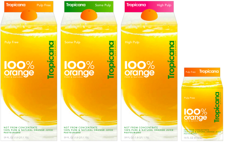
The new design doesn’t mention the pulp level and that’s one of the main things I’m thinking about when trying to pick out an OJ. So when you pair that with a redesign, it’s unclear to me what’s in the carton.

For some reason the image used there doesn't show it but you can see what they had in mind here [1], still could be clearer.

[1]: https://www.thebrandingjournal.com/wp-content/uploads/2015/0...

Post reply on HN