Live data from Hacker News

Dropdowns Should Be the UI of Last Resort

lukew.com

151–160 of 241 posts

Re: Dropdowns Should Be the UI of Last Resort

#151
post #76

If you want to see the images in actual 1:1 resolution, here is how: * Click on the image in the text. * Click on the image in the tweet. * Right-click on the image in the pop-up. * Open image in new tab. * Change the "large" at the end of the URL to "orig". Load that URL. Congrats, you now see a huge (blurry upscaled) image that you can actually read. You are out 3 times the network traffic that was needed. Why woul…

While I completely agree with you - it's an ridiculous choice - you can just right click and click "Open Image in New Tab" in Chrome. Which ironically is located on the authors own domain.

Those aren't actually the full size images. It looks like the author has replaced the image links to go directly to the full size image now.

Example: http://static.lukew.com/dropdowns_compare_2x.png

Re: Dropdowns Should Be the UI of Last Resort

#152
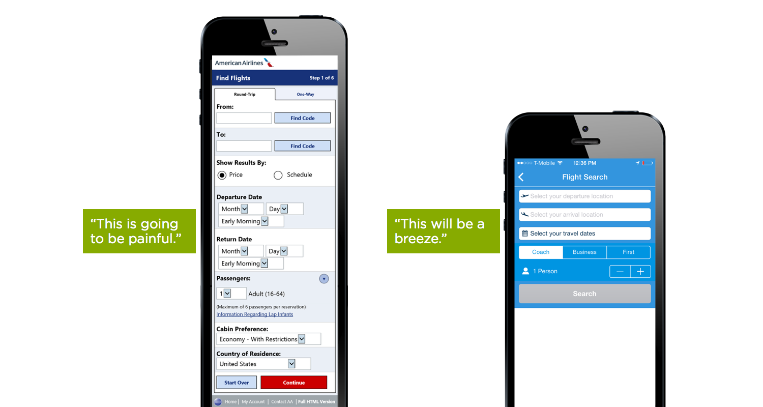
The article glosses over the two hard selections - from/to airport, and date. For both of those, the number of options is large. The author offers no advice on that hard problem. His suggested UI would seem to force the user to bring up a keyboard and type airport codes.

Re: Dropdowns Should Be the UI of Last Resort

#153

The article glosses over the two hard selections - from/to airport, and date. For both of those, the number of options is large. The author offers no advice on that hard problem. His suggested UI would seem to force the user to bring up a keyboard and type airport codes.

at the very end of the article it states "All these alternatives to dropdown menus don't mean you should never use them in a user interface design. Well-designed forms make use of the most appropriate input control for each question they ask". The from/to airport, at least, is a candidate for dropdown. The point of the article is that it's best not to default to "what works", and approach "what's works best" or what's most appropriate for the data to be input.

Re: Dropdowns Should Be the UI of Last Resort

#154

The article glosses over the two hard selections - from/to airport, and date. For both of those, the number of options is large. The author offers no advice on that hard problem. His suggested UI would seem to force the user to bring up a keyboard and type airport codes.

[deleted]

Re: Dropdowns Should Be the UI of Last Resort

#155
post #119

Earlier quoted context omitted.

Are you able to articulate 5 or more of those plentiful reasons? The reasons I can think you would desire to zoom in on a legible, functional, accessible website would be for curiosity, or to see a detail closer and admire the layout. There are details like this in apps all the time and I screenshot it and zoom in on my screenshot. Those are interests (I want to see that closer) that are separate concerns from me usi…

Are you able to articulate 5 or more of those plentiful reasons? At times I have zoomed in or out because: 1. I'm further away from the screen, because my screen is large. 2. I'm further away from the screen, because I am showing a website to a friend or colleague. 3. I'm displaying the site on a projector, and people at the back of the room say they can't see. 4. I'm viewing a website on my colleague's high-dpi disp…

I feel like a lot of these complaints are endemic to defining things in CSS using 'px' as units instead of more sensible (and repsonsive) modern techniques like defining type in 'pt' and widths in more complex units (percents, or mixed units).

It's possible to avoid a lot of these pitfalls with better design.

1. User far from big screen: You can zoom much faster and easier with your forearm than a pinch gesture

2. User far from screen, unusual viewing angle: how much time to you spend browsing at awkward angles versus dead-on? This seems like a small consideration that would affect some types of sites more than others. I doubt a banking website would feel the same way about this as a social media website project for example…

3. Classroom projection is decidedly not the use-case nearly any mobile website is designed to work under, unless the website is cloud-based projection software, but that's a specialty thing in itself.

4. This is why we define font sizes in PT and no PX, this isn't a mobile or responsive issue, but rather a design choice in CSS

5. Does your mobile browser include a 'reader' mode that isolates text content and provides the ability to make it more legible in these conditions?

6. Ah yes, and what's even more surprising for people is how differently Mobile Safari calculates screen dimensions between iPhone and iPad! Then the difference between how iOS and Android handle keyboards, and then the difference at how those OS's handle browser verus web-app mode. There is currently no good solution to keyboard control.

Anecdotally, we ran into an issue on Friday where an email field was autofocused and the keyboard was popping up and obscuring what you were entering. I didn't make it that way, but I did provide the solution: remove autofocus for touchscreen users: http://staticresource.com/autofocuser.html This is a way that we can have one feature for desktop users where it speeds up entry, but target mobile users separately and provide a better targeted experience for them.

    
      // Block autofocus for touchscreen users
      onload = function(){
        if(('ontouchstart' in window)||(navigator.msMaxTouchPoints>0)){
          var field = document.querySelectorAll('[autofocus]');
          for(var i=0;i
7. I hear you there, I've felt the same way when reading long texts. Any easy workaround would be to allow the user to adjust the font size of the article text on the site within reasonable limits!

8. That's usually a problem with the difference between 'pixels' on your screen and CSS 'px' units. Defining layout in other units in CSS can avoid this problem on HiDPI displays.

9. Testing, testing, testing. I make sure to supply well-made fonts, I use a special set of CSS rules that control the rendering of text display so that the same font renders the same thickness in all browser's and OSes, and with those differences out of the way I can move forward using only weights that work (usually no lower than 400 weight unless the size being displayed is very large) and be sure that they are legible everywhere. Here's my snippet (and honestly, this cuts out SO many other common text rendering bugs):

    *,
    *:before,
    *:after {
      text-rendering: optimizeLegibility;
      -webkit-font-smoothing: antialiased;
      -moz-osx-font-smoothing: grayscale;
      font-kerning: auto;
    }
10. My job is to make sure that the experience of the desktop site, with all of its abilities, functionality, and information, are displayed in an equally recognizable, usable way on mobile. I don't cut features, I don't ever assume a mobile user or desktop user won't want anything. My job is to make it just as great everywhere.

11. Turn your brightness down, you only have one set of eyeballs.

12. I'm not sure panning and zooming will help you feel better when the room is spinning so fast you can't read.

I'm not dismissing these reasons, I believe many of them are small or fleeting and to change an entire project for one of these whims seems short-sighted. Other reasons listed here are 100% valid, and workaround can be found without enabling zooming.

For projects where zooming makes sense I wouldn't have it any other way, but I don't see a compelling case listed here to always have zoom enabled.
Re: Dropdowns Should Be the UI of Last Resort

#156
post #76

If you want to see the images in actual 1:1 resolution, here is how: * Click on the image in the text. * Click on the image in the tweet. * Right-click on the image in the pop-up. * Open image in new tab. * Change the "large" at the end of the URL to "orig". Load that URL. Congrats, you now see a huge (blurry upscaled) image that you can actually read. You are out 3 times the network traffic that was needed. Why woul…

my guess is he is mining for twitter interactions. not justifiable IMO, but a reason nonetheless

On an article about saving precious clicks and time due to poor UX/UI choices, no less. Oh sweet irony.

Re: Dropdowns Should Be the UI of Last Resort

#157

On that note, is there a really basic caveman-friendly resource out there for UX-illiterate developers like me to help us make decent user experience decisions? A best practices text, or a guide for how to avoid the most obvious usability mishaps? I've had to "teach" myself most of this stuff by looking at other people's UX, but my results are still "meh" at best. Help! :)

> A best practices text, or a guide for how to avoid the most obvious usability mishaps?

https://www.goodui.org

Re: Dropdowns Should Be the UI of Last Resort

#158
post #86

Earlier quoted context omitted.

Actually, in this particular case, I'd argue that this is incredibly relevant: Preacher preaches against UX sin. Commits UX sin with a non-zooming harlot.

No, it's not relevant at all. It's not a dumb rant against dropdowns: it's a well written piece with lots of examples and arguments that show which UX patterns are better than a dropdown for specific usecases. That's not preaching, it's explaining. Finding a small flaw in his site and using that to downplay the quality of the article and the competence of the author is shortsighted, rude and unfair. Nobody's perfect.…

It isn't really a small flaw when your article about mobile faux pas doesn't work on mobile for many.

It's just people making a comment about that fact and other people agreeing or responding with an opinion. That discussion isn't stopping anyone from discussing anything else.

Re: Dropdowns Should Be the UI of Last Resort

#159
post #76

If you want to see the images in actual 1:1 resolution, here is how: * Click on the image in the text. * Click on the image in the tweet. * Right-click on the image in the pop-up. * Open image in new tab. * Change the "large" at the end of the URL to "orig". Load that URL. Congrats, you now see a huge (blurry upscaled) image that you can actually read. You are out 3 times the network traffic that was needed. Why woul…

looks like he fixed it, now clicking on the images work

Re: Dropdowns Should Be the UI of Last Resort

#160

IMHO the best option for inputting a small integer value is the combination of a text field and a stepper, which has been around for a long time and has its own name (for touchscreen operation, the +/- buttons could be made larger and horizontally, like the steppers shown): https://en.wikipedia.org/wiki/Spinner_(computing) For dates, a calendar control would probably be appropriate. I'm a bit puzzled as to why dropdo…

Those things suck. Tiny click area requiring fine mouse control.

Are you talking about spinners or calendars?

For either, you can just enlarge the widgets to enlarge the click areas.

For spinners, one can often scroll one's mousewheel (or equivalent gesture) with the pointer inside the spinner to rapidly increase or decrease the value contained within.

The best calendar widgets I've seen also permit you to click a part of the widget -say the displayed date- to type in a desired date.

Post reply on HN