Live data from Hacker News

An Update on the Lock Icon

blog.chromium.org

151–160 of 169 posts

Re: An Update on the Lock Icon

#151
post #146

I never understood why a website served using a self-signed (and untrusted) certificate would throw up more warnings than a website served without any encryption at all. Even today, a page served over HTTP just gets an unobtrusive bit of text saying "Not secure", but if a page is served over HTTPS with a cert that expired yesterday you will get a very scary full-page warning that entirely blocks you from accessing th…

An analogy may help, imagine the website as a door. A website using HTTP is a normal door and using HTTPS is a door with a lock, where the keyring in this analogy are the trusted CAs by your browser. A website using HTTPS with an expired certificate is a door that should have a lock, but the lock no longer latches; and a self-signed certificate is a locked door with a key left in the doorknob. From a security perspec…

That makes sense in theory, but you need to think about how the average user is going to perceive these UI choices: we're posting smaller warning for less-safe things. Put another way, the average user is going to be much more concerned about using a website with an expired certificate than a website that has no protection at all.

Put a third way: to the average user, a website behind an SSL-stripping MITM proxy is going to look more trustworthy than a website that forgot to renew their cert.
Re: An Update on the Lock Icon

#152
post #31

Earlier quoted context omitted.

For forever I used yahoo.com to login to a captive portal. I don't know why, but for some reason it worked for me when typing google.com, etc didn't work. Somehow I figured that out and stuck to it. I haven't done it in a while, though, not sure if it would still work.

I always figured this was due to DNS caching: if you got a domain you never visit, it has to actually fetch it and that triggers the captive portal login .

Exactly right - which is why neverssl.com now redirects to a randomly generated subdomain.

Re: An Update on the Lock Icon

#153
post #141

Earlier quoted context omitted.

In the escalation of security, some browsers or browsers with extensions only ever try https, so that change was necessary to handle those browsers.

I use HTTPS Only mode in Firefox. For a site like this, what I would expect is it to not accept connections on port 443, then my browser would issue a “Secure Site Not Available” error page, and I’d have to click the “Continue to HTTP Site” button to allow it to connect over HTTP for the rest of the session. What happens is it just gets served over HTTPS—the one attempted HTTPS-on-apex-to-HTTP-on-subdomain redirect b…

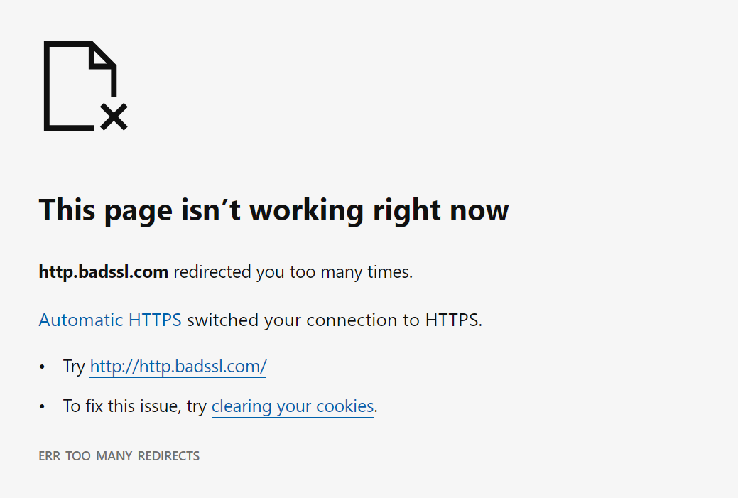
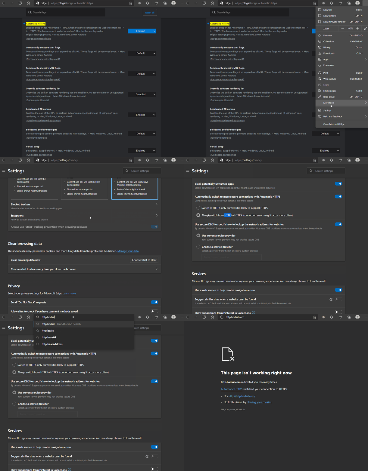
Cleartext HTTP is blocked for users on Microsoft Edge with "Automatically switch to more secure connections with Automatic HTTPS" turned on via corporate policy - which means they can't turn it off to get around the "feature".

There's also this chrome extension which can be configured by Corporate IT to disable HTTP and then they can also prevent disabling the extension.

https://chrome.google.com/webstore/detail/http-request-block...

Re: An Update on the Lock Icon

#154
post #153

Earlier quoted context omitted.

I use HTTPS Only mode in Firefox. For a site like this, what I would expect is it to not accept connections on port 443, then my browser would issue a “Secure Site Not Available” error page, and I’d have to click the “Continue to HTTP Site” button to allow it to connect over HTTP for the rest of the session. What happens is it just gets served over HTTPS—the one attempted HTTPS-on-apex-to-HTTP-on-subdomain redirect b…

Cleartext HTTP is blocked for users on Microsoft Edge with "Automatically switch to more secure connections with Automatic HTTPS" turned on via corporate policy - which means they can't turn it off to get around the "feature". There's also this chrome extension which can be configured by Corporate IT to disable HTTP and then they can also prevent disabling the extension. https://chrome.google.com/webstore/detail/http…

On Edge: https://blogs.windows.com/wp-content/uploads/prod/sites/33/2... shows an option “Try http://http.badssl.com/”; does that not work, or have things changed since that time? (https://www.eff.org/files/2021/09/21/edge_https_only.gif also shows this, in the strictest Automatic HTTPS mode.)

Re: An Update on the Lock Icon

#155
post #92
post #16

If you're using Chrome, right-click the URL bar and check "Always show full URLs", so you can see the https:// prefix like it's 1999. This also fixes a variety of UX problems with editing URLs. By the way, does anyone know of a good alternative to http://neverssl.com ? I had been using this for years, but now it supports SSL for some unfathomable reason.

My latest annoyance with the Chrome URL bar is when certain things autofill (it might be bookmarks, but I think I see it in other frequently-visited addressed too), instead of it populating with the full URL so I can edit it, it just pops up as a piece of text to the right of where I'm typing, so I can see the URL that will fill if I hit enter but I can't edit it. It just started doing this a few months ago maybe?

The responsible people must have a way of using chrome that is completely different to our way...

Re: An Update on the Lock Icon

#156

> The new icon is scheduled to launch in Chrome 117, which releases in early September 2023, as part of a general design refresh for desktop platforms. I downloaded Chrome Canary to take a look at this "general design refresh" and... sigh. The new browser UI is now 10 pixels taller than the old one. I realize 10 pixels isn't a lot. But it's also not noting—it's half the height of the top bar on Hacker News. And this…

I created a comparison. [1] [1] https://i.imgur.com/cuCcyf1.png

I am amazed at how the UI is larger but the actually important information (the bloody URL) is smaller.

What in the actual fuck.

Re: An Update on the Lock Icon

#157

> The new icon is scheduled to launch in Chrome 117, which releases in early September 2023, as part of a general design refresh for desktop platforms. I downloaded Chrome Canary to take a look at this "general design refresh" and... sigh. The new browser UI is now 10 pixels taller than the old one. I realize 10 pixels isn't a lot. But it's also not noting—it's half the height of the top bar on Hacker News. And this…

It is not just about pixels... The line-height of the text in the address bar simply feels wrong to me. We now have more spaces but smaller, harder to see text. Feels like going backwards for me. Reminds me of the new Steam download UI, the elements are larger while the download speed is much harder to discrern. I rememember lying on bed checking on the game download speed in my high school years, now I have to get r…

It's been the trend for the past decade or so to use as little of the available rendering power as possible.

32-bit color? Naw, we're going two tone: Black and white.

8k screen resolution? Naw, we can't waste precious screen real estate on such frivolous things like borders and shading.

240Hz screens? Naw, we can't waste precious processor cycles and power on frivolous animations.

As for fonts, I get the impression that designers behind it are all in their 20s, maybe even fresh out of their late 10s. One's eyesight is usually still top notch in that age range, I know mine was; and I too dabbled in font sizes for ants because they looked cooler.

But I'm in my 30s now, and I can't stand tiny fonts anymore. My eyes aren't what they used to be, and designers by either their ignorance or naivety can't seem to respect the fact that people fucking age. I don't entirely blame them, I was that ignorant and naive bastard too once upon a time; I've grown wiser with age.

Newer/younger designers really ought to be shown how their seniors use their designs, it'll be an eye opening (pun intended) learning moment for the ones who were just naive. The ignorant ones probably can't be helped, but who knows.

Re: An Update on the Lock Icon

#158
post #133
post #84

Earlier quoted context omitted.

http://www.alwayshttp.com

That one has some sort of weird forever-loading TLS unfortunately.

I believe that's the point! (Would probably be more user-friendly if it sent a RST instead of silently dropping the connection and letting it time out.)

Re: An Update on the Lock Icon

#159

Such a cryptic lock is even more confusing. I propose a very simple, easy to understand solution: http should simply be RED https should not be indicated at all A curated list, preferably by the gov. should indicate which SSL certificates are allowed to be green.

> We will continue to mark HTTP as insecure.

Grayed out. No color indication, no icon with an exclamation mark.

Re: An Update on the Lock Icon

#160

Reading through this it's making a lot of sense, the lock icon was added to convey that the 'connection is secure', while making the assumption that the user understood it's talking about the transport layer behind the scenes. Of course, most users cannot be expected to know that kind of detail, so they would associate it with the thing in front of their eyes, the website itself. I am sticking to Firefox but as chang…

while making the assumption that the user understood it's talking about the transport layer behind the scenes I remember using an early (90s?) browser that explicitly said "Secured Connection " in the status bar with an icon that featured a depiction of a network cable. I don't remember the details, but I think that may have been in the early days of SSL.

imo it's the use of the word "secured" at all that's the problem, not the context to which it's applied. "Secured" can mean many things to many people, whereas "Encrypted" is much more descriptive as to what's actually happening and much less subject to interpretation.
Post reply on HN