Live data from Hacker News

UX clichés

uxdesign.cc

141–150 of 172 posts

Re: UX clichés

#141
post #70

Earlier quoted context omitted.

UX for laptops/desktops was solved in the early 2000. In the early 2000, my music library was a few dozens GBs played back using mpeg123 or something. Nowadays it’s a Google Play Music subscription. Things have moved to the cloud, a lot. That’s a huge change in how computers work, requiring some serious UX changes. I too hate gratuitous UI changes, but things need to keep evolving.

Spotify and Google Play Music are a kind of worse version of UI of Foobar2000, with much limited features. There was a huge UX regression coming with the move to the cloud. I'm all for things evolving, but it's better if they don't devolve .
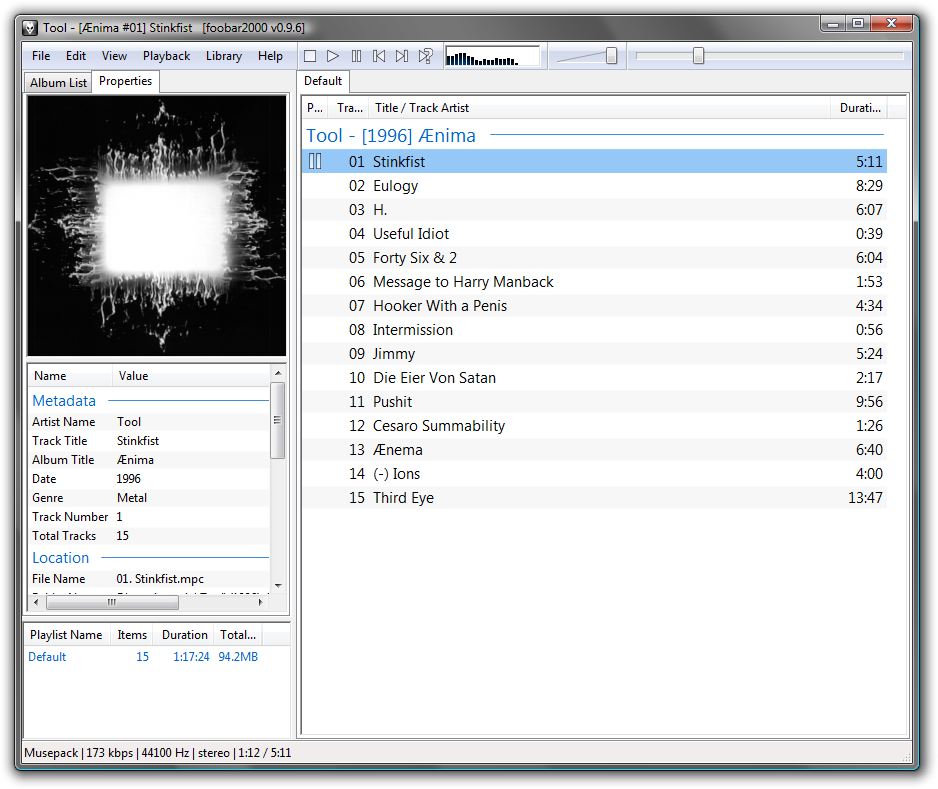
For power users, maybe. When I open a music player the first thing I'll do is search for something, and there's no search box at all here: https://www.foobar2000.org/images/img/main.png

I'm sure there is a way to search, but I think Foobar is maybe built for a different kind of user than Spotify, etc.
Re: UX clichés

#142
post #27

These are overall really accurate depictions of what life in UX is like. I do have a comment on this one: > “Users don’t read” > An overly used argument to convince clients and stakeholders to cut copy length in half. If you made this far to this article, you’re living proof that this statement is untrue. The real principle here is that users don't read anything that doesn't look like it will help them do what they'r…

Honestly I skimmed the first part of the article and then checked the comments. It may be a design cliche, but it may be true. I didn't make it to that part.

Ha, I read the first two or three, then shot right to the bottom and read that one. So yes, true in this n of 1.

Re: UX clichés

#143

I am not a designer nor a software engineer, nor a business person. I am just a (heavy) user of all sorts of software for a very long time. I am a competent coder, and I code for research and pleasure. I don't have a dog in this, let's say, professional race. Every time I spot "UX" in relation to something I use, I cringe. Not because I have anything against the idea of design, or good interfaces, or designing good i…

> UX for laptops/desktops was solved in the early 2000. Everything else since then is just irrelevant bullshit.

Couldnt agree more. And yes this is part of also why i like using macOS. Things get changed for a reason - I may not agree but at least it is 'reason-able' changes.

had a good chuckle reading the OP article - some parts read like it was an article in TheOnion or a weekly read from The Register they were so funny.

Re: UX clichés

#144
post #33

Earlier quoted context omitted.

Depends on what your designing. If you're working on highly distributed, microservice based backends then single sources of truth can quickly become a serious bottleneck. Check out Event Sourcing if you're not already familiar with it. This is essentially a pattern where each area of your domain maintains its own view of the data it needs through immutable "facts" (events). In this case you could say the source of tr…

Even worse in my case, we are using event sourcing, but the client reads the Eventstore streams indirectly. It's terribly uncomfortable being the only one on a team of 7 who thinks this is terrible.

We have an API that lets clients read streams from beginning to end. They do not read the streams directly, but the API is thin enough that one might go "eh, just give them the lib"

Re: UX clichés

#145

Earlier quoted context omitted.

Even worse in my case, we are using event sourcing, but the client reads the Eventstore streams indirectly. It's terribly uncomfortable being the only one on a team of 7 who thinks this is terrible.

Can you describe what you mean by indirectly?

Not the person you're responding to, but I was on a team which probably did the same thing.

Instead of listening directly to the event store for events you have another non-abstracting layer on top and listen to that.

A sensible architecture would have that layer be an abstraction layer for business use cases, so instead of listening to "user-created", "user-edited" and "user-deleted" events and rebuilding the user state in the consumer every time an event is fired, you'd have that layer expose a single user state stream. The rebuilding is handled entirely within the layer.

Many people skip that and just re-expose the "primitive" streams of the event store, because they read "don't expose your persistence layer" and skipped the important ", expose the business state layer instead" which usually comes right after that.

Re: UX clichés

#146
post #141

Earlier quoted context omitted.

Spotify and Google Play Music are a kind of worse version of UI of Foobar2000, with much limited features. There was a huge UX regression coming with the move to the cloud. I'm all for things evolving, but it's better if they don't devolve .

For power users, maybe. When I open a music player the first thing I'll do is search for something, and there's no search box at all here: https://www.foobar2000.org/images/img/main.png I'm sure there is a way to search, but I think Foobar is maybe built for a different kind of user than Spotify, etc.

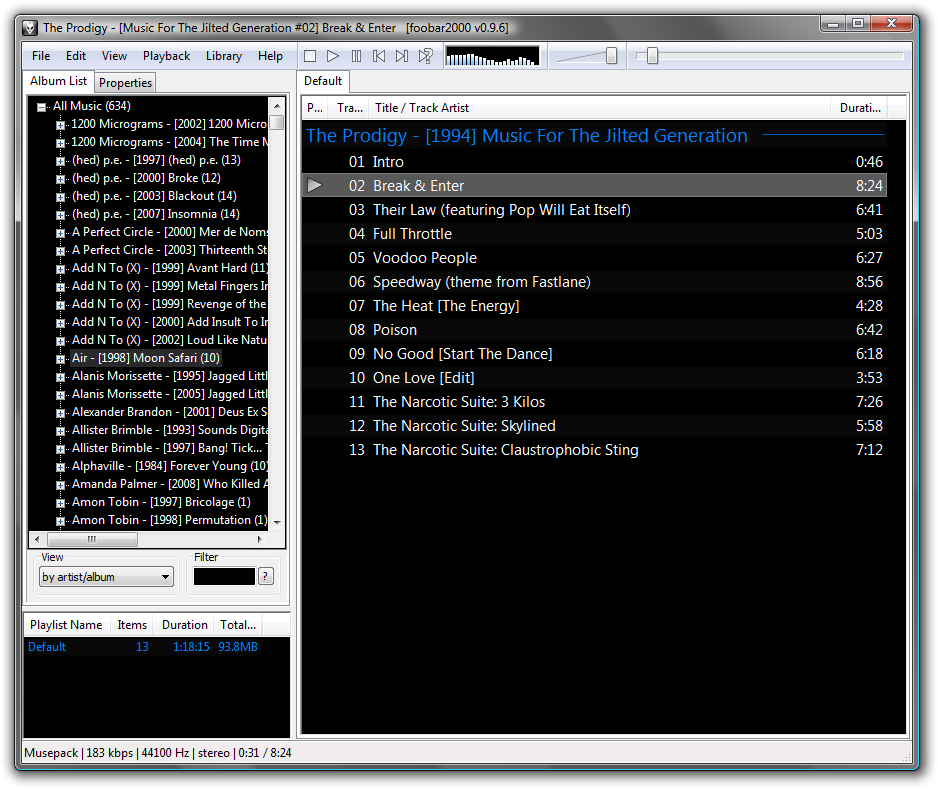
They shown the wrong tab. Below is the same thing, but with "Album List" tab selected:

https://www.foobar2000.org/images/img/main-black.png (ignore the white-on-black, that's orthogonal style change).

See that Filter box? That's a search that, within the scope of your music library, works better than Google's or Spotify's. It's an incremental search box (I believe web kids call that "Instant" nowadays?), that filters the album list by your search about as fast as you type.

I don't think it's built for "a different kind of user" - Spotify UI is pretty complex, because everything from search to managing playlists presents you with a pretty noisy UI that makes you click around a lot to find what you want and not click on what you don't want (Foobar never "suggests" you music it fully knows is not what you're searching for). Being a user of both - having switched to Spotify when it became easier than bringing an external drive full of MP3s to work - I can tell the basic UI interactions are of similar complexity, except Spotify is a bit more confusing at times.

Foobar's incremental search is such a useful feature I ditched Winamp for it back in the old days, and I still use it as a go-to example in product/UI development sessions.

Re: UX clichés

#147

Earlier quoted context omitted.

This is not true: "The human brain is incredibly plastic and adaptable. Unless the interface is truly absurd, most people can get used to it and never give it a second thought again." I've interviewed and observed enough users to know this is not true. There are a lot of interfaces that are suffer from issues with discoverability and understanding, and even when a user figures this stuff out one time (or is showed it…

Minor Quibble: Power Users are real users. However, they may or may not be worth the cost to support depending on your niche.

Then again, if your users are using your software many hours a day, day in day out (e.g. in work context), they are power users due to circumstances. If you treat them as regular "common denominator" users, you're actually and directly hurting them.

Re: UX clichés

#148

I am not a designer nor a software engineer, nor a business person. I am just a (heavy) user of all sorts of software for a very long time. I am a competent coder, and I code for research and pleasure. I don't have a dog in this, let's say, professional race. Every time I spot "UX" in relation to something I use, I cringe. Not because I have anything against the idea of design, or good interfaces, or designing good i…

As a like-/counter-anecdote, I developed semiconductor CAD tools for 10 years, after spending 10 years using them. When they first started being developed with GUIs, GUI meant UI, and its oft-maligned sibling, UX, wasn't a term. In my learnings, Xt (XToolKit) started putting words and code behind the abstract patterns in the late 80's, but our tool usability suffered horribly as more and more (usually nonresizing) At…

Fascinating! As somebody who uses that kind of software, old timer electrical engineers seem to be very very unforgiving to UI problems and even more unforgiving to any change for better or worse. I learned that while volunteering for UI/UX at horizon-EDA which aims to become a more usable kiCAD¹

I have never seen worse UX/UI than in electrical engineering tools and I worked a lot with 3D software. They are completely inconsistent with other software, often even with themselves. It often resembles the heating room of a 500 year old building were everybody added things but nobody deared to clean up the things that were already there.

My suffering as a user of such tools motivated me to change things for the better. I never got the idea behind resisting change in UI/UX. It seems to be rooted in the believe that change in UX always means change for the worse and never for good. Which is weird, because even someone like a carpenter is very much interested in the usability of their own tools.

Maybe the problem is that each change in the software means they have to adapt and this demands a certain adaptability, or a will to stay on top in a changing world. It certainly costs energy to do that.

--- ¹: Check it out here: https://github.com/carrotIndustries/horizon or watch the FOSDEM19 talk:https://www.youtube.com/watch?v=13xmFwgikh8

It is quite usable already, but there is no 1.0 release yet so useful things like installers and documentation are still lacking.

Re: UX clichés

#149
post #34

Earlier quoted context omitted.

Ahem, actually: in norse mythology there was the flying horse «Sleipnir:» https://en.wikipedia.org/wiki/Sleipnir While not «realistic,» they did believe it was.

Who says folks believed myths to be realistic? We are actually talking about knowledge, not believe. There may have been many people for whom between horses and steam engine powered trains there was no certainty nor prospect for motorization, only wet dreams of flying. Interesting fact nontheless, Pegasus comes to mind.

True.

I find it hard to relate to. Do priest believe god is real, (if so: also realistic,) or do they just believe in him?

Re: UX clichés

#150
post #113

Earlier quoted context omitted.

What's wrong with the hamburger menu? It seems like a good compromise of quickly accessible functionality for little screen real estate. For desktop apps with plenty of screen real estate it's crazy (looking at you gnome) but on mobiles it's fine, especially when the alternatives seem to be some sort of hidden and undiscovered slide out menu or long button press.

It's been proven to be misunderstood globally. Just the word "menu" is more beneficial.

English isn't understood globally.
Post reply on HN