Live data from Hacker News

McDonald’s Universal Icons for 109 Countries [pdf]

enlaso.com

131–140 of 164 posts

Re: McDonald’s Universal Icons for 109 Countries [pdf]

#131

Okay, I've got a crazy idea. Why not create a combination of words that expresses the thing, instead of these very weird and incomprehensible-at-first-glance icons? For example, for proteins: the word "protein" is understandable in English, French, Spanish, Italian, Portuguese, Greek and Swedish. The Russian "belok" should be understandable to Polish and Russian speakers, and the Dutch "eiwitten" should be understand…

What about people in those countries who cant read?

How would they understand the original icons, then? Nobody I asked understood them, except for the "kcal" icon which you would only understand if you could read.

McDonald's plan to get people to understand them is to put the words next to the icons to get people to understand the icons, which also wouldn't help if you can't read.
Re: McDonald’s Universal Icons for 109 Countries [pdf]

#132
post #111

Earlier quoted context omitted.

A heretical opinion, but one I agree with. I feel like the success of iOS and Android proves that the world of windows and icons from desktop computers was fine for nerds but ultimately a failure for mainstream use. hell, just look at fabric instruction icons… https://s-media-cache-ak0.pinimg.com/736x/a0/6b/b9/a06bb91bc...

Your fabric icons example may seem diffficult to get at first, but once you read what each of this icons represent it's pretty easy to remember that next time

It's exactly the same with letters. There's nothing particularly evocative about the English 'a' in the glyph for it.

Even the arrows the OP mentions is learned association.

Re: McDonald’s Universal Icons for 109 Countries [pdf]

#133

The older I get, the more I'm convinced that icons are not a terribly good way to convey information. Some things and concepts, sure. Others, not so much. Especially in technology and science. Navigation can make good use of icons. Left, right, up, down, start, stop, these kinds of things can be learned and used widely. Somethings like text manipulation icons, cursors, insertions, selections, can be used effectively,…

A heretical opinion, but one I agree with. I feel like the success of iOS and Android proves that the world of windows and icons from desktop computers was fine for nerds but ultimately a failure for mainstream use. hell, just look at fabric instruction icons… https://s-media-cache-ak0.pinimg.com/736x/a0/6b/b9/a06bb91bc...

Neal Stephenson has a funny take on them in Anathem.

Re: McDonald’s Universal Icons for 109 Countries [pdf]

#134

Earlier quoted context omitted.

Yeah -- think about a lot of commonly accepted icons, like for nuclear radiation or biohazards. Or even the weird icons like those for "pause" and "record" on media devices -- these aren't intuitive icons, we've just gotten used to them.

None of the icons McDonald's chose as their final ones had any meaning to me without a translation chart. How is that different from learning what a word means? Didn't anyone at McDonald's dare to question the basic idea of this?

That was what they were aiming for. They wanted symbols that were either obvious in meaning, or 'blank slates' onto which they could imbue meaning. What they were trying to avoid was symbols who preexisting associations would contradict or cause confusion with the meaning they wanted to provide.

Better to give meaning to nonsense than to try and fight against peoples' culture.

Re: McDonald’s Universal Icons for 109 Countries [pdf]

#135
post #58

Earlier quoted context omitted.

> McDonalds has a clear conflict of interest in the design of these icons for nutrition information. I could understand the point if they'd created McDonald's-specific units (e.g 10 grams of sugar = 1 McVigor). But they're just icons for info that McDonald's makes no effort to hide. Care to elaborate?

Not GP, but using a weight scale for fat and a fuel gauge for carbs, suggests that fat makes you fat while carbs give you energy. This thinking, enshrined in the FDA food pyramid, led to the modern epidemic of obesity and diabetes.

[deleted]

Re: McDonald’s Universal Icons for 109 Countries [pdf]

#136
post #128

Earlier quoted context omitted.

That whole effort was such a waste of time and money. If civilization collapses, what does it matter if the waste storage site is disturbed? It's not like it's going to be a threat to humanity. Without advanced technology, any damage from radioactivity would be limited to the local population. To extract a large amount of contaminated material and spread it around the world, you would need an advanced technological c…

Well the issue would be that it hurts the local population. And maybe you can prevent them from getting hurt, if you try to come up with a good warning.

But there's an opportunity cost. You pay a whole interdisciplinary committee to sit on their asses thinking about it for n weeks (I don't even want to know how long it took). You could take that money and use it on a million other things that would result in a larger reduction of people-getting-hurt.

Re: McDonald’s Universal Icons for 109 Countries [pdf]

#138
post #49

Earlier quoted context omitted.

I would suggest that if it can't currently fit then it needs to be rethought if it should be there at all, especially if abbreviations can't be used in whatever language it's required. Icons that are impossible to decipher don't improve anything IMHO. Perhaps they should have gone culturally-specific, something with just the first letter, or anything else that people might locally understand if the word absolutely ca…

Why is it a problem if people can't understand the icons right now ? The goal is to slap them on everything, everywhere, for decades. Complete, textual nutrition labels will continue existing where they already do. People will make the mental association when they're looking at their food packaging and see the two kinds of labels, with the same numbers between the two. Is it a problem that the "floppy disk" symbol fo…

Because these icons are for mcdonalds only. If magically they were universally adopted, then I'd agree. I seriously doubt they will, especially because they're not particularly clear as they currently stand.

Re: McDonald’s Universal Icons for 109 Countries [pdf]

#139

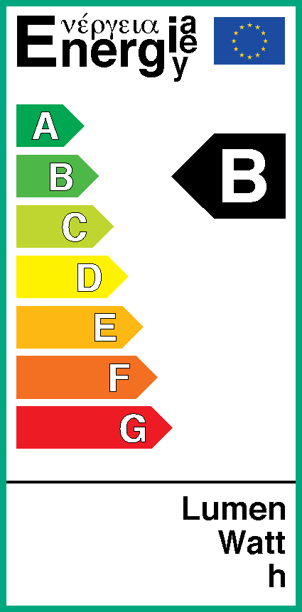
Okay, I've got a crazy idea. Why not create a combination of words that expresses the thing, instead of these very weird and incomprehensible-at-first-glance icons? For example, for proteins: the word "protein" is understandable in English, French, Spanish, Italian, Portuguese, Greek and Swedish. The Russian "belok" should be understandable to Polish and Russian speakers, and the Dutch "eiwitten" should be understand…

The EU tried something like that with their energy efficiency label http://www.olino.org/wp-content/uploads/2010/10/2010_10_ener...

Re: McDonald’s Universal Icons for 109 Countries [pdf]

#140
post #132
post #111

Earlier quoted context omitted.

Your fabric icons example may seem diffficult to get at first, but once you read what each of this icons represent it's pretty easy to remember that next time

It's exactly the same with letters. There's nothing particularly evocative about the English 'a' in the glyph for it. Even the arrows the OP mentions is learned association.

It's not exactly the same. The icons are mnemonics which are mostly useful when you understand what they are trying to represent. Words on the other hand are totally useless if you don't speak the language they're in. It would be very difficult to memorize a word just by its appearance in comparison to an icon.
Post reply on HN