Live data from Hacker News

macOS Tahoe windows have different corner radiuses

lapcatsoftware.com

121–130 of 235 posts

Re: macOS Tahoe windows have different corner radiuses

#121
post #22

Maybe this is intentional? Either way, doesn't look bad.

I suppose that's subjective, because to me it looks distracting and tacky. I want the window chrome to be present, opinionated, yet consistent and plain. This is one of the many Tahoe-isms that violates the latter two. It's visual noise that detracts from one of the most basic utilities of the UI, which is to simply hold my applications in a regular, cohesive, predictable manner. Maybe it shouldn't irritate me, but i…

This 100%. I _like_ new features and new UX when it enhances things or makes them easier to work with. That used to be a huge selling point when purchasing a Mac vs PC, genuine thought and consideration had been given to every single interaction and user impact.

And then ... Apple lost its way. Now when I get a new Mac I spend the better part of a day turning off as much of the pointless eye candy as I can so that I can focus on the task I'm working on, not the distracting UX conventions.

I want a computer, not an iPad with a keyboard. That already exists, and there is a reason I don't have one.
Re: macOS Tahoe windows have different corner radiuses

#122
post #18

Earlier quoted context omitted.

> In the new design system, windows now have a softer, more generous corner radius, which varies based on the style of window. Windows with toolbars now use a larger radius, which is designed to wrap concentrically around the glass toolbar elements, scaling to match the size of the toolbar. Titlebar-only windows retain a smaller corner radius, wrapping compactly around the window controls. These larger corners provid…

Just a bunch of words that raised no red flags, maybe sounded like a decent idea even, but when you see it how is your reaction not “oh, that’s bad” I feel like this is the design process. You have ideas, they sound ok, you try them out, and then immediately you revert a lot of them. The ideas without the taste to know when not to do something is becoming the new Apple way

Rounded corners (and the utterly massive drag area next to them) are touchbar 2.0. Features that no one asked for, has questionable value, and that provides marginal benefit even for its intended audience (touchscreen macs, no doubt).

Re: macOS Tahoe windows have different corner radiuses

#123

This one really bothers me. Whenever maximizing or tiling my windows (which is all the time), I see multiple layers of oddly rounded corners. I think if there's any upside to Tahoe, the grievances may push me into blogging for the first time ever, because I can't keep these to myself. I actually feel sorry for Apple's developers because there's no way you ship software this bad and inconsistent unless you've been han…

The thing which killed me is this is one of the things Windows 10 got _right_ (well, took the path of least resistance) with square corners which made screen grabs look good/work more easily --- I run a utility to get them back in Windows 11 (and have seriously contemplated investigating if removing the glass from my laptop screen and scraping away the paint which obscures the corners is an option to get those pixels back....)

Used to be this sort of thing "just worked" on Mac OS --- you'd think with a diminishing number of UI tool kits/dev tools this sort of thing would get better/more consistent.... always liked "Themes" and this just gives me one more reason to wish that they would come back.

Re: macOS Tahoe windows have different corner radiuses

#124
post #104

The justification by Apple is that it keeps the concentricity between window corner and the red/green/yellow window controls. Which, as you may notice, it does. It's wrong though, because the window is the higher element in the hierarchy (container) and should not be affected by what is inside. It creates a larger inconsistency than the "consistency" it supposedly brings.

Agreed.

A better solution would be to adjust the sizing/placement of the window controls (and allow the hit area to include the original placement maybe?).

Re: macOS Tahoe windows have different corner radiuses

#127
post #79

Mac OS's UX design has been in free fall the last 5-10 years (ever since the "iOS-ify everything" zeitgeist took root). Sincerely hope that they one day revert back, because the current UX is just godawful for any usecase I can imagine.

> ever since the "iOS-ify everything" zeitgeist took root That started in 2010, a bit more than 5-10 years.

IMHO it started with iOS 7 [1] - year 2013.

Uber flat, you don't know what's a button, what's a text. I dunno if I just adjusted to it or it actually somewhat got better up to iOS/macOS 15. Though with iOS/macOS 26 - it's iOS 7 moment yet again.

NB: not sure about Liquid Glass - though I was recently (and weirdly) recommended to watch iOS 7 trailer on youtube[2]. Comments are overwhelmingly positive. Dunno if it's just people who were kids/teens looking through rose tinted glasses. Though I am not sure anymore, maybe people actually like such designs and it's just HN bubble complaining (IMHO complains here are 110% valid) about nothing. Maybe in 10+ years ordinary guy will praise iOS/macOS 26.

[1] https://en.wikipedia.org/wiki/IOS_7

[2] https://www.youtube.com/watch?v=4xzLr7xSr-g

Re: macOS Tahoe windows have different corner radiuses

#128
post #104

The justification by Apple is that it keeps the concentricity between window corner and the red/green/yellow window controls. Which, as you may notice, it does. It's wrong though, because the window is the higher element in the hierarchy (container) and should not be affected by what is inside. It creates a larger inconsistency than the "consistency" it supposedly brings.

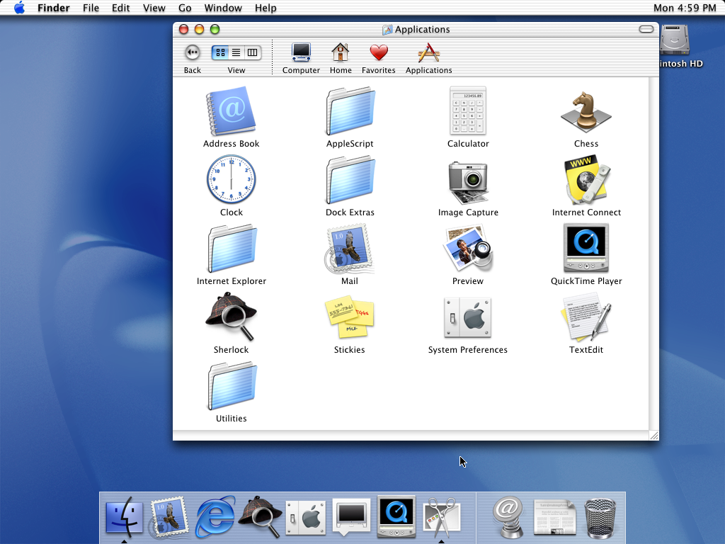
Here's a Finder window screenshot from Mac OS X 10.0 Cheetah: https://512pixels.net/wp-content/uploads/2018/08/10-0-Cheeta...

Notice two things:

1) The window chrome with traffic lights and title is entirely separate from the toolbar, not unified with the toolbar.

2) The top of the window is rounded, but the bottom of the window is not!

I think the old design was superior for several reasons, one of which is that it made the windows much easier to drag around the screen. In any case, though, even if there's an argument about concentricity and window controls, it makes no sense that the bottom of the window has the same corner radius as the top when the toolbar is only at the top.

Re: macOS Tahoe windows have different corner radiuses

#130

The rounded corners is such a key element of apple design. They patented rounded corners on the iphone for precisely this reason. They wanted to trademark this but got a design patent instead. And then samsung notoriously copied this one almost verbatim same radius which pissed off apple.

>one almost verbatim same radius which pissed off apple

So this is what they decided to do? Use so many different rounded radius variations that competitors don't know which one to copy?

Post reply on HN