Live data from Hacker News

LiftKit – UI where "everything derives from the golden ratio"

chainlift.io

111–120 of 160 posts

Re: LiftKit – UI where "everything derives from the golden ratio"

#111
post #70

When we designed Chrome, since minimalism was our thing and screens used to be small, A LOT of time was spent on the total vertical space - thin titlebar, slightly bigger tabstrip, and a large toolbar. Lots of discussion, lots of questions Telling people the height ratios between them followed the golden ratio was a very convenient way to shortcut the bikeshedding and get to "aha, very nice" The trick was it didn't f…

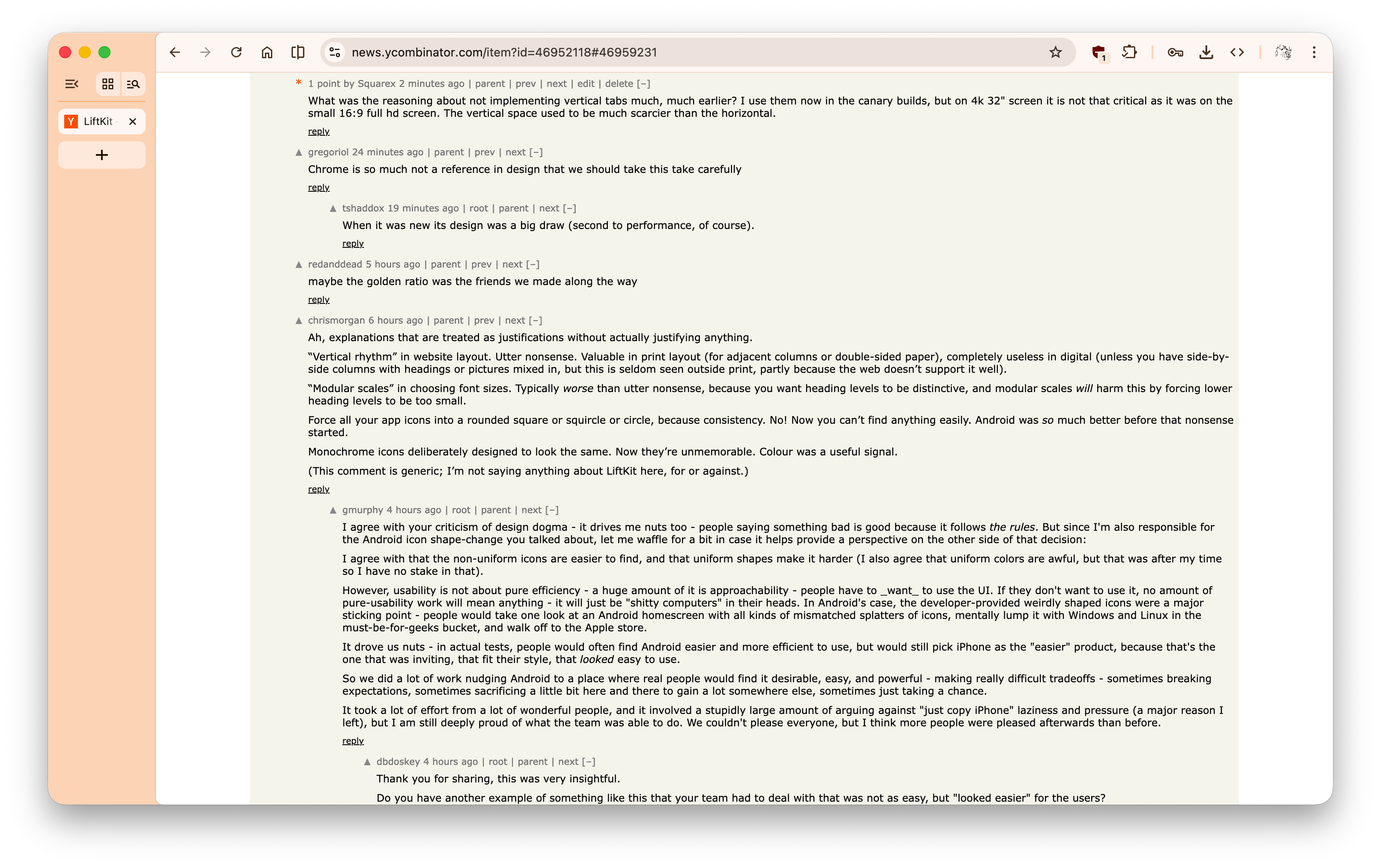
Chrome is so much not a reference in design that we should take this take carefully
Re: LiftKit – UI where "everything derives from the golden ratio"

#112
post #70

When we designed Chrome, since minimalism was our thing and screens used to be small, A LOT of time was spent on the total vertical space - thin titlebar, slightly bigger tabstrip, and a large toolbar. Lots of discussion, lots of questions Telling people the height ratios between them followed the golden ratio was a very convenient way to shortcut the bikeshedding and get to "aha, very nice" The trick was it didn't f…

Chrome is so much not a reference in design that we should take this take carefully

When it was new its design was a big draw (second to performance, of course).

Re: LiftKit – UI where "everything derives from the golden ratio"

#113
post #70

When we designed Chrome, since minimalism was our thing and screens used to be small, A LOT of time was spent on the total vertical space - thin titlebar, slightly bigger tabstrip, and a large toolbar. Lots of discussion, lots of questions Telling people the height ratios between them followed the golden ratio was a very convenient way to shortcut the bikeshedding and get to "aha, very nice" The trick was it didn't f…

What was the reasoning about not implementing vertical tabs much, much earlier? I use them now in the canary builds, but on 4k 32" screen it is not that critical as it was on the small 16:9 full hd screen. The vertical space used to be much scarcier than the horizontal.

Re: LiftKit – UI where "everything derives from the golden ratio"

#114
post #70

When we designed Chrome, since minimalism was our thing and screens used to be small, A LOT of time was spent on the total vertical space - thin titlebar, slightly bigger tabstrip, and a large toolbar. Lots of discussion, lots of questions Telling people the height ratios between them followed the golden ratio was a very convenient way to shortcut the bikeshedding and get to "aha, very nice" The trick was it didn't f…

What was the reasoning about not implementing vertical tabs much, much earlier? I use them now in the canary builds, but on 4k 32" screen it is not that critical as it was on the small 16:9 full hd screen. The vertical space used to be much scarcier than the horizontal.

Are you working on the design anymore by any chance? I must admin that the current vertical tabs implementation is the most beautiful I have ever seen. Brave, Edge, Orion are much worse. https://pub-882250cae12744b197b56b6f097999aa.r2.dev/Sni%CC%8...

Re: LiftKit – UI where "everything derives from the golden ratio"

#115
post #70

When we designed Chrome, since minimalism was our thing and screens used to be small, A LOT of time was spent on the total vertical space - thin titlebar, slightly bigger tabstrip, and a large toolbar. Lots of discussion, lots of questions Telling people the height ratios between them followed the golden ratio was a very convenient way to shortcut the bikeshedding and get to "aha, very nice" The trick was it didn't f…

Chrome is so much not a reference in design that we should take this take carefully

All other browser I've tried (firefox, vivaldi, edge, safari, atlas, many others) and all other programs with a tab-based UI I use (zed, vs code, sqlitebrowser) look worse.

Re: LiftKit – UI where "everything derives from the golden ratio"

#116
post #70

When we designed Chrome, since minimalism was our thing and screens used to be small, A LOT of time was spent on the total vertical space - thin titlebar, slightly bigger tabstrip, and a large toolbar. Lots of discussion, lots of questions Telling people the height ratios between them followed the golden ratio was a very convenient way to shortcut the bikeshedding and get to "aha, very nice" The trick was it didn't f…

Chrome is so much not a reference in design that we should take this take carefully

What don't you like about Chrome design?

Re: LiftKit – UI where "everything derives from the golden ratio"

#117
post #70

When we designed Chrome, since minimalism was our thing and screens used to be small, A LOT of time was spent on the total vertical space - thin titlebar, slightly bigger tabstrip, and a large toolbar. Lots of discussion, lots of questions Telling people the height ratios between them followed the golden ratio was a very convenient way to shortcut the bikeshedding and get to "aha, very nice" The trick was it didn't f…

Ah, explanations that are treated as justifications without actually justifying anything. “Vertical rhythm” in website layout. Utter nonsense. Valuable in print layout (for adjacent columns or double-sided paper), completely useless in digital (unless you have side-by-side columns with headings or pictures mixed in, but this is seldom seen outside print, partly because the web doesn’t support it well). “Modular scale…

> unless you have side-by-side columns with headings or pictures mixed in, but this is seldom seen outside print, partly because the web doesn’t support it well

It does now.[1]

[1]: https://developer.mozilla.org/de/docs/Web/CSS/Guides/Grid_la...

Re: LiftKit – UI where "everything derives from the golden ratio"

#119
post #70

When we designed Chrome, since minimalism was our thing and screens used to be small, A LOT of time was spent on the total vertical space - thin titlebar, slightly bigger tabstrip, and a large toolbar. Lots of discussion, lots of questions Telling people the height ratios between them followed the golden ratio was a very convenient way to shortcut the bikeshedding and get to "aha, very nice" The trick was it didn't f…

I loved the minimalism of early Chrome, thank you so much for your work on that!

I wish this was still a priority for modern Chrome. Just because screens are bigger now doesn’t mean I want to waste that space.

Re: LiftKit – UI where "everything derives from the golden ratio"

#120
post #70

When we designed Chrome, since minimalism was our thing and screens used to be small, A LOT of time was spent on the total vertical space - thin titlebar, slightly bigger tabstrip, and a large toolbar. Lots of discussion, lots of questions Telling people the height ratios between them followed the golden ratio was a very convenient way to shortcut the bikeshedding and get to "aha, very nice" The trick was it didn't f…

Chrome is so much not a reference in design that we should take this take carefully

Are you confusing modern Google Chrome with early Google Chrome, or did you dislike early Google Chrome?
Post reply on HN