Earlier quoted context omitted.
Some of us are perfectly qualified to understand them and the nuances.
A plot that requires the reader to be perfectly qualified is a bad plot.
If it's a bad plot, perhaps some introspection is required...
111–120 of 258 posts
>box plots always make distributions look bell shaped I feel like this is where the confusion stems from for the author and everyone else here. Box plots don't make anything bell shaped (they don't change the distribution), they assume that your data follows a bell/gaussian shape. This is correct in cases where the central limit theorem can be applied (which is almost everywhere) - but when that is not the case, the…
> they assume that your data follows a bell/gaussian shape No they don't. They show quartiles mostly, and don't assume symmetry or any parameters of a gaussian.
Earlier quoted context omitted.
Count data points in each quartile. You can do that for any sortable data, independent of distribution.
If you do that in your paper, you better write next to the graph that you did that.
>box plots always make distributions look bell shaped I feel like this is where the confusion stems from for the author and everyone else here. Box plots don't make anything bell shaped (they don't change the distribution), they assume that your data follows a bell/gaussian shape. This is correct in cases where the central limit theorem can be applied (which is almost everywhere) - but when that is not the case, the…
A bell shape has no minimum/maximum, like the box has.
No you shouldn’t stop using box plots. You should use them for when they are appropriate - showing location and spread. And not shape! There’s absolutely no information on modality or distribution presented past quartiles and limits. They are mostly useful for comparing batches not analysing an individual batch. The author doesn’t know what they are talking about and is telling people as if they do. If he read any of…
The author is approaching this as a human problem. Plots are not made for machines, they are for people to read, and the author specifically wants as many people can read and parse plots easily as possible. As lamentable as math education might be, we have to work with what we have, and I do think it is a reasonable goal. I agree with the author that it should not be necessary to know what quartiles are in order to see how spread out a distribution is.
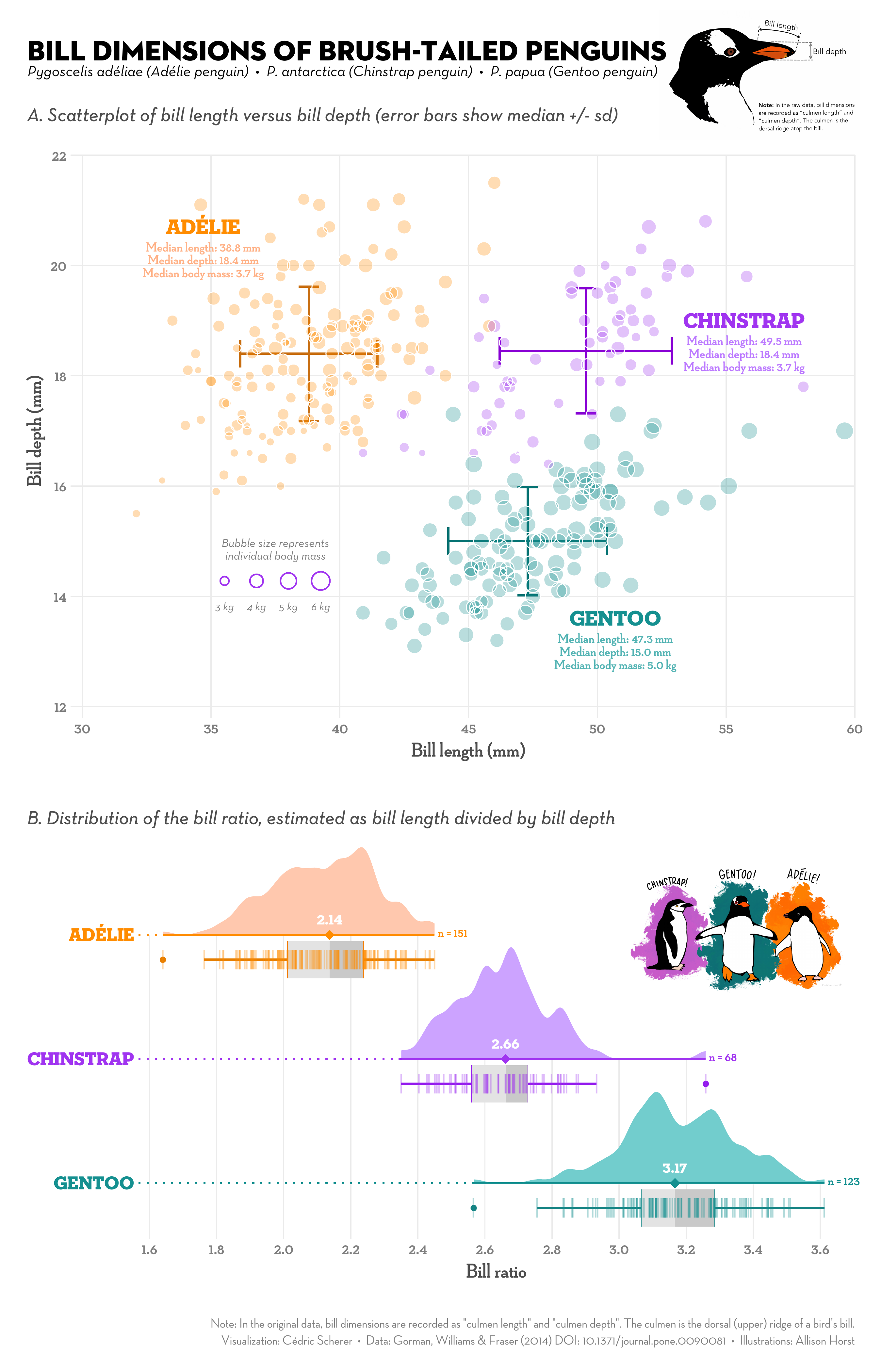
The only advantage box plots had is that they can be drawn by hand. Now that computers are ubiquitous this is no longer valuable. Violin plots and bee swarm plots are better. Jittered strip plots can be okay if you're careful to avoid saturation (or more points added in the saturated region will disappear as they can't make it any darker).
I'll take a plain histogram/kde plot every day of the week over those damn violin plots. I think box plots are quite usefull as they are easy to read but only if you trust the author has actually looked at the histogram. And you can typically not trust the author to have done that.
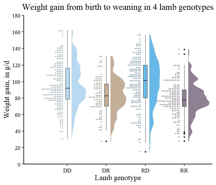
You can even make 'em show histograms: https://miro.medium.com/v2/1*J3Q4JKXa9WwJHtNaXRu-kQ.jpeg
No you shouldn’t stop using box plots. You should use them for when they are appropriate - showing location and spread. And not shape! There’s absolutely no information on modality or distribution presented past quartiles and limits. They are mostly useful for comparing batches not analysing an individual batch. The author doesn’t know what they are talking about and is telling people as if they do. If he read any of…
You are looking at this as a technical problem, where box plot is a compact visual representation of variance and outliers that is perfectly perfunctory as it is cromulent. The author is approaching this as a human problem. Plots are not made for machines, they are for people to read, and the author specifically wants as many people can read and parse plots easily as possible. As lamentable as math education might be…
Well that explains the entire data visualisation and dashboard consultancy nicely.
How does anyone rationalise the information they have if they don’t make an effort to understand it. Or how can they even select a visualisation method or comparison method. We are truly fucked!
What about violin plots. https://en.m.wikipedia.org/wiki/Violin_plot
The author mentions those at the bottom of the article, but two problems highlighted still remain: * There's another intermediary concept (kernel density estimation) between the audience and the data * They're still likely to misrepresent tight groupings and discontinuities, which will be smoothed out
So the diagram should not be used because of an education problem with some audiences? Isn't that a bit like banning cars because some people can't drive? Some diagrams are simply not for mass consumption and this is one, particularly because it is designed to illustrate an interpretation of ranges instead of the direct/linear representation of the raw data. Of course I'd illustrate this fact as a Venn diagram compar…
But the real education deficit shown here is psychology education. Humans are bad at doing some calculations inherently. They are not able to properly asses pie charts and easily confused by numbers with a lot of digits. Even before these studies were done people were able to come up with visualizations that were better suited for human understanding.
People chose to use box plots because the visualization was better to understand by people than the numerical representation of the same information. Luckily there are now even better tools to represent the same numerical data in a way that is even better to understand.
So, if you are truly educated properly you don't use visualization.