Live data from Hacker News

Myna: Monospace typeface designed for symbol-heavy programming languages

github.com

101–110 of 185 posts

Re: Myna: Monospace typeface designed for symbol-heavy programming languages

#101
post #45

This, like many fonts, fails to handle vertical arrows: | ^ v | Note that the raised appearance of `^` exists for compatibility with typewriters that use the backspace key to use it as a circumflex accent over lowercase letters. This is doubly obsolete today (we have real combined characters and can use them on uppercase). This is one of those cases where the name originally used for the character in various standard…

> Note that the raised appearance of `^` exists for compatibility with typewriters that use the backspace key to use it as a circumflex accent over lowercase letters. This is doubly obsolete today

The origins don’t really matter at this point. That’s what the character looks like and it’s what everyone expects.

Your use case is extremely niche. Making a font choice for that specific double-line situation would alienate everyone else who just wants the ^ to look like a ^.

Like others suggested, just use the Unicode arrows if you want arrows. Let the ^ be a classic ^.

It’s really disappointing when I find a new font that seems interesting until I encounter one weird design choice that makes it surprising to read. Fonts should be boring, typical, and follow what your brain expects to see, not trying to erase decades of typography norms and start something new for one common character.
Re: Myna: Monospace typeface designed for symbol-heavy programming languages

#102

> Do you ever feel like your font treats symbols as second-class glyphs? No because this problem has been solved by other font designers working with pretty much exactly the same requirements.

thanks for the feedback. if that be the case, i'm afraid Myna might not be of much use to you.

Re: Myna: Monospace typeface designed for symbol-heavy programming languages

#103

Earlier quoted context omitted.

designer here. by symbol-heavy languages i mean languages like Perl and Haskell which make heavy use of symbols (sigils in Perl and operators in Haskell). Myna was designed after my frustration with other monospace fonts combined with my (self-imposed) inability to use ligatures.

I think it might be useful to put some screenshots of other fonts on your page, to show what symbol or alignment problems yours corrects. Because I've studied a lot of typeface design, and I can't really figure out what you're doing, what pain points you're trying to address. Because when you say "and $, @, % seem ever mismatched?", I don't have the slightest idea what you're talking about. I certainly am curious tho…

They are definitely not aligned for me: https://i.postimg.cc/cHXyWhYT/Screenshot-2025-11-08-07-47-37...

Re: Myna: Monospace typeface designed for symbol-heavy programming languages

#105
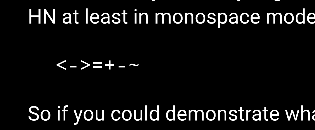
> Are you frustrated that -> looks nothing like an arrow

The proper solution is, of course, to allow ←arrows→ (and, naturally, not trying to fit a variable peg into a monowidth whole)... maybe in the next generation of languages when the bottom level of typesetting quality is raised a bit

Re: Myna: Monospace typeface designed for symbol-heavy programming languages

#106

Meta, but I've personally switched to a proportional font for my coding. Heresy, I know, but it feels wrong to have to look at code as if I'm coding on an 80 column terminal in 1960. Input Sans is great: https://input.djr.com

Great, but it unfortunately breaks vertical alignment with elastic tabstops solution still missing everywhere

https://nick-gravgaard.com/elastic-tabstops/

Re: Myna: Monospace typeface designed for symbol-heavy programming languages

#107
post #45

This, like many fonts, fails to handle vertical arrows: | ^ v | Note that the raised appearance of `^` exists for compatibility with typewriters that use the backspace key to use it as a circumflex accent over lowercase letters. This is doubly obsolete today (we have real combined characters and can use them on uppercase). This is one of those cases where the name originally used for the character in various standard…

Doesn't raised appearance also exist for compatibility with math exponentiation? Do still not obsolete

Re: Myna: Monospace typeface designed for symbol-heavy programming languages

#108
post #45

This, like many fonts, fails to handle vertical arrows: | ^ v | Note that the raised appearance of `^` exists for compatibility with typewriters that use the backspace key to use it as a circumflex accent over lowercase letters. This is doubly obsolete today (we have real combined characters and can use them on uppercase). This is one of those cases where the name originally used for the character in various standard…

> Note that the raised appearance of `^` exists for compatibility with typewriters that use the backspace key to use it as a circumflex accent over lowercase letters. This is doubly obsolete today The origins don’t really matter at this point. That’s what the character looks like and it’s what everyone expects. Your use case is extremely niche. Making a font choice for that specific double-line situation would aliena…

> Fonts should be boring, typical, and follow what your brain expects to see

So you're ok with permanent confusion of 0 vs O because "boring/expected" doesn't add a dot for zero?

> erase decades of typography norms and

This is not (such) a (n absolute) thing, there are different contradictory norms that persist for decades, just like in and artistic (though not only) field, so at a practical level this offers no guidance for any specific decision, you'd have to actually consider it in that specific case to see whether it makes sense

Re: Myna: Monospace typeface designed for symbol-heavy programming languages

#109
post #105

> Are you frustrated that -> looks nothing like an arrow The proper solution is, of course, to allow ←arrows→ (and, naturally, not trying to fit a variable peg into a monowidth whole)... maybe in the next generation of languages when the bottom level of typesetting quality is raised a bit

i have addressed this in one of the other comments. it is impossible to achieve both elegance (good look) and consistency (monospace width) in these cases. many folks, like yourself, are pioneering full Unicode editing. we, on the other end, are just trying to make editing without ligatures elegant because ASCII, i believe, would remain predominant for a long time to come.

Re: Myna: Monospace typeface designed for symbol-heavy programming languages

#110

Not trying to be negative, just confused: I don't really see how this font is "designed for symbol-heavy languages". The symbols look normal to me. Maybe the letters are a little more spaced? I'd love to be enlightened.

That's because the proper way to explain design differences is by showing them, and there is no comparison, so of course it's easy to get confused
Post reply on HN