Live data from Hacker News

MacOS X 10.1 (2001)

toastytech.com

101–110 of 185 posts

Re: MacOS X 10.1 (2001)

#101

Earlier quoted context omitted.

Agreed. I think the new System Preferences was a big step back.

And for what reason? There were things that were so easy to do - like change network interface priority by reordering the list of interfaces - that have obvious method anymore (I want to prefer ethernet when it’s attached, for example). I can no longer navigate to settings I frequently used and need to search for just about everything. Perhaps I shouldn’t expect things to stay the same after 20 years(!), but for long…

It's just a big dumb list that I now have to use search to find anything in. My guess is that someone doesn't want to spend developer and designer resources curating the old design. Now they can more or less shove new things into the list and call it a day. Sad.
Re: MacOS X 10.1 (2001)

#102
post #27

The first time I learned about OS X, I blindly bought Apple shares. I knew it would set them up for success down the road. Sounds silly now but foundation, such as OS for a computer company, matter. Although, OS X was painful for many years.

Hope you held onto them. I sold my apple stock at a mere 2x multiple to put the money into buying a house.

Re: MacOS X 10.1 (2001)

#103

I think one of the weirdest things to me is how unchanged OSX / MacOS is. As much as I like this specific paradigm of computing UI, I kind of see why they’ve been trying new things as of late. (Stage manager, new settings panel, iOS-y control centre) Just because it’s old, doesn’t mean it NEEDS to change, but I can imagine the need to at least explore a bit if something stays mostly the same for 20 years.

It seems like "EVERYTHING" Apple has done in this arena just ensures I'll have to use a search function to find what I want. Same is true for Windows 10+. "I just want to format a USB Thumbdrive!!! why do I have to search for some sort of Disks section in the Control Panel??"

Re: MacOS X 10.1 (2001)

#104
post #95

> This screen shot shows the login screen. It displays a graphical list of users that can login on this system. (Interestingly Windows XP does something similar) > Being based on BSD Unix, MacOS X inherits many useful unix features such as real security and user accounts. > This means that, for example, you can create a special account for someone else to play games and don't have to worry about them deleting system…

Turns out it wasn’t enough. What we were just barely starting to grasp then was that, among the “other users” we need to be protected from, were the software vendors themselves. In other words, I am not a single user; the combination of me and various groupings of binaries are the user, and they must be carefully isolated. And now, it turns out I want still another layer of protection too (e.g. multiple browser profi…

Yes great point and very true. I don't think we have complexity for complexities sake, there are real problems we are solving. It's sad that we have to protect ourselves from software vendors, but you're right we absolutely do. The simplicity of the past was based on something that is no longer (probably never was but that's another discussion) true, which is that code the user is running is running with consent of and on behalf of the user.

Re: MacOS X 10.1 (2001)

#105

I'll take Puma's System Preferences, pinstripes and all, over what we have today. Blech!

I hear ya. I was so in love with that interface back in the day. I thought it was beautiful. If I have to stare at a screen all day I want it to be attractive. Everything is so flat, muted, and boring now. A button is so much less intuitively discovered these days. Tabs are hard to determine due to limited perspective. Window borders are gone and it's so difficult to determine the boundaries of applications. I'd gladly take back some skeuomorphism please.

Remember how cool those confirmation buttons were? Nice blue pill that said "Click me!" They really looked like you could touch them. If only Apple hadn't taken away the customization capabilities of the UI. Remember themes with Shapeshifter? I would love to have that back now to get some old school OS X widgets.

Re: MacOS X 10.1 (2001)

#106
post #16

Here is the John Siracusa review from 2001 https://arstechnica.com/gadgets/2001/10/macosx-10-1/

> As in Mac OS 9, it is possible to play DVD movies "on the desktop" by setting the desktop pattern to be a particular color. The DVD player uses this color as a mask for its video display, allowing the movie to appear on the desktop pattern even when the player window itself is hidden. Today I learned!

Windows has this too. Something to do with sending the video data directly to the graphics card, and the graphics card doing the decoding of the MPEG data, and replacing the color (which is usually green) with the video image before outputing to the screen.

So if you're playing a video and you open a web page, and the webpage has the same green color, it looks like there's a hole on the browser window and you can see the video playing "behind" it.

Re: MacOS X 10.1 (2001)

#107

Earlier quoted context omitted.

I miss the textured Aqua days. Peak was Leopard/Snow Leopard. Flat is just so... flat. And boring. And also harder to read, because it's harder to orient yourself in a big textureless area than in a space with some texture in it.

It got to a point with Apple where I had to tell my mother, "just tap everything... there's really no indicator if anything's a button anymore". While material/flat can look pretty, it is counterintuitive to communication. I'm sure Jony Ive read "The Design of Everyday Things" at some point in his career. Perhaps he got to a point where he decided that didn't apply?

Historically Jony Ive isn't involved in the user interface. Has he been in more recent years? I know that back during Scott Forstall's time and Apple's skeuomorphism phase that Ive stated in interviews that he wasn't involved in any of that. I thought his (direct) influence was limited to (hardware) product design.

Re: MacOS X 10.1 (2001)

#108

I think one of the weirdest things to me is how unchanged OSX / MacOS is. As much as I like this specific paradigm of computing UI, I kind of see why they’ve been trying new things as of late. (Stage manager, new settings panel, iOS-y control centre) Just because it’s old, doesn’t mean it NEEDS to change, but I can imagine the need to at least explore a bit if something stays mostly the same for 20 years.

It seems like "EVERYTHING" Apple has done in this arena just ensures I'll have to use a search function to find what I want. Same is true for Windows 10+. "I just want to format a USB Thumbdrive!!! why do I have to search for some sort of Disks section in the Control Panel??"

I mean, why not? I think a lot of people under-20 will instinctively think of “erase this whole disk and put a new file system on it” as a very “settings” sort of thing, not something to be done in a separate application like Disk Manager. (Which is technically a hold over from when OSes did not ship with extensive disk management tools, so normally you would have some flavour of Norton Utilities installed after-market.)

If you’ve grown up with phones and tablets, anything that’s a change to the device, even if it’s an operation and not a setting, is in “settings”.

I get it, doesn’t mean I agree with it to be fair! I miss old system preferences as much as you.

Re: MacOS X 10.1 (2001)

#109

Earlier quoted context omitted.

And for what reason? There were things that were so easy to do - like change network interface priority by reordering the list of interfaces - that have obvious method anymore (I want to prefer ethernet when it’s attached, for example). I can no longer navigate to settings I frequently used and need to search for just about everything. Perhaps I shouldn’t expect things to stay the same after 20 years(!), but for long…

It's just a big dumb list that I now have to use search to find anything in. My guess is that someone doesn't want to spend developer and designer resources curating the old design. Now they can more or less shove new things into the list and call it a day. Sad.

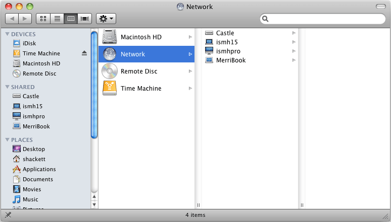
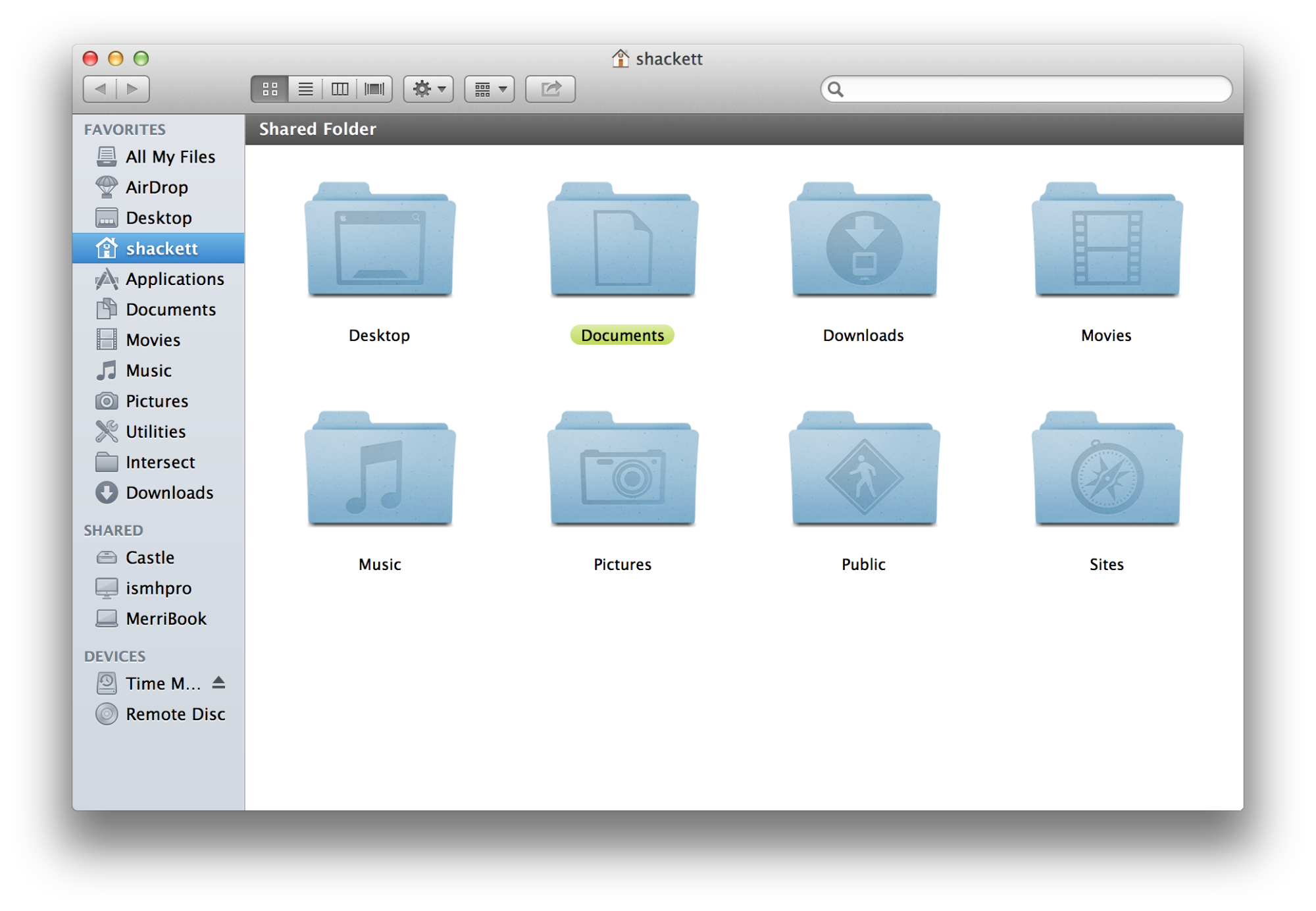
One thing that I think makes System Settings much worse than it has to be is how indistinguishable its sidebar icons are. They all have the same shape, some share the same background color or have very similar background colors, their glyph shapes are thin, and the white glyph color has extremely bad contrast with some of the background colors.

If the icons were more akin to 10.6 Snow Leopard sidebar icons[0] it'd give the sidebar items much more substantial visual anchors. Heck even the more muted sidebar icons of 10.7 Lion[1] would be a substantial improvement.

[0]: https://www.versionmuseum.com/images/operating-systems/mac-o... [1]: https://512pixels.net/wp-content/uploads/2018/08/10-8-Mounta...

Re: MacOS X 10.1 (2001)

#110

Earlier quoted context omitted.

Agreed. I think the new System Preferences was a big step back.

And for what reason? There were things that were so easy to do - like change network interface priority by reordering the list of interfaces - that have obvious method anymore (I want to prefer ethernet when it’s attached, for example). I can no longer navigate to settings I frequently used and need to search for just about everything. Perhaps I shouldn’t expect things to stay the same after 20 years(!), but for long…

I’m a long time user (pre-OS X) and I prefer the new settings. It always took me longer to find things in the icon grid.
Post reply on HN