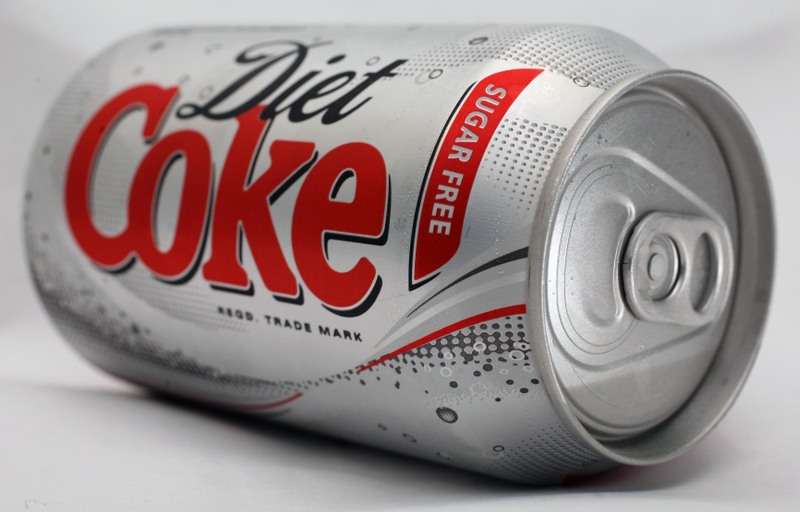
Never seen "Coke" in that classic font before. Is it new or perhaps particular to the US?
There's a little bit about the history of the logo here: http://www.coca-cola.co.uk/125/history-of-coca-cola-logo.htm...
11–20 of 58 posts
Never seen "Coke" in that classic font before. Is it new or perhaps particular to the US?
There's a little bit about the history of the logo here: http://www.coca-cola.co.uk/125/history-of-coca-cola-logo.htm...
Is "responsive" the new buzzword for "things that change when you resize them"? I've been seeing it used an awful lot in web design as of the past few years, often rather vaguely as some sort of feature.
The fact that things rearrange dynamically as you resize your window on a desktop box is not the main target, the target is a design working equally well on your desktop, your table in both landscape and portrait, your much smaller phone, and so forth, so the designer doesn't need to maintain multiple versions of the site/page/app.
Is "responsive" the new buzzword for "things that change when you resize them"? I've been seeing it used an awful lot in web design as of the past few years, often rather vaguely as some sort of feature.
Not just change, but remove flourishes and not entirely necessary elements.
> I've been seeing it used an awful lot in web design as of the past few years, often rather vaguely as some sort of feature.
It's a feature for cross-device compatibility, the point being to alter visible content to fit multiple device sizes.
Is "responsive" the new buzzword for "things that change when you resize them"? I've been seeing it used an awful lot in web design as of the past few years, often rather vaguely as some sort of feature.
It would be much more impressive to see the same parts of logos reused on different variants of logos - "The Man With A Gun’s Method" that is covered in the same article by Ilya Pukhalski.
For comparison: "The Hobo’s Method" - http://responsivelogos.co.uk/images/logo5.svg and "The Man With A Gun’s Method" - http://pukhalski.com/responsive-icons/responsive2.svg
Edit:
It is strange that author publishes (source: http://www.joeharrison.co.uk/projects/responsiveicons ) the information from Smashing Magazine containing the methods of responsive SVG and still uses the poorest method.
Never seen "Coke" in that classic font before. Is it new or perhaps particular to the US?
The classic logo is often on the can/bottle near the nutritional information: http://imgur.com/OHinuge (from a can of Diet Coke in the UK, taken today. The can was part of a large multi-pack case). There's a little bit about the history of the logo here: http://www.coca-cola.co.uk/125/history-of-coca-cola-logo.htm...
Is "responsive" the new buzzword for "things that change when you resize them"? I've been seeing it used an awful lot in web design as of the past few years, often rather vaguely as some sort of feature.