Live data from Hacker News

Global land temperatures since 1900 visualized

halftone.co

11–20 of 35 posts

Re: Global land temperatures since 1900 visualized

#11

Its great - but as far as I can see the north was cold the south was hot until 1990, then the north heated up. I assumed it was much smoother over the century. Ok, we're all boned. Impressive visualisation - what did you use - can you do a post on how you built it?

Here's the Land vs. Ocean plot in addition to the hemisphere plot.

I'd like to incorporate this bar chart, because I saw some tweets claiming that this project is evidence that global warming is not real. That annoys me.

http://www.ncdc.noaa.gov/sotc/service/global/glob/201301-201...
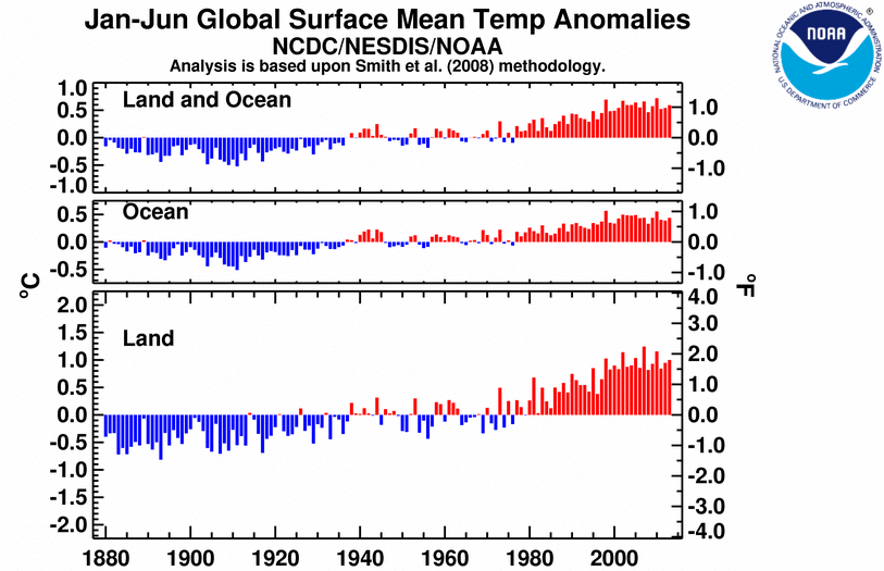
And yes, we will write a post on what we learned in making it!

Re: Global land temperatures since 1900 visualized

#12
Very cool implementation and pre-loading action...it's almost impossible to talk about global temperatures without talking about climate change. A view that I think many people would find interesting is the map colored by temperature deltas, over a given time...i.e. let the user set start and beginning and color the map based on the difference (and yes, that will probably increase hits on your DB, so I'm guessing it may not be trivial to implement)

Re: Global land temperatures since 1900 visualized

#13
post #12

Very cool implementation and pre-loading action...it's almost impossible to talk about global temperatures without talking about climate change. A view that I think many people would find interesting is the map colored by temperature deltas, over a given time...i.e. let the user set start and beginning and color the map based on the difference (and yes, that will probably increase hits on your DB, so I'm guessing it…

It's something that we wanted to show too. Apart from the technical complexity involved it would be hard to show warming. In the last century overall warming was maybe 1 deg C, but temperatures fluctuate from year to year by up to 15 degrees. Here is a delta graph for 1900 - 2012, for example: https://www.evernote.com/shard/s5/sh/6d1d932a-c1ed-411d-9b74... One way of doing it though would be to use a rolling average of, say, 5 years.

Re: Global land temperatures since 1900 visualized

#16
Warning on the site when you visit with an ipad:

"Hey there. It looks like you're on a mobile device. Just a quick warning: This project will download a lot of data from the interwebs (no really!), and even then it probably won't look that great.

Your best bet is to bookmark this page, go home, check it out on your desktop, and see it in its full glory."

I am at home, on the couch, with an ipad. That is my favorite computing device at home, I hardly touch my desktop these days... Times are changing... Why would I want to use a truck at home?

Re: Global land temperatures since 1900 visualized

#19
post #18

This is a naive question, but why is the southern hemisphere so much warmer?

Antarctica is missing, and the equator is not in the middle of the map (more like 2/3 down). Might this be the reason for your impression?

Yes, it appears symmetric around the equator. Thanks!
Post reply on HN