Live data from Hacker News

Yahoo Removes Registered Trademark (R) From Logo

instagram.com

11–20 of 124 posts

Re: Yahoo Removes Registered Trademark (R) From Logo

#11

Is there a reason this page is completely devoid of any interactivity? I wanted to view further pictures she might have shared, but clicking her name just brings up pointless statistics (number of photos and followers). Same deal with the comment section. It's like someone pulled a copy of the page and removed all the hyperlinks.

This is definitely being done for a reason. One of the best ways to increase user clicks on a particular link is to remove all the other links on a page.

This case is a bit extreme: Instagram has removed most links not only for mobile web browsers, but also for desktop users. That said, the reason for removing it from desktop browsers may also extend to privacy: I personally really like it that it's not easy to find links to my Instagram posts. Privacy through obfuscation, I suppose.

In any case, Instagram's web presence really encourages users to download the app. That's smart, as that's where Facebook is the weakest... so Instagram was able to focus its (very) limited resources in the one place where it could really shine.
Re: Yahoo Removes Registered Trademark (R) From Logo

#13
post #9

and here is the opposite effect, the new windows 8 logo: http://i50.tinypic.com/15oidfb.jpg A clean, simple, elegant logo, completely ruined by the honking TM and (R) injected by the lawyers. The bizarre presence of two separate legalese-related sigils on a single logo makes it impossible to miss. Also makes it clear who is running the place.

How does apple get away without this? Curious if anyone knows

Re: Yahoo Removes Registered Trademark (R) From Logo

#14
post #9

and here is the opposite effect, the new windows 8 logo: http://i50.tinypic.com/15oidfb.jpg A clean, simple, elegant logo, completely ruined by the honking TM and (R) injected by the lawyers. The bizarre presence of two separate legalese-related sigils on a single logo makes it impossible to miss. Also makes it clear who is running the place.

I actually like the visual appearance of these symbols in some logos, including this one.

I believe in this case I like it because the ™ slightly reinforces the 3D effect, and because it's a rather bad logo to begin with. I.e. almost any change is an improvement and the small pictograms give it a bit of an "organic" touch.

Re: Yahoo Removes Registered Trademark (R) From Logo

#15
post #13
post #9

and here is the opposite effect, the new windows 8 logo: http://i50.tinypic.com/15oidfb.jpg A clean, simple, elegant logo, completely ruined by the honking TM and (R) injected by the lawyers. The bizarre presence of two separate legalese-related sigils on a single logo makes it impossible to miss. Also makes it clear who is running the place.

How does apple get away without this? Curious if anyone knows

fear

Re: Yahoo Removes Registered Trademark (R) From Logo

#16
post #9

and here is the opposite effect, the new windows 8 logo: http://i50.tinypic.com/15oidfb.jpg A clean, simple, elegant logo, completely ruined by the honking TM and (R) injected by the lawyers. The bizarre presence of two separate legalese-related sigils on a single logo makes it impossible to miss. Also makes it clear who is running the place.

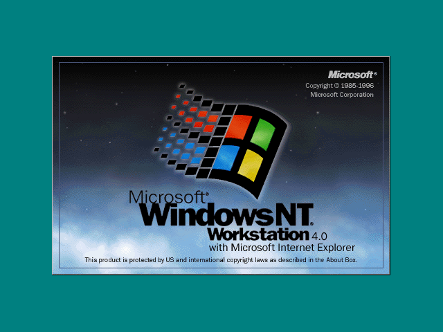
It's always been that way. Remember the Windows 95 and Windows NT startup screens? Take this for instance:

http://www.guidebookgallery.org/screenshots/winnt40

In particular: http://www.guidebookgallery.org/pics/gui/startupshutdown/spl...

It wasn't uncommon for Microsoft to have their name mentioned 4 or 5 times on a single screen, alongside copyright symbols, trademarks, and other crap.

Re: Yahoo Removes Registered Trademark (R) From Logo

#19
post #13
post #9

and here is the opposite effect, the new windows 8 logo: http://i50.tinypic.com/15oidfb.jpg A clean, simple, elegant logo, completely ruined by the honking TM and (R) injected by the lawyers. The bizarre presence of two separate legalese-related sigils on a single logo makes it impossible to miss. Also makes it clear who is running the place.

How does apple get away without this? Curious if anyone knows

[deleted]

Re: Yahoo Removes Registered Trademark (R) From Logo

#20
post #13
post #9

and here is the opposite effect, the new windows 8 logo: http://i50.tinypic.com/15oidfb.jpg A clean, simple, elegant logo, completely ruined by the honking TM and (R) injected by the lawyers. The bizarre presence of two separate legalese-related sigils on a single logo makes it impossible to miss. Also makes it clear who is running the place.

How does apple get away without this? Curious if anyone knows

http://en.wikipedia.org/wiki/Apple_Corps_v_Apple_Computer

maybe they couldn't for a while?

Post reply on HN