Does anyone else find the font used on that page really distracting? What's with the I looking like a J?
This. Since when was an I a slightly smaller J?
11–20 of 305 posts
Does anyone else find the font used on that page really distracting? What's with the I looking like a J?
If a user doesn't recognise the word "English" then they are not going to have any idea what language select. The reason the languages are all listed on the page without any interaction needed is so someone can look at the webpage and recognise their language and select it without having to understand anything else. How do I access the main page of a wiki?
This isn't redefined, it's just a redesign with some bad, some good, aesthetic changes.
Does anyone else find the font used on that page really distracting? What's with the I looking like a J?
Deciding that users want to see your overbearing minimalism and your 'sound-great-in-concept-meetings-but-shit-on-paper' designs instead of you know, actual information on the front page of an encyclopaedia strikes me as an astonishing act of hubris.
The one piece of information given on the front page (the languages bar) is a nice curiosity, but utterly useless after about one visit. I'm sure the Swiss, the Swedes, the Danes, the Indonesians would also be delighted to find that their languages have been relegated to 'rollover' status.
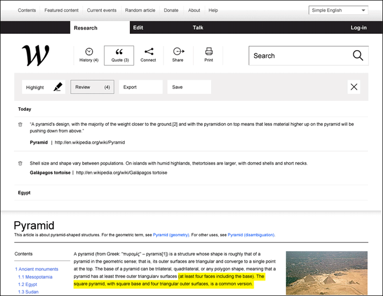
As for the article pages, too much white-space, nowhere near enough information density. Did it not strike the authors, "Hey, hang on, the article is almost invisible on this page after all the crap we put in?" http://www.wikipediaredefined.com/img/27.png
copying my comment from reddit: If a user doesn't recognise the word "English" then they are not going to have any idea what language select. The reason the languages are all listed on the page without any interaction needed is so someone can look at the webpage and recognise their language and select it without having to understand anything else. How do I access the main page of a wiki? This isn't redefined, it's ju…
(also ... the content is open .... ripe for anyone else to give this a go)
Too much space is taken up by navigation in this scheme. There's a reason Wikipedia's design is dominated by text.
I agree. Websites that do this are awful, Google Plus is guilty of this. Re combo-boxing the language list: Wikipedia is the most successful multi-language website by far. Highlighting this to new and old users is a great thing. Its not like the search box takes up any more than one line anyway. For Wikipedia, this redesign blows. I do like the visual style though. This is really just showcasing the webdesign company…
Does anyone else find the font used on that page really distracting? What's with the I looking like a J?
This. Since when was an I a slightly smaller J?