Live data from Hacker News

Why Your Links Should Never Say “Click Here”

uxmovement.com

11–20 of 93 posts

Re: Why Your Links Should Never Say “Click Here”

#11
post #4

I've tried to abide by this rule for most of the 17 years I've done web development. There is, however, an exception to this rule: My mom. My mom (and my dad) belong to the group that - even after a decade of daily computer use - frequently fail to recognize distinct interface elements. They seem to have no general concept of the look / purpose of a link, a window, a modal box etc. Colors and chrome are meaningless t…

"My mom (and my dad) belong to the group"

As a matter of fact I spoke to your parents the other day. They asked me if there was a space between the first and second word of my domain name. They also didn't understand that you can't just send an email to domainname you need an address at domainname. They didn't know what a browser bar was they just type my domain name in google and go from there.

In all seriousness you raise an excellent point.

It would be interesting if there was some data and metrics to backup the web saavyness of various audience types and how a particular link style impacts those groups. What works with one group might be a detriment in another group.
Re: Why Your Links Should Never Say “Click Here”

#12
post #4

I've tried to abide by this rule for most of the 17 years I've done web development. There is, however, an exception to this rule: My mom. My mom (and my dad) belong to the group that - even after a decade of daily computer use - frequently fail to recognize distinct interface elements. They seem to have no general concept of the look / purpose of a link, a window, a modal box etc. Colors and chrome are meaningless t…

I came here just to say this. UI is a learned behavior and if you're a beginner any explicit sign or help indicating what to do next is very much welcomed.

Re: Why Your Links Should Never Say “Click Here”

#14
I agree with almost everything in this post, philosophically and intellectually. However, any usability study I remember seeing on this subject has always concluded that "click here" converts better. So until they back up any of their suggestions with data, this article gets relegated to pure brain fodder.

Edit: And I'm sure conversions would probably also depend on the demographics of your user base, so I'd be interested in seeing that included as well.

Re: Why Your Links Should Never Say “Click Here”

#15
I've been a firm "eye-roller" at this idea for a long time. My boss often uses terms like "call to action" and has me change text because he feels it might "confuse" people. I do it, don't get me wrong, but I give an extra strong roll with my eyes as I'm doing it.

I get that there really are dumb people out there, but if "submit" confuses you when you are "submitting an application" (of which the button is "submit your application" rather than "submit") you might not get the job. Likely so even if you are applying to McDonalds.

This article though... Almost turns me to his side, at least on this topic. Nice read.

Re: Why Your Links Should Never Say “Click Here”

#16

I agree with almost everything in this post, philosophically and intellectually. However, any usability study I remember seeing on this subject has always concluded that "click here" converts better. So until they back up any of their suggestions with data, this article gets relegated to pure brain fodder. Edit: And I'm sure conversions would probably also depend on the demographics of your user base, so I'd be inter…

How do we change these behaviors if we don't lead users to it as an industry? Do you want to make the web a better place or just raise your conversion rate? I don't know if there is a "right" answer.

Re: Why Your Links Should Never Say “Click Here”

#17
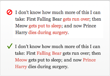
I think this example (http://uxmovement.com/wp-content/uploads/2012/06/clickhere_n...) is absolutely awful. Many websites style text in many ways, if you're going to refuse to have "click here" (or any other call to action) then you absolutely must stick to common patterns: links being blue and underlined.

Re: Why Your Links Should Never Say “Click Here”

#20
I'm surprised that no one appears to have mentioned the main reason I was always taught not to use "click here".

From W3C: http://www.w3.org/TR/WCAG10/#gl-facilitate-navigation

"Link text should be meaningful enough to make sense when read out of context -- either on its own or as part of a sequence of links."

This is especially true when you consider users who use screen readers.

Post reply on HN