It's because the plebes that can't afford iphones are gross. /s
One trick Apple uses to make you think green bubbles are “gross”
11–20 of 354 posts
Re: One trick Apple uses to make you think green bubbles are “gross”
#12Ermmm. Wasn’t it green for sms way before iMessage was launched?
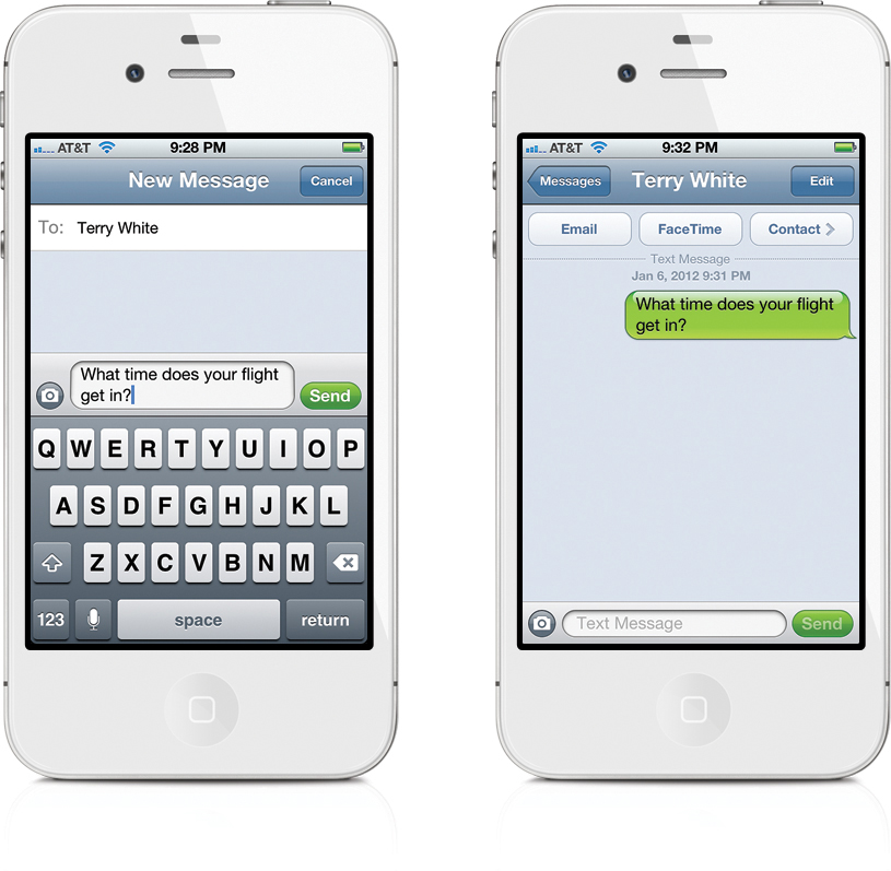
Yes. From the article: "To be clear, it is not that green is gross. It is the low color contrast of the green Apple picked and used against white text is gross." The original design used black text, for one thing.
Re: One trick Apple uses to make you think green bubbles are “gross”
#13Ermmm. Wasn’t it green for sms way before iMessage was launched?
Yes and no. It used to be black on green (with imo a way worse green).
https://www.oreilly.com/api/v2/epubs/9780133016529/files/gra...
Re: One trick Apple uses to make you think green bubbles are “gross”
#14Nice theory, but the reality of how these decisions get made is usually far less interesting.
Some product owner probably wanted the iMessage enabled texter to "pop" and the designers usually take that and roll with it usually through some combination of boldening one, and deemphasizing the other to give the overall desired effect. It's a good call out for them to improve the color contrast, but you can adjust the contrast yourself through the accessibility options.
Re: One trick Apple uses to make you think green bubbles are “gross”
#15When will people realize that the point of differentiating between Android/iOS bubbles isn’t about discriminating against teenagers, but rather it’s about security. If my messages are being sent through an insecure protocol that leaks my messages to the police, carrier, and skids with a rtl-SDR (SMS) rather than a secure encrypted protocol (iMessage), I want it to be obvious.
They have every reason to make “green bubbles” look toxic and off putting, because unencrypted SMS is genuinely hazardous.
Re: One trick Apple uses to make you think green bubbles are “gross”
#16Green is not a negative color in all cases.
Green also signifies good to go
Re: One trick Apple uses to make you think green bubbles are “gross”
#17Re: One trick Apple uses to make you think green bubbles are “gross”
#18The author is just overthinking things here. If anything, green is the color used to indicate “go”, a positive sign that has been etched into our minds. The reason is very clear as already mentioned “it doesn’t support messages”. Why isn’t that explanation enough?
EDIT: to clarify here, the author does explain his point about the color and the contrast of the text. He may have a point there but IMO, the main issue was that it’s not messages. The thing I should have added is that back when it was implemented people had to pay real money per message to send as a text message. That means everyone in the group had to feel uncomfortable sending frivolous messages when it costs someone money. I think that is the real reason for the bifurcation and not the color choice.
Re: One trick Apple uses to make you think green bubbles are “gross”
#19Ermmm. Wasn’t it green for sms way before iMessage was launched?
Yes, but the contrast was good.
iOS 4, green Aqua-ish bubbles with black text: https://d2bs8hqp6qvsw6.cloudfront.net/article/images/750x750...

iOS 5, introducing blue iMessage bubbles (still good contrast in both colors): https://images.anandtech.com/doci/4956/IMG_0907.PNG
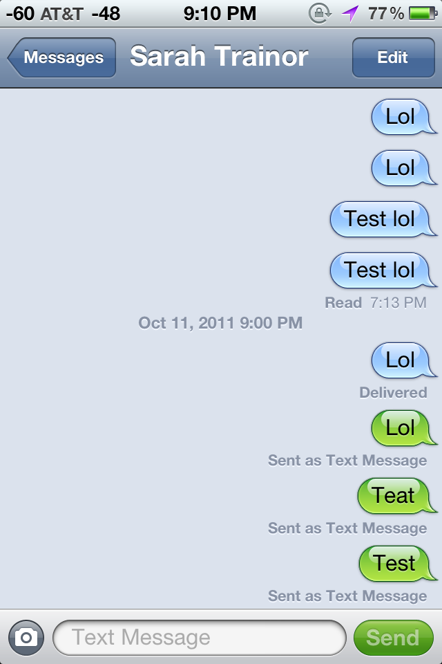
The change in contrast came with Ive's "flat" iOS 7:
https://i.insider.com/5df902c5fd9db27769749a5f?width=1300&fo...
Re: One trick Apple uses to make you think green bubbles are “gross”
#20Green was the original color of text messages when the iPhone was introduced. When Apple introduced iMessages four or five years later they made iMessages Blue. This isn’t some great conspiracy.
Did you RTFA? It's not about the colour, it's about the contrast.
I wonder if the contrast has changed over the years. It could be a worse green today than originally.