Earlier quoted context omitted.
This effort allows GNUStep applications to share GNOME configurations (themes, menus, icons, etc). It's designed for people who want to develop Cocoa applications in Linux without dealing with the horrid-looking NeXTStep theme.
I understand what you mean, but I don't think it's horrid. I would call it retro-chic.
http://www.gnustep.org/images/full-screenshot1.png
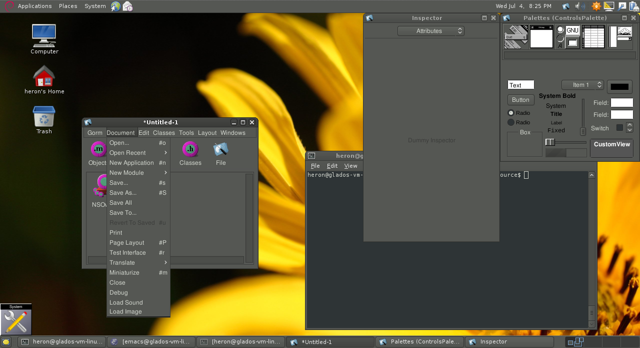
Why is the services menu popping up on top but not next to the services element in the list? What's the difference between the menu dock things on the top right and the bottom left, and why isn't it obvious? I love how the "25.54GB free" text is just floating about randomly in the file viewer. I can see the pixels in the gradient on the recycle symbol at the bottom right.
http://www.gnustep.org/images/full-screenshot2.png
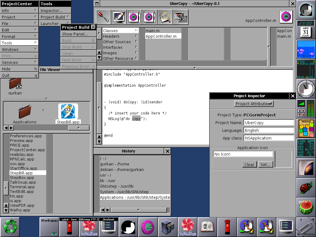
In this one, why are the docks eating up so much screen real estate? On the bottom dock, I see two of the same yin-yang icon w/ squiggly, how am I supposed to differentiate?
Nah, I think GNUStep's appearance is provably horrid.