Live data from Hacker News

Your eyes suck at blue

nfggames.com

11–20 of 44 posts

Re: Your eyes suck at blue

#11

Ugh. We don't have an entirely clear picture of how our eyes physically detect color, much less how we perceive it, but there are serious problems with the argument the author makes here. You cannot simply take a color photograph of a scene, split it in to three channels, then point out that the blue channel is "dark and contains less detail" as evidence of our inability to perceive the color blue. The fact is that t…

Lots of text there, and you certainly sound confident, but I tried an experiment, and it confirmed the claims of the article. I used Paint.NET, loaded in an image, copied it to three layers. Adusted each layer to be a single colour channel, then changed each of the layers to 'Additive' mode. Pixellating the blue layer - I could perceive at most some 'colour blotching', but no real loss of 'sharpness' Pixellating the…

How do you know the unnoticeable pixellation of the blue isn't an artifact of the way blue is displayed by your screen?
Re: Your eyes suck at blue

#12
post #5

That is pretty neat, although I'm not sure I understand all the outrage. "THE DVD FORUM IS STEALING OUR PIXELS!!" If your eye doesn't notice the difference, are you being "bilked"?

I think it's the same situation as so called "audiophiles" who spend large amounts of money on gold cables and ultra expensive headphones. They may or may not be able to tell the difference but the knowledge that their 10000USD headphones produce a slightly large range of sound than the 100USD pair makes them believe that the more expensive headphones are worth it. In the same way you could probably sell some sort of... DVD re...bluer? or something and make a mint even if no one could tell the difference.

Re: Your eyes suck at blue

#13

Ugh. We don't have an entirely clear picture of how our eyes physically detect color, much less how we perceive it, but there are serious problems with the argument the author makes here. You cannot simply take a color photograph of a scene, split it in to three channels, then point out that the blue channel is "dark and contains less detail" as evidence of our inability to perceive the color blue. The fact is that t…

Lots of text there, and you certainly sound confident, but I tried an experiment, and it confirmed the claims of the article. I used Paint.NET, loaded in an image, copied it to three layers. Adusted each layer to be a single colour channel, then changed each of the layers to 'Additive' mode. Pixellating the blue layer - I could perceive at most some 'colour blotching', but no real loss of 'sharpness' Pixellating the…

The additive color model isn't exactly the same as the layer modes you'll see in image editing apps. This "mode" affects how the values of the current layer are applied to the layers below it. The normal mode is to replace the values below. When you switch to additive, the RGB channels from the current layer are "added" to the values of the layer below. This is entirely different than the concept of the additive color model.

There are two broad color model types: additive and subtractive. Additive color models (like RGB) "add" color to arrive at white. Subtractive color models (like CMYK) "subtract" color to arrive at white. In the RGB additive color model, we most frequently refer to the primary colors, RGB, but the secondary colors (cyan, magenta, and yellow) are equally important. The primary colors are the result of raising only one channel to full luminance while all the others are at zero. The secondary colors are produced by raising all channels to the maximum, then dropping one channel to zero. The secondary color for the blue channel is yellow.

The consequence of this is that you can't simply pixelate the blue channel in an additive model RGB image and claim this proves a lack of ability to perceive color in the blue light spectrum, because the alteration of the primary color will inevitably affect the distribution of the secondary color, depending upon the luminance of the other channels in the region.

A better test would display a test pattern in different colors, but matching luminosity. The trouble with testing this on your computer is that your display must be calibrated. On a properly calibrated display, the display of RGB[0,255,0] and RGB[0,0,255] should have identical luminance values. Very few people have calibrated displays, and even if you do, the chances that your display is accurate throughout the color gamut for a given luminance value is even less.

Re: Your eyes suck at blue

#14

Ugh. We don't have an entirely clear picture of how our eyes physically detect color, much less how we perceive it, but there are serious problems with the argument the author makes here. You cannot simply take a color photograph of a scene, split it in to three channels, then point out that the blue channel is "dark and contains less detail" as evidence of our inability to perceive the color blue. The fact is that t…

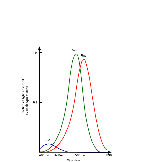
I do know a little about human color perception. Although the author's example is flawed, his argument does stand. Human eyes are much less sensitive to details in blue compared to green and red. Here's the best illustration I can find in a minute's googling: http://homepages.inf.ed.ac.uk/rbf/CVonline/LOCAL_COPIES/OWEN... from http://homepages.inf.ed.ac.uk/rbf/CVonline/LOCAL_COPIES/OWEN...

This shows up in the Red-vs-Blue battle analytics in both Halo and Team Fortress 2 --Blue wins measurably more often because they are harder to focus on. Red-vs-Green would be more fair, but that would screw over the large male population with Red-Green colorblindness.

This is why the standard conversion of linear RGB to greyscale is 30%red + 59%green + 11%blue. 33% each would make the blue seem to have too much influence after conversion. This is why BluBlocker glasses make the world seem more sharp. It's why I try to minimize blue in my IDE color schemes.

If you are designing a purely pragmatic UX that requires seeing fine details, I'd recommend a yellow-on-black color scheme with some green and little blue. The classic green/amber terminal screens of yore were ugly, but effective.

Re: Your eyes suck at blue

#17
post #2

I wouldn't have thought so given that blue is the favorite color of most people[1]. [1] http://www.joehallock.com/edu/COM498/preferences.html

Not really. Favourite colours have to do more with social and cultural features than your ability to finely distinguish between different shades of said colour. I strongly believe that the proper phrasing for the results should not be "blue is the favorite color of most people" but rather "blue is the favourite colour of most White North Americans/Western Europeans". I bet if this was done in China, it would be more…

Maybe also because `blue' (or `red' or `green') is easy to say. More so than more detailed descriptions of colors.

Re: Your eyes suck at blue

#18
Does the article mention that images taken with a digital camera (with a few exceptions) only sample 1/2 the green pixels and 1/4 each of the red and blue ones?

http://en.wikipedia.org/wiki/Bayer_filter

There will be more information in the green channel because that is how the camera is built. I'm sure somewhere there is proper research that was was used in developing the Bayer filter that indicates the human eye is more sensitive to green, but this looks like a case of bad methodology ending up with the right conclusion through luck.

Re: Your eyes suck at blue

#19

Earlier quoted context omitted.

Lots of text there, and you certainly sound confident, but I tried an experiment, and it confirmed the claims of the article. I used Paint.NET, loaded in an image, copied it to three layers. Adusted each layer to be a single colour channel, then changed each of the layers to 'Additive' mode. Pixellating the blue layer - I could perceive at most some 'colour blotching', but no real loss of 'sharpness' Pixellating the…

How do you know the unnoticeable pixellation of the blue isn't an artifact of the way blue is displayed by your screen?

If you have an LCD screen with a normal RGBRGB pixel layout, you really can't expect problems. Then again, you can always use a magnifying glass.

Re: Your eyes suck at blue

#20
post #3

> This is how DVDs work: a high res green image and two low-res images, one for red, one for blue. Not true. MPEG-2 uses the YCbCr colorspace, consisting of a high resolution Luminance signal (brightness) and a low resolution Chrominance signal (color). So in fact, all color information is subsampled, green is not treated specially.

Green is absolutely treated specially in YCbCr; you just have to understand how YCbCr relates to RGB.

ITU-R BT.601 defines YCbCr as follows:

    Y ~= 0.30 R + 0.59 G + 0.11 B
    Cb ~= -0.17 R - 0.33 G + 0.5 B
    Cr ~= 0.5 R - 0.42 G - 0.08 B
Y is given the most bandwidth, and green makes up 60% of Y. Cb and Cr are allocated substantially less bandwidth, and green still makes up a sizable chunk of the value. In total, green occupies about 2/3 of the bandwidth in YCbCr. That's pretty much the whole point of doing it---RGB spends an unnecessary amount of bandwidth on R and B.

(reference: http://en.wikipedia.org/wiki/YCbCr )

Post reply on HN