Live data from Hacker News

New Map Scale Is More Readable by People Who Are Color Blind

scientificamerican.com

11–20 of 52 posts

Re: New Map Scale Is More Readable by People Who Are Color Blind

#11
post #10

Did I miss it, or are there zero example images in the article using the new color scale?

The yellowish/blueish diagrams are the new scale. https://static.scientificamerican.com/sciam/assets/Image/jou...
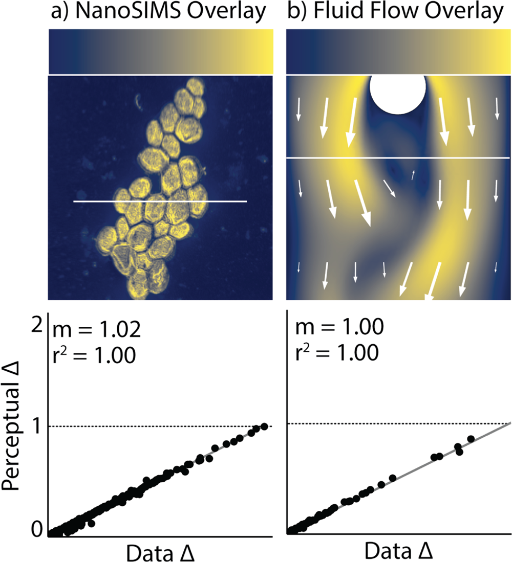
I always hated rainbow scales because I always see artificial boundaries where the colors change between 2 contrasting ones.
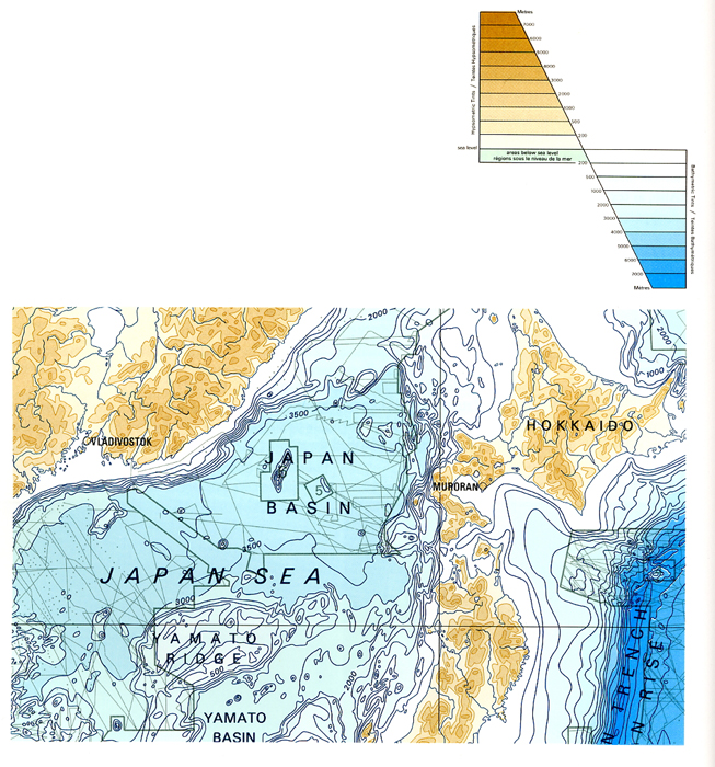
Re: New Map Scale Is More Readable by People Who Are Color Blind

#12
post #8

Related: How Bad Is Your Colormap? (Or, Why People Hate Jet – and You Should Too): https://jakevdp.github.io/blog/2014/10/16/how-bad-is-your-co... Also related: seaborn (a helper library on top of matplotlib) has a special case dedicated to rejecting requests for using jet

Why is it called jet? Can't find any definition/abbreviation for it beside that it's called jet in MATLAB.

https://www.mathworks.com/help/matlab/ref/jet.html

Re: New Map Scale Is More Readable by People Who Are Color Blind

#13
I've been using Color Oracle [1] to simulate colour-blindness as part of my standard developer workflow recently. For such a common disability, it's shocking how little work most people put into ensuring accessibility for colour-blind people.

[1] https://colororacle.org/

Re: New Map Scale Is More Readable by People Who Are Color Blind

#15
post #2

I wish the article would have provided the formula for cividis... that is, how to transform a range of values from 0 to 1.0 into standard RGB values.

I was looking for a table too, and found https://github.com/pnnl/cmaputil (colormaps/ directory)
Post reply on HN