Gnome Files: A detailed UI examination
datagubbe.se
Gnome Files: A detailed UI examination
1–10 of 293 posts
Re: Gnome Files: A detailed UI examination
#2These complaints aren't invalid, but I do wonder how many users actually get tripped up on these things. If you want a list view, clicking on the icon that looks like a list isn't a crazy thing to do. I agree the dropdown behaviour is a bit strange.
Equally, it's accepted that a bunch of today's Gnome apps have title bars with controls inside them. I don't think it's that jarring that if you don't click on a control accurately and then start dragging the mouse, you're going to move the window.
Re: Gnome Files: A detailed UI examination
#3I don't use Gnome since the days of version 2, which was really nice and friendly. But I was impressed by how well the latest iteration works in a tablet.
That's a great advantage, because it's the same UI as a desktop. Plus, they have made sure all core applications work well using a touch UI.
Re: Gnome Files: A detailed UI examination
#4These complaints aren't invalid, but I do wonder how many users actually get tripped up on these things. If you want a list view, clicking on the icon that looks like a list isn't a crazy thing to do. I agree the dropdown behaviour is a bit strange. Equally, it's accepted that a bunch of today's Gnome apps have title bars with controls inside them. I don't think it's that jarring that if you don't click on a control…
The sort of mental process the author related to find that list view was pretty much the same I went through, so at least there's two people. But, as they said and the author quoted, "Our software is built to be usable by everyone. We care deeply about user experience."
Though there are already TONS of critiques to GNOME (hell, even I have written some stuff about them here) and so much has been said about it that saying something else seems like a waste of time in my humble opinion. Its devs won't change their mind because they have a laser-sharp vision of what they want to achieve. Its users won't change their mind because they like it and feel at home using it. We the people that don't (or no longer) like it won't change our minds either because it can feel really strange, confusing and even limiting.
It's been more than 10 years since they went to that route but they will do little to nothing about that because, as the author correctly asserted, "it's also a project that's very vocal - opinionated, as the saying goes - about how to do things." So either you like the GNOME way of doing things or you just can go somewhere else. Which, again, it's a bit contradictory taking in account their "Our software is built to be usable by everyone" motto.
Re: Gnome Files: A detailed UI examination
#5[deleted]
Re: Gnome Files: A detailed UI examination
#6I don't use Gnome since the days of version 2, which was really nice and friendly. But I was impressed by how well the latest iteration works in a tablet. That's a great advantage, because it's the same UI as a desktop. Plus, they have made sure all core applications work well using a touch UI.
From the article's summary:
> Some common features are only accessible - and discoverable - through keyboard shortcuts. The keyboard shortcuts listing is non-interactive, modal, and incurs a substantial mental context switch.
Re: Gnome Files: A detailed UI examination
#7These complaints aren't invalid, but I do wonder how many users actually get tripped up on these things. If you want a list view, clicking on the icon that looks like a list isn't a crazy thing to do. I agree the dropdown behaviour is a bit strange. Equally, it's accepted that a bunch of today's Gnome apps have title bars with controls inside them. I don't think it's that jarring that if you don't click on a control…
The sort of mental process the author related to find that list view was pretty much the same I went through, so at least there's two people. But, as they said and the author quoted, "Our software is built to be usable by everyone. We care deeply about user experience." Though there are already TONS of critiques to GNOME (hell, even I have written some stuff about them here) and so much has been said about it that sa…
I think one day it will be a sword they fall on as fewer people become interested in working with such aggressive position, the developers will look elsewhere instead of wait for GNOME to implement something or be reasonable.
Re: Gnome Files: A detailed UI examination
#8I don't use Gnome since the days of version 2, which was really nice and friendly. But I was impressed by how well the latest iteration works in a tablet. That's a great advantage, because it's the same UI as a desktop. Plus, they have made sure all core applications work well using a touch UI.
From the article's summary: > Some common features are only accessible - and discoverable - through keyboard shortcuts. The keyboard shortcuts listing is non-interactive, modal, and incurs a substantial mental context switch.
That's something natural, touch interfaces need to be simpler. I didn't miss any normal functionality without access to a keyboard.
Re: Gnome Files: A detailed UI examination
#9Decent critique, but it mixes together two things: the design language, and UI papercuts showing a lack of attention to detail.
Consider the current macOS Finder:
https://a.qoid.us/20240907-finder.png
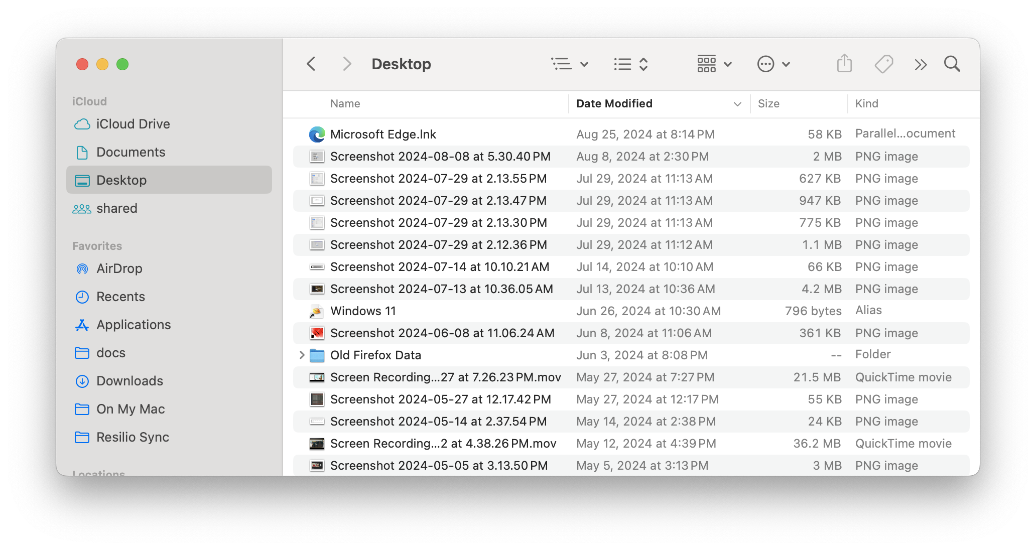
Finder's design is extremely similar to GNOME Files! And so the inherent downsides of the design language are present in Finder too, such as it being harder to drag windows around or click to activate windows.
But macOS does avoid most of the UI papercuts the author points out. It's not perfect, but let's go through the list.
- View Options: Finder has a similar-looking icon that does the same thing. But in Finder, the little arrows on the right of an icon are always part of the same button as the icon itself. Finder doesn't use split buttons in the way the author complains about.
- Help: The macOS User Guide explains all the icons and what they do. But you don't actually need to go that far, because macOS has a feature where if you click Help and start typing, it will show menu items (from any menu) that match what you typed. In this case, if you start typing "list", it will show the "as List" menu item, which achieves what the author wants. (I guess I should point out that macOS does have a menu bar at the top of the screen, and all the actions you can take by clicking icons can also be taken through the menu bar.)
- Tooltips: Finder doesn't have tooltips for the locations on the left pane, only for the icons in the toolbar. Even there they take a while to appear.
- Navigation: I'd ding Finder here because there is no location bar at all (only an 'open by path' dialog that's kind of buried). Even going to the parent directory is not exposed in a particularly obvious way. Still, at least Finder doesn't have something that looks editable but isn't.
- Scrolling: macOS has hidden scrollbars by default, but they stay at the right of the window. They don't jump to the left like the author is complaining about.
Re: Gnome Files: A detailed UI examination
#10As someone who can't cope with Gnome Files, I've been pleased with worker as desktop file manager recently.
http://www.boomerangsworld.de/cms/worker/
https://packages.debian.org/bookworm/worker
Still on the lookout for a reasonable FileChooserDialog replacement... Easily the worst part of GTK and a great candidate for its own dedicated article (hint hint :)). Supposedly it takes some LD_PRELOAD fudging to override it and while there is the linked previous work from KDE I'm not aware of anything else at this point. Anyone know of any recentish attempts? Would it be a good idea with a "libgtkfilepicker" which provides a more accessible API for implementations to interface with?
https://unix.stackexchange.com/questions/743931/can-i-someho...