An Update on the Lock Icon
blog.chromium.org
An Update on the Lock Icon
1–10 of 169 posts
Re: An Update on the Lock Icon
#2"You know that green lock in your browser?" used to be how I explained what I did in 5 seconds. Now what am I supposed to do?!
I like this update, I think this is an excellent UX change
Re: An Update on the Lock Icon
#3Good change imo. They didn't mention in the post but I do hope they continue to show the "Not Secure" warning for HTTP-only websites.
Re: An Update on the Lock Icon
#4I approve of getting rid of the lock icon, showing only a broken lock for HTTP and no lock for HTTPS. It's always been weird to have site permissions settings revealed by clicking that lock.
But the replacement icon looks really strange to me. They're calling it a "tune icon," but I've never seen a tune icon like this, with just two circles and two lines. Looks weird. I'm surprised that it fared well in the experiment.
I would prefer it if they'd use a gear icon, which is normally used for settings like this. You can see a gear icon at the bottom of the tune menu for "Site settings," which makes it all the weirder that they're using a tune icon in the URL bar and a gear icon in the menu for site settings.
Re: An Update on the Lock Icon
#5Good change imo. They didn't mention in the post but I do hope they continue to show the "Not Secure" warning for HTTP-only websites.
> We continued to mark HTTP as insecure in the URL bar.
Re: An Update on the Lock Icon
#6Good change imo. They didn't mention in the post but I do hope they continue to show the "Not Secure" warning for HTTP-only websites.
They did mention it in the post. "On all platforms, we will continue to mark plaintext HTTP as insecure."
Re: An Update on the Lock Icon
#7I approve of getting rid of the lock icon, showing only a broken lock for HTTP and no lock for HTTPS. It's always been weird to have site permissions settings revealed by clicking that lock. But the replacement icon looks really strange to me. They're calling it a "tune icon," but I've never seen a tune icon like this, with just two circles and two lines. Looks weird. I'm surprised that it fared well in the experimen…
The icon looks like something from audio equipment. I get it.
Re: An Update on the Lock Icon
#8What's with the naming and visuals of the "tune" icon, which seems to be a "site settings" icon with weird left- and right-justified radio buttons?
Re: An Update on the Lock Icon
#9I approve of getting rid of the lock icon, showing only a broken lock for HTTP and no lock for HTTPS. It's always been weird to have site permissions settings revealed by clicking that lock. But the replacement icon looks really strange to me. They're calling it a "tune icon," but I've never seen a tune icon like this, with just two circles and two lines. Looks weird. I'm surprised that it fared well in the experimen…
It represents a vertical list of toggle icons, commonly seen these days in preferences panes, including the flyout shown in the same image: https://blogger.googleusercontent.com/img/b/R29vZ2xl/AVvXsEh...
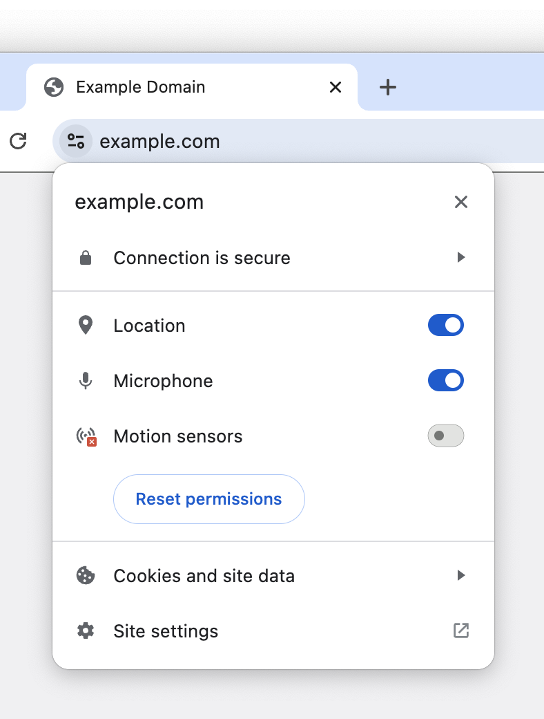
A gear icon would work as well, but the intent was immediately obvious to me.
Re: An Update on the Lock Icon
#10Reading through this it's making a lot of sense, the lock icon was added to convey that the 'connection is secure', while making the assumption that the user understood it's talking about the transport layer behind the scenes. Of course, most users cannot be expected to know that kind of detail, so they would associate it with the thing in front of their eyes, the website itself.
I am sticking to Firefox but as changes go, this wouldn't be a terrible one for non-Chrome browsers to converge upon. I don't think it's a good idea to hide the option away entirely though; a lack of available information and options for a user on a platform can often lead to the platform itself deciding it needs to become the arbiter of information, but I assume the iOS limitation is Apple's usual user-hostile behaviour.