My Favorite Chart on Earth
csmonitor.com
My Favorite Chart on Earth
1–10 of 53 posts
Re: My Favorite Chart on Earth
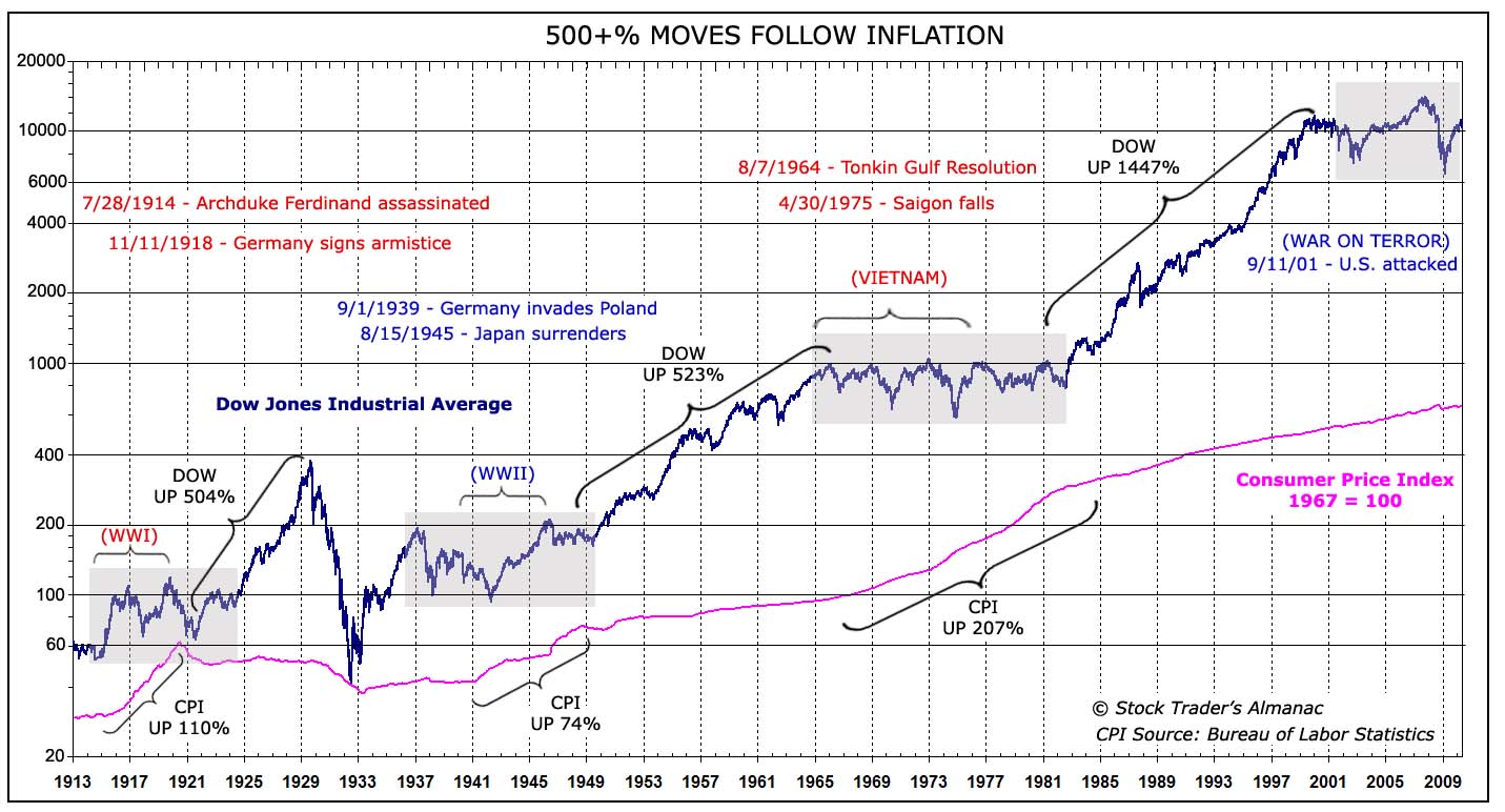
#2This suggests that we are in for a long period of inflation.
Re: My Favorite Chart on Earth
#3Of course Korea and First Gulf War are not here, since they would ruin the author's argument. Cue the chorus of people arguing why Korea and First Gulf are "different."
Re: My Favorite Chart on Earth
#4Large version of chart, here:
http://www.thereformedbroker.com/wp-content/uploads/2011/01/...
Re: My Favorite Chart on Earth
#5Of course Korea and First Gulf War are not here, since they would ruin the author's argument. Cue the chorus of people arguing why Korea and First Gulf are "different."
I don't know if I'm the chorus you're talking about, but they were both much shorter than the ones marked (gulf war 1: 90-91, korea: 50-53). If he shaded those boxes as well to the graph, I don't see it "ruining" his argument. The growth in those four years wasn't exactly spectacular. Very slightly up at best.
Re: My Favorite Chart on Earth
#6Note that the chart uses a logarithmic y-axis, so it is most useful for relative comparisons. Don't try to get absolute data from it as our brains aren't built for doing exponential graph transformations.
Re: My Favorite Chart on Earth
#7Of course Korea and First Gulf War are not here, since they would ruin the author's argument. Cue the chorus of people arguing why Korea and First Gulf are "different."
I don't know if I'm the chorus you're talking about, but they were both much shorter than the ones marked (gulf war 1: 90-91, korea: 50-53). If he shaded those boxes as well to the graph, I don't see it "ruining" his argument. The growth in those four years wasn't exactly spectacular. Very slightly up at best.
50-53 growth is as strong as the general trendline. 90-91 is too small to tell.
Re: My Favorite Chart on Earth
#8Out of six or seven wars, he picks the ones that make his case. This guy (and anyone tempted to draw any conclusions from this chart) should read A Random Walk Down Wall Street.
Re: My Favorite Chart on Earth
#9Note that the chart uses a logarithmic y-axis, so it is most useful for relative comparisons. Don't try to get absolute data from it as our brains aren't built for doing exponential graph transformations.
A logarithmic graph of money! A newspaper (book?) that actually gets it. It's astonishing how many linear graphs of money exist - and they are all worthless and misleading.
And if you need proof that linear graphs of money are misleading then compare:
http://en.wikipedia.org/wiki/File:Components_of_US_Money_sup... http://en.wikipedia.org/wiki/File:Components_of_US_Money_sup...

.svg)
Re: My Favorite Chart on Earth
#10Out of six or seven wars, he picks the ones that make his case. This guy (and anyone tempted to draw any conclusions from this chart) should read A Random Walk Down Wall Street. http://en.wikipedia.org/wiki/A_Random_Walk_Down_Wall_Street
Which other relatively long or expensive wars are missing from this?
Wouldn't the length of a war be difficult to estimate at the outset, and hence be priced in to stock market growth over time? In my economics class they taught us that war is bad for the (real) economy because the country is relatively more invested in the engines of destruction than production, and thus productivity growth in things that make life better is lower. The conclusions of this chart stand to intuitive reason based on that teaching, but I'm by no means an expert.